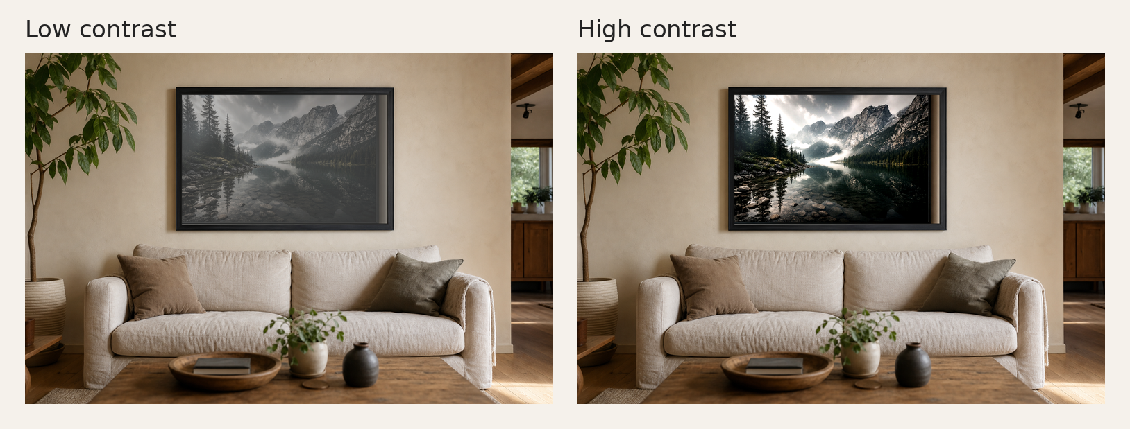
A high contrast photograph has a clear distance between its dark and light areas. That sounds technical, but the effect is simple: the image feels more decisive. It can make a room feel calmer, sharper, or more architectural without adding more colour or visual noise.
People often search for high contrast photography because the phrase appears in camera guides, editing apps, and print descriptions. It can sound like a setting you either get right or wrong. In reality, it is more useful to think of contrast as a kind of visual pressure.
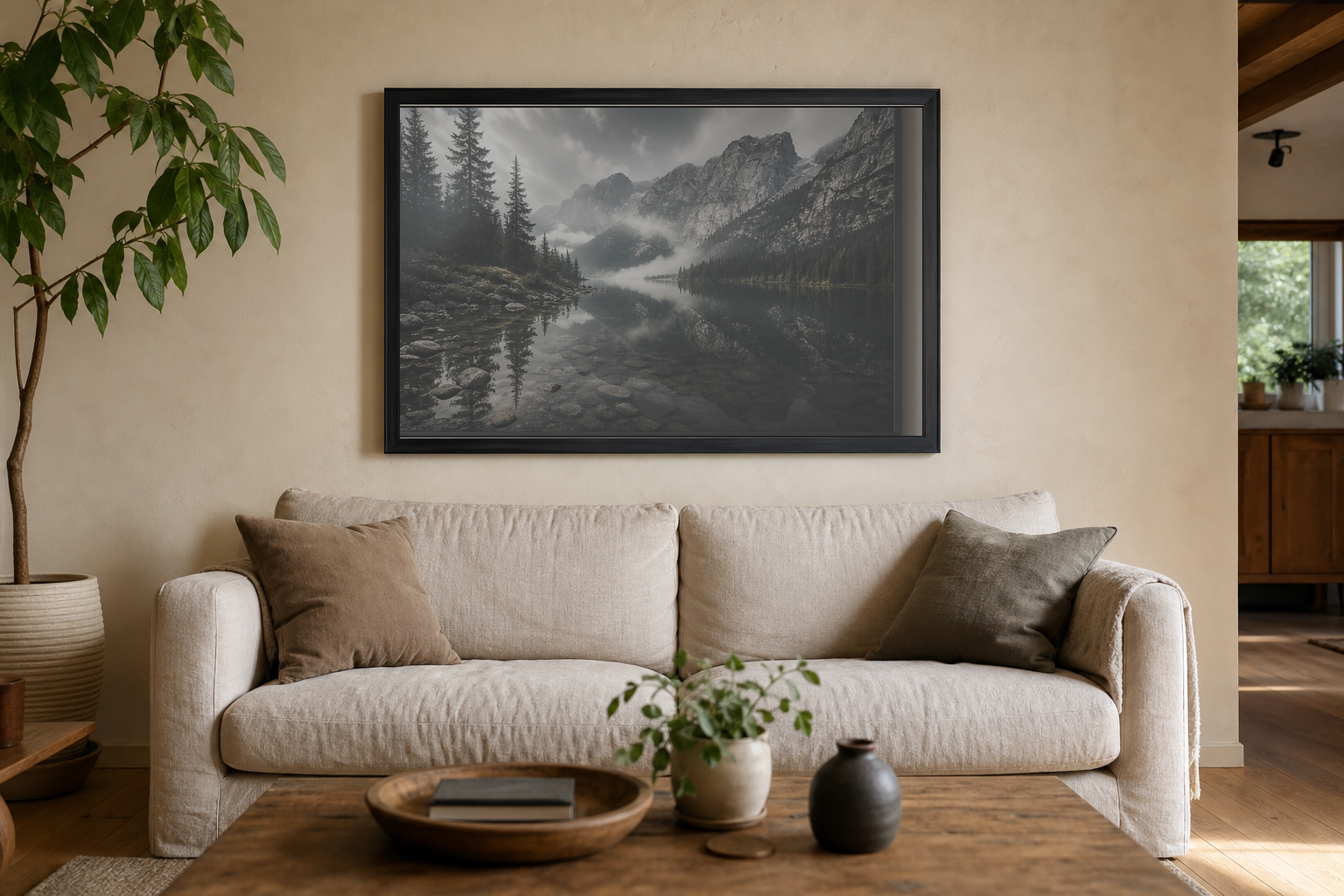
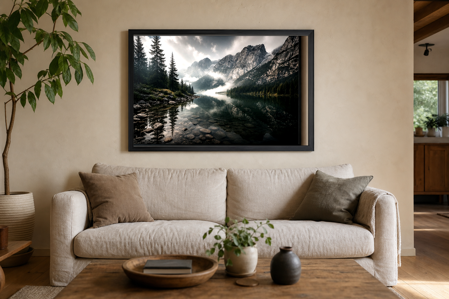
Low contrast photographs move gently. Shadows are soft. Highlights do not pull too hard. High contrast photographs make stronger separations. A pale sky against a dark building. A bright reflection cutting through a black street. A white cathedral façade surrounded by deep shadow. The image becomes easier to read from across a room.
What does “high contrast” mean in photography?
In photography, high contrast means there is a noticeable difference between the lightest and darkest parts of the image. It is not only about making blacks blacker or whites whiter. It is about separation.
A high contrast scene might include:
Strong light against deep shadow
Late afternoon sun on stone, with the street or sky falling darker around it.
Simple shapes
Architecture, bridges, windows, silhouettes, and repeating lines often hold contrast well.
Limited colour
When colour is reduced or removed, tone becomes more important. This is why black and white photography often feels naturally high contrast.
Contrast also has a long history in visual art. The term chiaroscuro describes the use of strong light and dark to create drama and form. Photography borrows the same instinct, even when the final image is quiet rather than theatrical.
Why high contrast works well as wall art
Wall art has to do something slightly different from an image on a phone. A small screen rewards quick detail. A print has to live with furniture, daylight, lamps, empty wall space, and the normal mess of a room.
High contrast photography works well on a wall because it keeps its structure at a distance. You do not need to stand close to understand the image. The main shape lands quickly. Then the smaller details arrive later.
This is especially useful in minimal interiors. A pale room can make a low contrast print disappear. A darker, more defined photograph gives the space an anchor. It does not have to be loud. It just needs enough weight to hold the wall.
High contrast does not always mean harsh
There is a bad version of high contrast. It happens when editing becomes too aggressive. Shadows are crushed until they lose detail. Highlights are pushed until stone, cloud, or skin turns flat. The image may look dramatic for two seconds, then tiring after that.
The better version is controlled. The dark areas still have texture. The bright areas still have shape. In a print, this matters more than it does online. Paper is less forgiving than a glowing screen. A photograph that looks punchy on Instagram can become heavy and blocked once printed.
For Othervariant, the strongest high contrast images tend to come from architecture and black and white London scenes. Stone, glass, bridges, towers, and old streets all give the photograph a natural structure before any editing begins.
When to choose high contrast photography for your home
High contrast photography is a good choice when you want the print to feel intentional rather than decorative. It suits spaces where the room already has a calm base: white walls, dark wood, black metal, stone, linen, concrete, or simple furniture.
| Room or mood | What to look for |
|---|---|
| Minimal living room | A black and white architectural print with one clear subject. |
| Home office | Sharper lines, city structures, bridges, or skyline forms. |
| Hallway | A strong vertical or central composition that reads quickly as you pass. |
| Bedroom | Softer contrast, unless the room already has a moody palette. |
If the room already has many colours, patterns, or small objects, high contrast black and white can help by removing one layer of complexity. It gives the eye somewhere clear to rest.
How to tell if a high contrast print is right
Do not only ask whether you like the subject. Ask how the photograph behaves in the space.
Three useful questions:
Does it have a clear shape?
The best high contrast prints usually have a silhouette, frame, tower, bridge, street line, or strong central form.
Does it suit the wall colour?
White and warm neutral walls can take stronger contrast. Very dark walls may need a print with brighter highlights.
Will you still like it when the room is quiet?
A good print should not need novelty to work. It should keep giving you small details after the first look.
For a practical starting point, look at black and white photography prints first. They make contrast easier to judge because colour is not distracting you. If you prefer city structure, the London print collection is a natural place to compare architectural shapes and tones.
The Symmetry & Stone St. Paul’s Cathedral print is a good example of high contrast used quietly. The building is bright and detailed, but the monochrome treatment keeps the photograph restrained. For a more open skyline feel, The Shard from Sky Garden uses contrast through distance, haze, and the hard geometry of the city.
If you want to understand the image side rather than the buying side, the Journal piece on what makes a good black and white photograph is a useful companion. It looks at tone, restraint, and why removing colour can sometimes make a photograph feel more honest.
Want a print with quiet structure?
Start with black and white London photographs. Look for clear light, clean geometry, and enough shadow to give the wall some weight.