
A giclée print is a digital inkjet print. That is the simple answer. For a pigment-ink giclée, image preparation, the ink-and-paper combination, colour management, proofing, print control and display conditions all affect the result.
The word appears on everything from carefully prepared exhibition prints to inexpensive reproductions. It sounds like a material or a protected grade. It is neither.
For photography, giclée can be an excellent process. It can hold fine colour changes, deep shadows and quiet detail on papers that feel very different from standard photo paper. But the label alone tells you very little. A serious listing should explain what the image is printed on and how it is produced.
What does “giclée” actually mean?
The word comes from the French verb gicler, meaning to spray or squirt. Printmaker Jack Duganne coined the term for fine-art output from Iris inkjet printers. He wanted a name without the negative associations then attached to inkjet prints, particularly early fading.
The meaning widened. London print studio Genesis Imaging describes both “giclée print” and “pigment print” as terms for output made from a digital file directly onto paper with an inkjet printer. The Fine Art Trade Guild gives an even simpler definition: a fine-art digital print made from a computer file.
That history matters because it explains the confusion. Giclée began as a way to distinguish serious digital printmaking. It is now used broadly enough that the word cannot act as a quality certificate on its own.
What the label proves, and what it does not
Digital inkjet process
The label suggests that the image was printed from a digital file with an inkjet printer. It does not identify the printer, ink set or paper.
Fine-art marketing
It is commonly marketed as a fine-art print. The word does not show whether the materials were independently tested.
Fine-art surface
Fine-art paper or canvas may have been used. The label does not promise permanence in every room or lighting condition.
Any kind of source image
The process can reproduce photography, painting and digital art. It says nothing about originality, signatures or edition size.
“Archival” deserves the same caution. It is useful shorthand, but it is not one universal lifespan. Print permanence belongs to a tested combination of ink, paper, coating, storage and display conditions. Change one part and the result can change.
The Fine Art Trade Guild’s ArtSure standard shows what a real quality framework looks like. Among other controls, it specifies a substrate of at least 250 gsm with a pH of 7–9, printer-manufacturer-approved inks, laboratory-tested materials and a finished-print lightfastness result of at least six on the Blue Wool Scale, or an equivalent empirical test. A seller does not have to use ArtSure to make a good print. The useful lesson is that quality comes from disclosed materials and testing, not from the accent over the letter “é”.
How a photographic giclée print is made
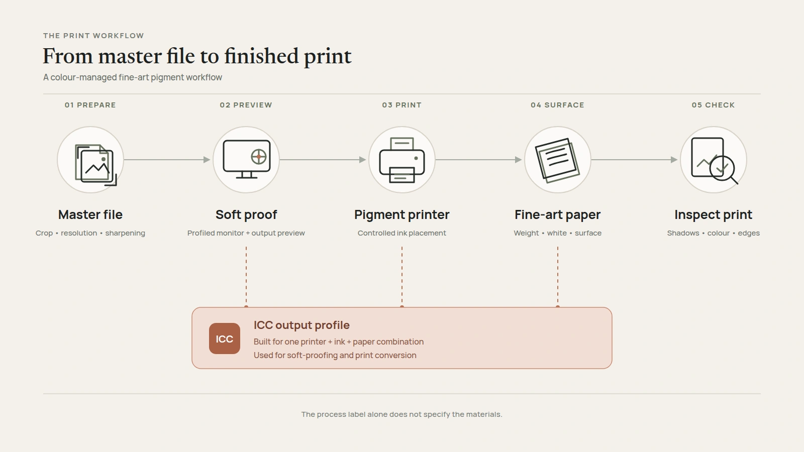
The printer is only one part of the process. A controlled photographic-print workflow can include five stages.
- The master file is prepared for the final size. The photographer decides the crop, checks resolution and controls sharpening at the intended output dimensions. A file that works at 30 cm may need different preparation at 120 cm.
- The screen is brought into a colour-managed workflow. A calibrated and profiled monitor under stable lighting reduces guesswork. A screen emits light while paper reflects it, and a soft proof cannot reproduce paper texture, surface sheen or the exact effect of viewing light.
- The file can be soft-proofed for a specific printer, ink and paper. An output ICC profile characterises the colour response and gamut of that combination. Colour-managed software uses the output profile to soft-proof the result on a profiled monitor and to convert image colours for print. Hahnemühle provides further guidance on paper-specific ICC profiles.
- The image is printed with controlled ink placement. Fine nozzles lay down droplets in repeated passes. In a professional pigment workflow, several ink channels help build colour, greys and dark tones without simply making everything louder.
- The physical print is inspected. The inspection goes beyond sharpness and colour. It looks for blocked shadows, colour casts, damaged edges, surface marks and a crop that no longer feels balanced at full size.
The sequence below shows where colour management sits between the master file and the finished print.
This is why two prints described with the same word can look very different. One may be prepared for its exact paper and size. The other may be a generic file sent to a printer with little control.
Why the paper changes the photograph
Fine-art paper is not a neutral carrier. It becomes part of the photograph.
The base
Cotton rag and highly purified alpha-cellulose are both used for serious inkjet papers. Cotton is not automatically better for every image. The paper’s coating, manufacture and tested ink compatibility matter too.
The surface
A smooth matte paper can keep glare low. A textured sheet adds physical presence but may soften the impression of very fine edges. A pearl or baryta-like surface can deepen contrast while reflecting more room light.
The base white
A warmer paper can quieten colour. A brighter white can make contrast feel stronger. Some bright papers use optical brighteners, which react to ultraviolet light and can alter how white the sheet appears under different illumination.
The weight
Paper weight affects handling and presence, but a higher number is not a complete quality score. Thickness, stiffness, surface and coating also shape how the print feels.
Giclée print vs C-type photo print
A giclée print is not the only serious way to print a digital photograph. The main comparison is often a digital C-type, also called a chromogenic print.
In digital C-type printing, a digital light source exposes silver-halide photographic paper, which is then wet-processed to form a chromogenic dye image. Genesis Imaging’s process, for example, uses a Durst Lambda with red, green and blue lasers. The source file may be digital, but the image is formed in photographic emulsion rather than by ink droplets.
Fine-art pigment inkjet
Ink droplets are deposited onto a coated paper or canvas surface. Fine-art photographic versions commonly use pigment inks and can work with smooth, textured, cotton, alpha-cellulose, baryta-like and pearl papers. Their visual character depends heavily on the chosen surface.
Permanence depends on the tested ink-and-surface combination and the way the print is displayed.
Digital C-type
Light-sensitive silver-halide paper is exposed and chemically processed. Common surfaces include smooth matte, gloss and lustre photographic papers, with the familiar character of a professional lab print.
Permanence depends on the paper, chemistry, processing and display conditions.
A C-type can be a beautiful, serious photographic print. A pigment giclée can be equally serious. Treating one word as a hierarchy misses the real decision: how should this particular photograph exist on paper?
Is giclée good for photography?
Yes, especially when the paper and preparation support the image.
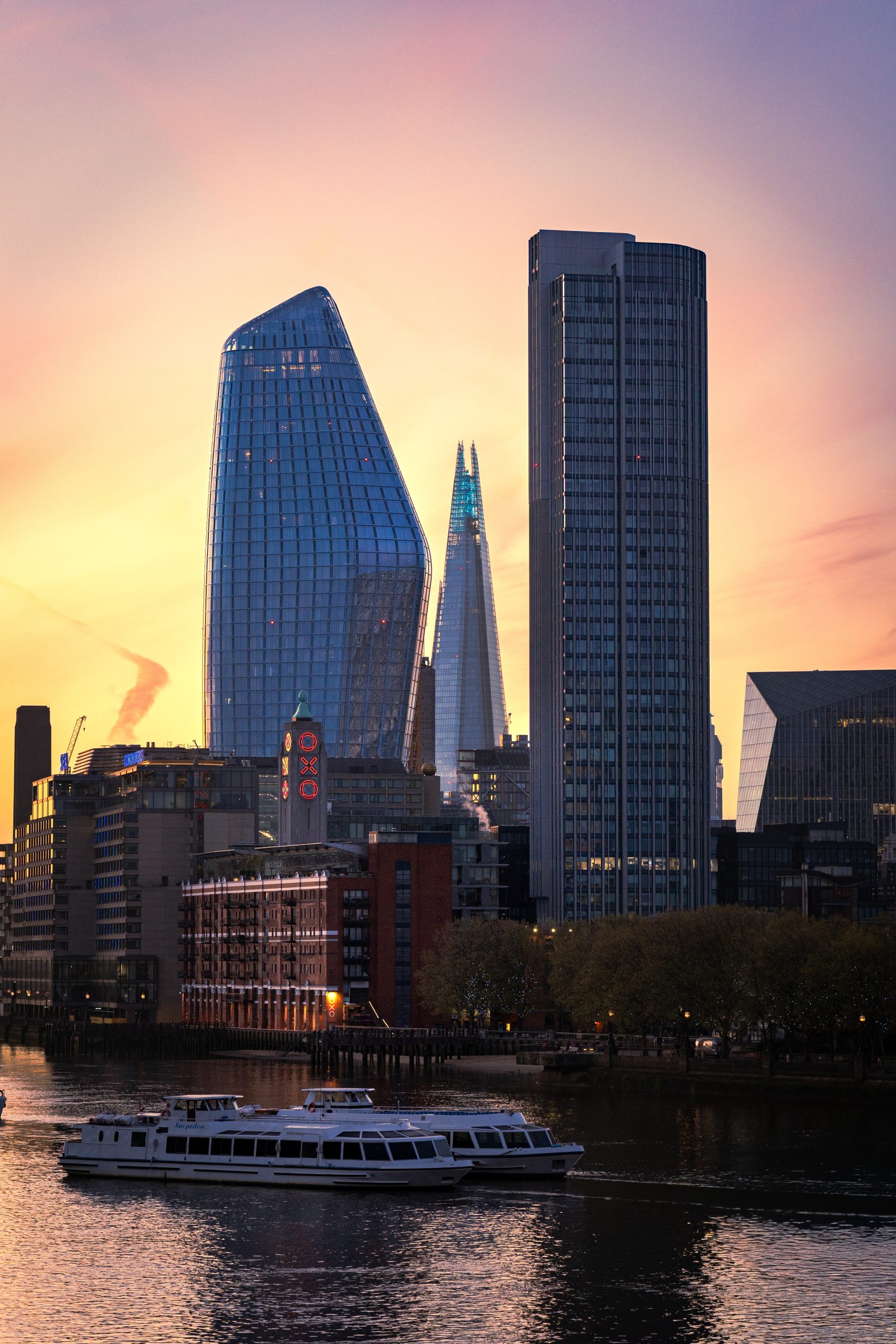
A dusk skyline needs gradual colour through the sky and separation between hundreds of small windows. Rain and dark architecture need shadows that remain distinct rather than collapsing into one heavy block. Black-and-white work needs neutral greys and a controlled path from highlight to deep shadow.
Pigment printing can handle those demands well. It also gives the photographer a wide choice of surfaces, and that choice needs care. Heavy texture may compete with precise architecture. A very glossy surface may add unwanted reflections in a bright room. A bright white paper may energise colour but feel wrong for a quiet, misty landscape.
The strongest print is not always the one with the deepest black or brightest colour. It is the one whose physical character agrees with the photograph.
How long will a giclée print last?
There is no single lifespan that applies to every giclée print.
Paper manufacturers and independent laboratories test particular combinations under defined conditions. Those tests can be useful when comparing materials. They are not a promise that a print will look unchanged for the same number of years beside a sunny window.
Light level, ultraviolet exposure, heat, humidity, air pollution, glazing and handling all matter. Keep a valuable paper print away from direct sun and persistent damp. For a valued print, use conservation-quality mount and backing materials. UV-filtering glazing can reduce, but not eliminate, light damage. Handle an unframed print by clean edges rather than touching the image surface.
For practical display advice, read the guide to caring for framed photography prints.
What should you check before buying?
If surface or colour is important to the purchase, ask for a paper sample or view a finished print where possible. A screen preview cannot reproduce texture, sheen or exact print colour.
1. Is the paper named?
“Fine-art paper” is vague. A named paper lets you check its weight, surface, base material and manufacturer’s specifications.
2. Is the ink process stated?
Look for pigment inkjet or a clearly named alternative such as C-type. Do not assume every product called giclée uses the same materials.
3. Who makes the print?
A lab name is useful when it is accompanied by the actual process, paper, ink type and quality-control information.
4. Does the size describe paper or image?
Check whether the dimensions include a white border or mount. The visible photograph may be smaller than the listed sheet or frame size.
5. Does the crop change?
A good process cannot rescue a poor crop. Check that the chosen ratio keeps the important edges, spacing and balance of the original photograph.
6. Is it framed or print only?
Paper choice, glazing and mounting affect how the finished work looks. Confirm exactly what arrives and whether it is ready to hang.
7. Is “limited edition” explained?
Edition size and authenticity are separate from printing method. A giclée can be open edition, limited edition or unsigned.
8. Do you still want the photograph?
Remove the words “giclée”, “archival” and “fine art” in your head. The image still has to earn its place on your wall.
Two photographs where the print process has real work to do
City Glow at Dusk relies on the transition from warm sky into blue glass and small points of evening light. Big Ben After Rain depends on wet reflections, dense cloud and readable detail in the darker half of the frame. They are different photographs, but both need the paper and printing process to preserve separation rather than turn atmosphere into noise.
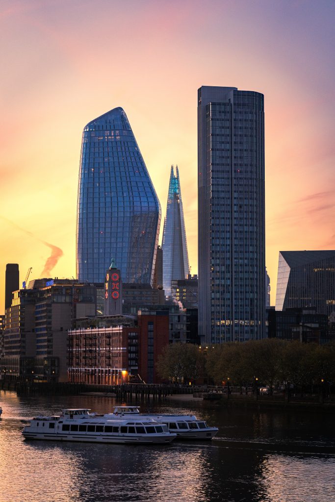
City Glow at Dusk
A London skyline photograph built from warm sky colour, blue glass and many small points of evening light.
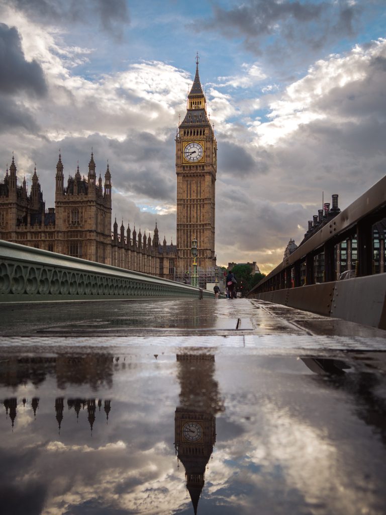
Big Ben After Rain
Wet pavement, heavy weather and Westminster detail make separation in the darker tones especially important.
So, is a giclée print worth choosing?
Yes, when the seller can tell you what the word means in that specific product.
A good answer names the printing process, paper, surface and presentation. A better answer also shows care in the crop, file preparation and physical inspection. If the only evidence is the word “giclée”, you still have unanswered questions.
The printing method matters. It should remain quiet enough that you notice the weather, light, distance and structure of the photograph first.
Choose the photograph, then check the specification
Start with the image you want to live with. Then check the paper, process, size, crop and framing rather than trusting a premium label on its own.