
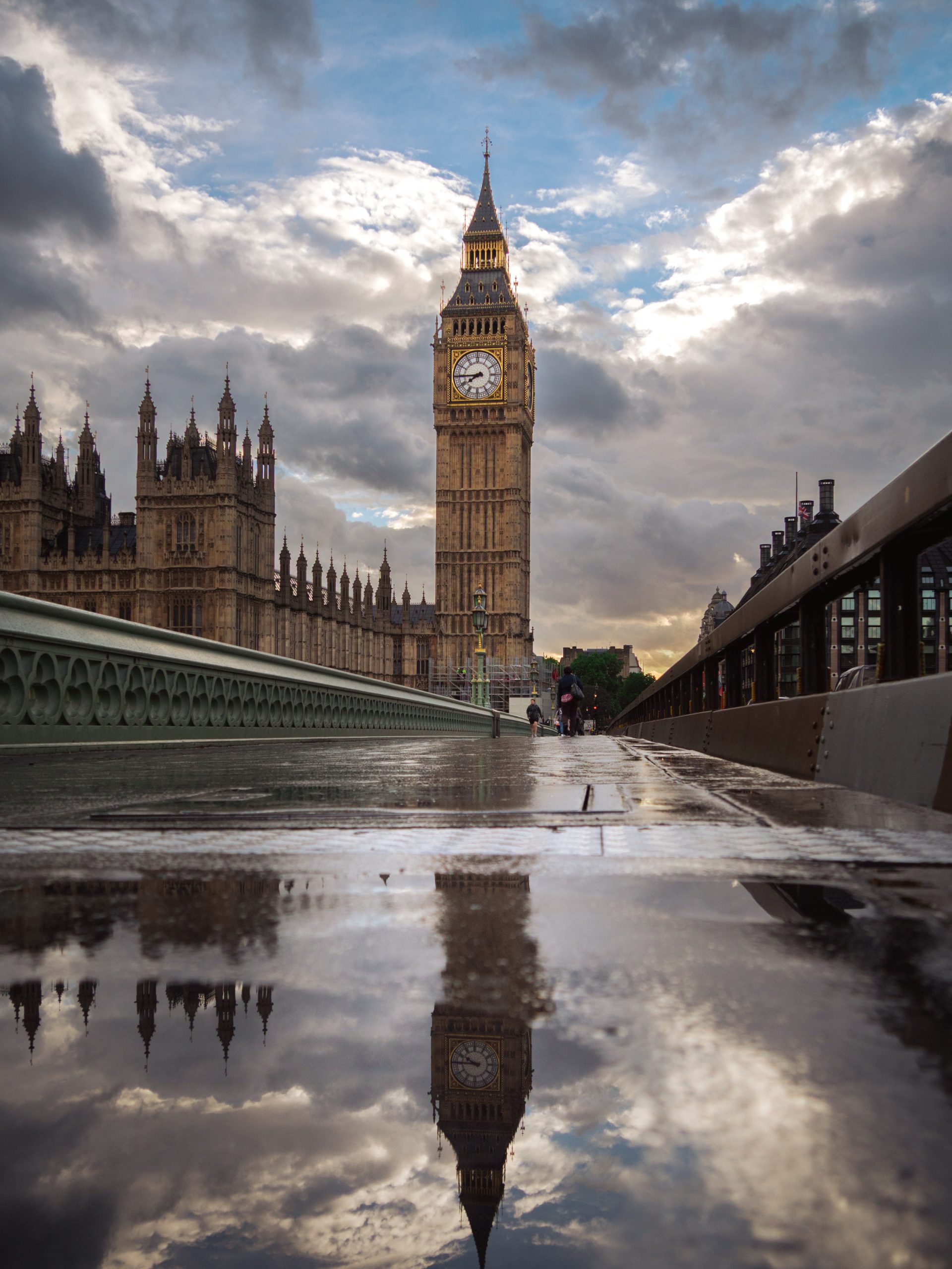
Office reception wall art has to work for more than one person. It should give the room a clear atmosphere, sit comfortably in a public space and remain easy to live with every working day.
Start with the job of the room
A reception is not a home office with a bigger desk. It is a shared threshold. Staff pass through it every day. Visitors may see it for thirty seconds or sit beside it for twenty minutes.
That changes the way the art needs to work. A very personal image may feel out of place. A busy gallery wall can compete with signs, screens, seating and the reception desk. Generic motivational text often adds noise without giving the room any real character.
Photography can be quieter. It can set a mood without telling people what to think.
Choose a mood before a subject
The useful first question is not “Which landmark do we like?” It is “How should this space feel?”
Calm and welcoming
Look for open sky, soft weather, water, mist or a simple landscape. These images give the eye somewhere to rest while a visitor waits.
Structured and assured
Choose architecture with strong lines, repeated forms or one recognisable subject. It can make a modern reception feel more settled without becoming severe.
Local and considered
A photograph connected to the building, city or region can add identity. Choose a less obvious view rather than a familiar tourist-poster treatment.
Make sure the image reads across the room
Reception art is often seen from the entrance before it is seen up close. Fine detail alone will not carry that distance. The photograph needs a clear shape, horizon, subject or path through the frame.
Step back to the main doorway and notice the usable wall, not the whole wall. Doors, switches, signs, plants and screens all reduce the space around a print. A larger piece with a simple composition will often feel calmer than several small pieces trying to fill the same area.
The guide to choosing large photography prints explains how to judge scale without overwhelming the room.
Use architecture when the space needs structure
Architecture suits receptions with clean furniture, stone, metal, glass or strong straight lines. It can echo the room without copying it exactly.
A London photograph also gives a city-based business a sense of place. The key is restraint. One well-composed bridge, station or landmark usually feels more considered than a collage of familiar icons.
Black and white makes shape and contrast more prominent. Colour can work just as well when the palette is controlled. Wet pavement, evening light and muted skies often sit more quietly than bright midday colour.
Use landscape when the room needs relief
Some receptions already contain enough hard edges: a long desk, ceiling lights, screens and practical flooring. A landscape can soften that structure.
Look for depth and space rather than a crowded scene. A distant ridge, a small group of trees or a simple horizon gives the eye somewhere beyond the room to travel. That can be especially useful beside a waiting area.
The photograph does not need to match the upholstery. A shared tone is enough. Warm timber may sit well with soft greens and mist. Darker furniture may suit a pale sky or a restrained monochrome image.
Place the print for the real sightline
The obvious wall behind the desk is not always the best wall. Check what people see when they enter, where they sit and which direction they naturally face.
If the print hangs behind a receptionist, keep the composition clear and avoid placing the main subject directly behind a head or monitor. If it hangs beside seating, the image can reward a closer look. A corridor leading away from reception often suits a vertical photograph or a small sequence with consistent framing.
Leave breathing room around the frame. Art that touches signage, shelving or a tall plant will feel accidental even when the photograph itself is strong.
Keep reception art separate from home-office advice
A private workspace can carry more personal meaning. It can also use a smaller print viewed from one desk. Reception art has a wider audience and usually needs a stronger distance-read.
If you are choosing for a desk or study rather than a shared entrance, the home-office photography guide is the better starting point.
A simple final test
Before choosing, stand where a visitor first enters and ask four plain questions:
Can I read it from here?
The main shape or subject should hold together before the small detail becomes visible.
Does it calm or crowd the wall?
Count the signs, screens and objects already competing for attention.
Does it belong to this place?
Connection can come from location, architecture, material or mood. It does not need a logo.
Then ask one final question: would it still work in five years? A photograph with lasting visual structure will usually age better than a short-lived décor theme.
Two quiet directions to consider
These two photographs solve different reception-room problems. One gives a wall urban structure. The other introduces distance and softer natural colour.
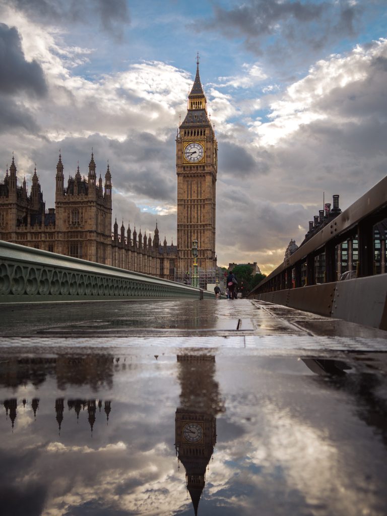
Big Ben After Rain
Clear architecture, a strong vertical subject and restrained reflections for a reception that needs a recognisable London anchor.

Three Olive Trees
Soft greens, open distance and a simple group of trees for a waiting area that needs relief from hard office lines.
Choose the atmosphere first
A reception does not need more decoration. It needs one image that makes the space feel deliberate from the moment someone enters.