
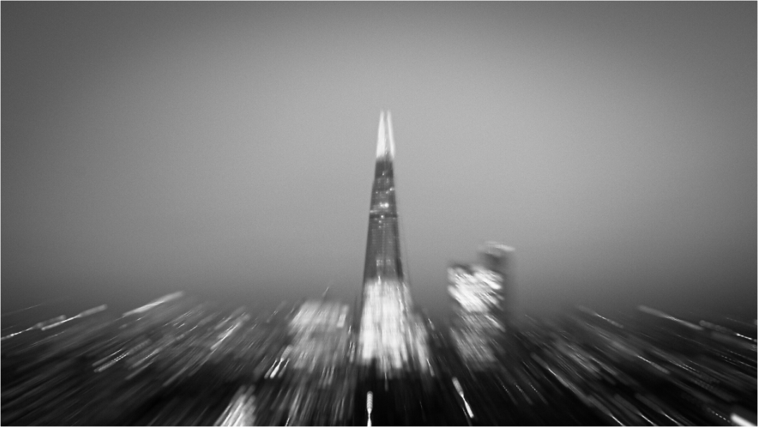
Photography does not need a separate wall from paintings or illustration. Mixed art works when the group has a clear hierarchy and a visual conversation, not when every piece shares the same colour or frame.
Choose the lead work
Every mixed group needs a first point of attention. It can be the largest piece, the darkest work or the image with the clearest subject. Decide this before arranging the rest.
A strong photograph can anchor looser drawings; a painting can lead while a quieter photograph adds structure. When every piece has equal size and contrast, the wall can feel like a grid of competing statements. A hierarchy lets different media keep their character without becoming noise.
Find one shared quality
Do not force a photograph to match the exact blue in a painting. Look for a less literal relationship: repeated curves, vertical lines, open space, warm light or a similar level of contrast. An abstract architecture photograph can sit beside gestural paint because both contain movement.
A small street detail can connect to an illustration through silhouette and negative space. One shared quality is enough. More than that can make the arrangement feel purchased as a set rather than assembled over time.
Use spacing to show relationships
Place related works slightly closer and give the whole group a clear outer boundary. Keep gaps consistent enough to feel intentional, but allow size differences to create rhythm. Lay the pieces on the floor or make paper templates at full outer-frame size.
Test the arrangement from the normal viewing distance. Mixed media often needs a little more space than a set of photographs because surfaces and marks differ. If the wall feels busy, remove one piece before making every gap wider.
Let frames support the media
Identical frames are not required. A restrained frame family is usually enough: perhaps black and natural wood with similar visual weight. A photograph with a clean mount may need breathing room beside a painting that runs to the edge.
Avoid adding ornate frames to every work in an attempt to unite them. The relationship should come from the images and spacing first. Frames can repeat one material already in the room and help the group sit with furniture.
Balance detail and distance
Photography can contain precise detail that pulls viewers close, while painting or illustration may read more through colour and gesture. Use this difference deliberately. Put a detailed photograph where it can be approached and a broader, simpler work where it is seen from across the room.
In a corridor, choose images that read quickly. Above seating, allow the group to reward slower looking. Mixed art becomes richer when each medium has a suitable viewing role.
Edit until the wall can breathe
Add the strongest pieces first and stop before every planned work is hung. View the arrangement in real daylight and evening light. If one item looks like filler, take it out.
A mixed wall should feel more personal than a matched product set, but personal does not mean crowded. Leave enough surrounding wall that the group has an edge. Future additions can wait until a genuinely relevant work appears.
Make a temporary full-size layout
Cut paper to the full outer size of every frame and tape the shapes to the wall with a removable, surface-safe method. Mark each with the artwork title and its darkest area. This is more useful than arranging small digital thumbnails because it reveals weight, height and gaps at room scale.
Live with the paper layout for a day and view it in changing light. If the group feels crowded before the images are present, remove a shape. When the structure feels balanced, transfer the fixing points carefully and use hardware suited to the wall and combined frame weights.
Two real print directions
These two current Othervariant photographs show how the decision can lead to different subjects without losing clarity. Use the product pages to compare the full image, available presentation and the shape of the work.
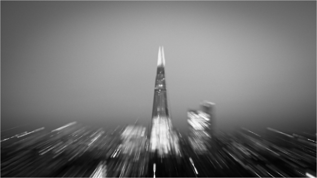
The Shard — Abstract London Architecture Fine Art Photography Print
Motion-led monochrome architecture can bridge geometric drawings and more gestural abstract work.
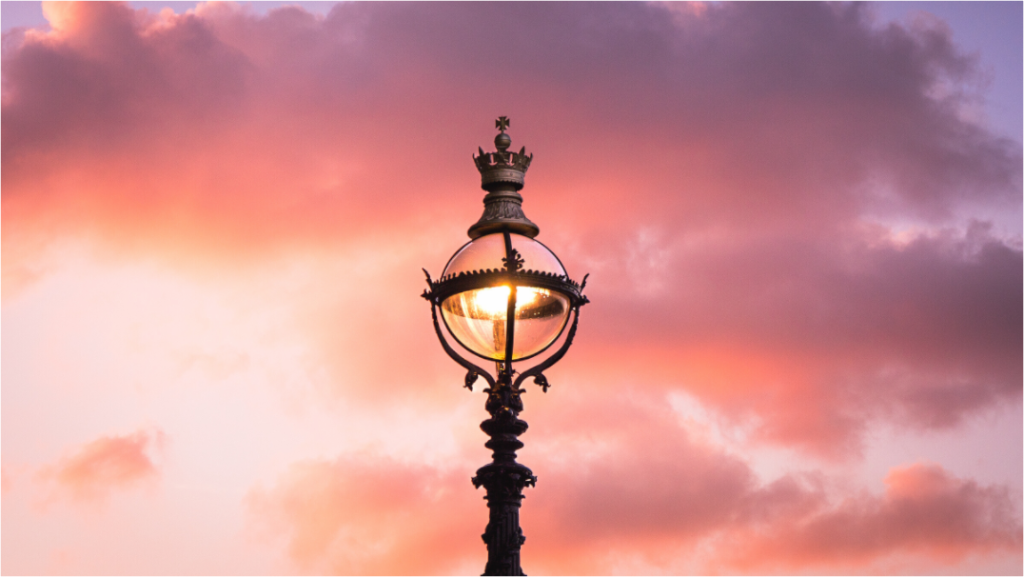
Crown Lamp at Sunset — London South Bank Photography Print
A smaller street detail with a strong silhouette can add a pause beside broader colour or illustration.
For a broader decision sequence, read the guide to choosing photography art for your home before measuring the final position.
Choose the photograph before filling the wall
Compare the image, room and scale slowly. The current collection is available to browse without urgency.