
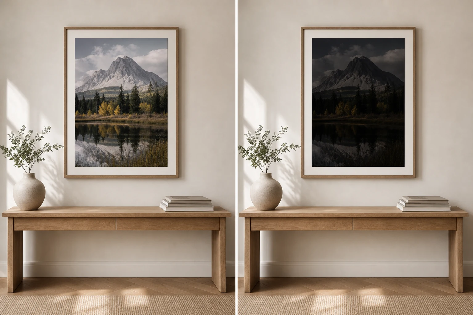
A print that looks too dark can be frustrating because the same image may have looked fine on screen. The key difference is simple: your screen emits light, but a print only reflects it.
Your screen is probably brighter than the paper
Most people edit or choose photos on a bright display. That display is doing some of the work for the image. It makes shadows feel more readable and colours feel more alive. When the file is printed, those shadows have to survive without a backlight.
Dark does not always mean moody
A moody print is deliberate. A too-dark print feels accidental. The difference is usually detail. In a good dark image, the viewer can still read shape, separation and atmosphere. In a bad dark print, the shadows merge into heavy blocks.
How to avoid it
Lower your screen brightness
Judge the image at a realistic brightness before ordering a print.
Check the shadows
If important details are already hard to see on screen, they may disappear on paper.
Think about the room
A print in a dim hallway needs a different tolerance than one near a bright window.
What this means for buying wall art
When choosing a photography print, look beyond whether the image is simply bright or dark. Ask whether the tonal balance will make sense in your room. A darker architectural print can be beautiful, but it still needs enough separation to breathe on the wall.
Explore prints with strong tone and atmosphere
A good print should feel considered before anyone notices the technical choices behind it.