
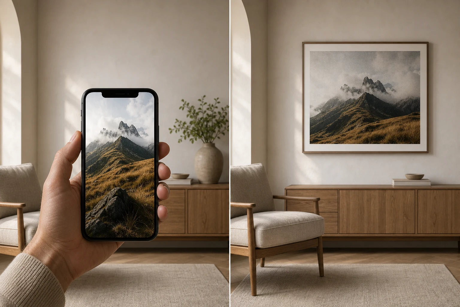
A photo can look perfect on a phone and disappointing as a print. That does not always mean the photo is bad. It usually means the screen was hiding problems that paper cannot hide.
Why the phone version feels better
A phone screen is small, bright and backlit. It adds its own light to the picture. Shadows feel more open, colours feel punchier, and detail can look cleaner because you are viewing the image at a small size.
When that same file becomes a print, the image has to stand on its own. Paper does not glow. It reflects the light in the room. Low light noise, heavy sharpening, compression and slightly missed focus become easier to notice.
The common reasons a print disappoints
The file is too small
A photo that is fine on a phone may not have enough clean detail for a larger print.
The screen was too bright
If you edit on a very bright display, the print can arrive looking darker than expected.
The image was over processed
Extra clarity, contrast and sharpening can look exciting on screen but harsh on paper.
How to check before printing
Look at the file at the size you want to print. Zoom in enough to see whether important details still hold together. Then lower your screen brightness and ask whether the shadows still have information in them.
For personal photos, this is especially useful with phone pictures taken indoors, at night or with heavy social media compression. For wall art, it is one reason a print should be prepared for paper rather than treated like a screen upload.
Choose photographs prepared to live on a wall
A good print should feel considered before anyone notices the technical choices behind it.