
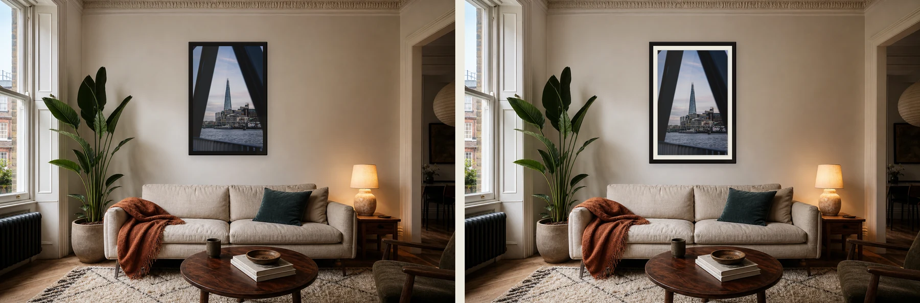
A white border is not just decoration. It changes the space between the photograph, the frame and the room.
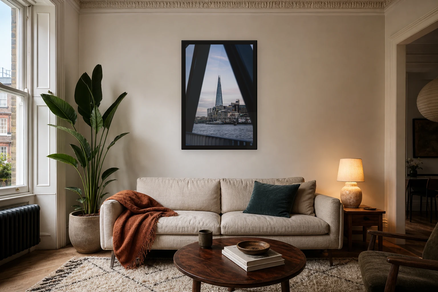
No border: more direct
An edge-to-edge print feels immediate. The image fills the frame and the viewer meets the photograph without a pause. This can work well for strong architecture, high contrast images and prints where the composition already has enough space inside it.
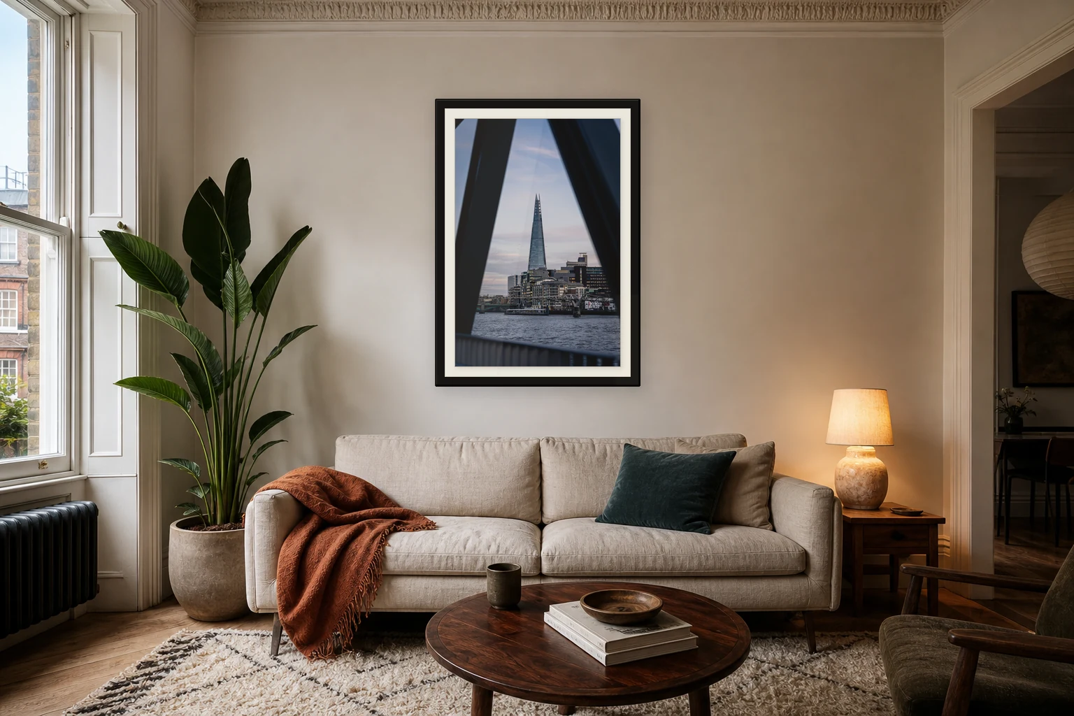
White mount: more breathing room
A mount gives the picture a quieter edge. It separates the photograph from the frame and can make the whole object feel more considered. The mount should usually be proportional. Too much white space can overpower the image.
Which is better?
There is no universal answer. A dark architectural print may look sharp and modern edge to edge. A softer landscape may benefit from a little space around it. The room matters too. Minimal rooms often suit a mount. Busier rooms may prefer a cleaner edge.
A practical rule
If the image already has strong negative space, you can often go edge to edge. If the image feels dense, dark or tightly composed, a small mount can help it breathe.
See the Shard print used in this example
A good print should feel considered before anyone notices the technical choices behind it.
Print mentioned in this article
A quick visual reference for the Othervariant print linked above.
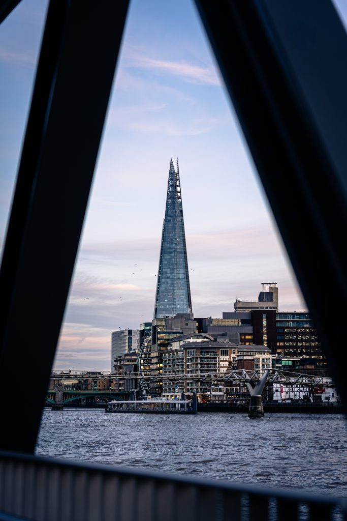
Shard Between Shadows
A minimal Shard architecture print, with London’s tallest building framed by dark structural shadows, pale evening sky and clean negative space.