
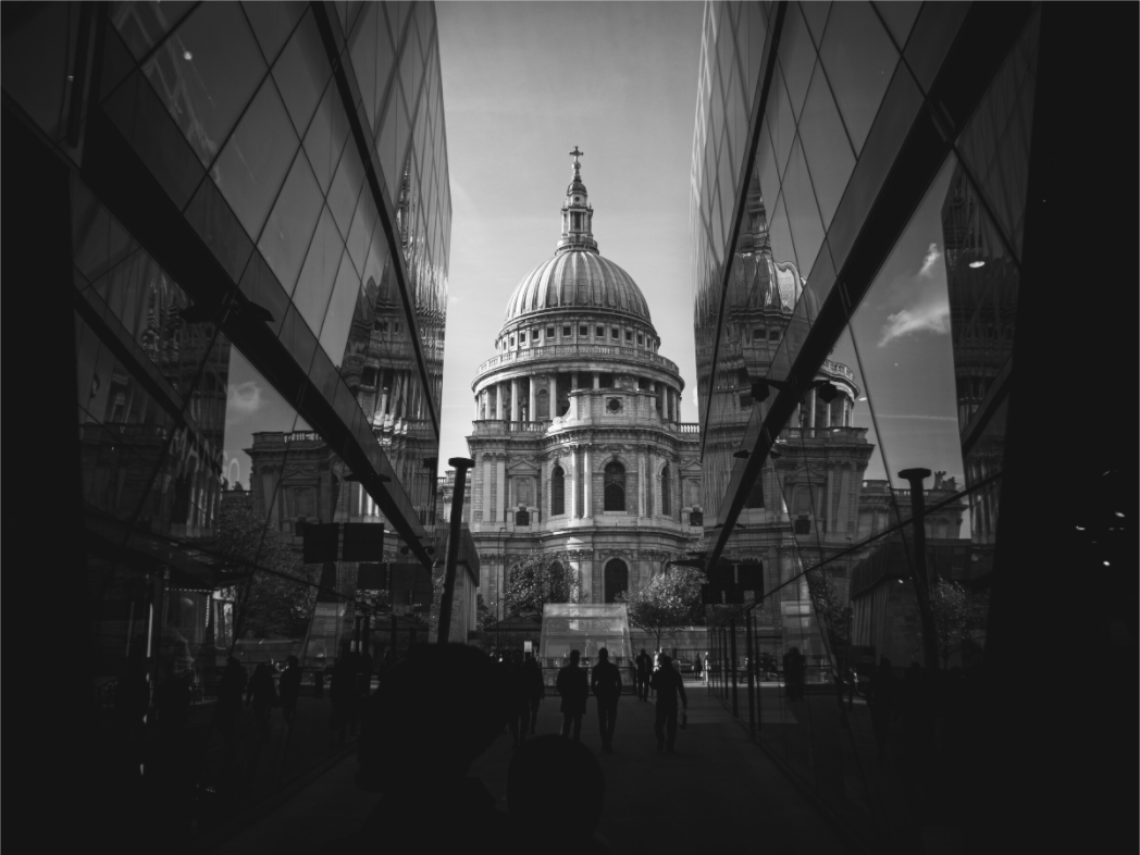
Composition in photography is the way the parts of a picture are arranged. It sounds technical, but it is the main reason some photographs feel calm, balanced and worth living with every day.
Most people notice the subject first.
A cathedral. A skyline. A coastline. A street at dusk.
That is normal. The subject gives the photograph its name. But composition is what makes the subject feel intentional. It decides where your eye goes first, where it rests, and whether the image feels noisy or settled.
That matters even more when a photograph becomes wall art. A print is not seen once, like a picture on a phone. It sits in the room. It becomes part of the background of daily life. Good composition helps it stay interesting without shouting for attention.
Composition is not just the rule of thirds
The rule of thirds is useful. It gives beginners a simple way to avoid placing everything dead centre. But composition is bigger than that.
It includes balance, symmetry, negative space, contrast, leading lines, scale, repetition and where the frame cuts off the world. Sometimes a centred image works perfectly. Sometimes a subject pushed to the edge feels stronger. Sometimes the quietest part of the frame is the reason the photograph works.
The point is not to follow a rule. The point is to make the photograph feel deliberate.
A weak composition usually makes the eye work too hard. A stronger one tends to feel simpler, even when the scene has not changed much.
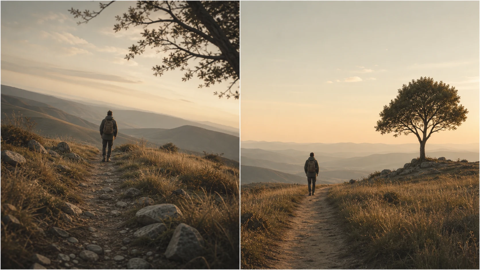
That is why composition is partly about placement, but also partly about subtraction: fewer distractions, cleaner edges, and a more obvious path for the eye.
The Tate’s glossary describes composition as the arrangement of elements within a work of art. That definition is simple, but it explains why the idea matters across painting, photography and interiors. Arrangement changes feeling.
Why composition changes how a print feels in a room
On a wall, composition becomes physical.
A photograph with strong vertical lines can make a room feel taller. A wide skyline can stretch a space horizontally. A calm area of sky or water can give the eye somewhere to rest. Dense detail can work in a hallway or study, but it may feel too busy above a sofa if the room is already visually full.
This is why two photographs of the same place can behave completely differently as prints. One might feel cinematic and dramatic. Another might feel quiet and architectural. The difference is often composition, not the location.
Symmetry feels calm
Balanced architecture, centred landmarks and repeated shapes often suit minimal interiors because the eye understands them quickly.
Negative space gives breathing room
Sky, sea, mist or shadow can stop a print from feeling crowded. This is useful in bedrooms, living rooms and narrow spaces.
Strong lines add direction
Bridges, streets, towers and horizons can pull the eye through the frame. They give the print movement without needing bright colour.
What to look for when choosing photography wall art
If you are choosing a print, do not only ask whether you like the subject. Ask how the image moves.
Where does your eye land first? Does it travel somewhere useful after that? Is there a quiet area, or is every part of the frame fighting for attention? Would the image still feel good from across the room?
For a calm interior, look for restraint. A clear shape. A controlled frame. Enough empty space around the subject. Black and white photography can be especially good for this because it strips the image down to light, shadow and structure. You can see the composition more clearly when colour is not doing all the work.
For a stronger room, you can go heavier. High contrast, sharp architecture, more geometry. A print like Symmetry & Stone works because the frame is ordered. The building carries weight, but the composition keeps it from becoming messy.
For a more abstract feel, look at shape before subject. The Shard in Motion is less about recognising a London landmark and more about movement, angle and atmosphere. That kind of composition can suit a modern room because it feels architectural without becoming a postcard.
A simple way to judge composition
Use this quick check before buying or printing a photograph.
| Question | What it tells you |
|---|---|
| Where does my eye go first? | Whether the photograph has a clear subject. |
| Is there somewhere for my eye to rest? | Whether the print will feel calm enough to live with. |
| Does the frame feel intentional? | Whether the photograph looks designed, not accidental. |
| Would it still work from across the room? | Whether the composition is strong enough for wall art. |
Composition is why simple photographs last
A good wall print does not need to explain itself every time you walk past it.
It needs a feeling you can return to. Quiet order. Weather. Distance. Shape. A familiar city made slightly unfamiliar. A landscape with enough space to breathe.
That is what composition does when it works. It removes the unnecessary parts and leaves the picture with a clear centre of gravity.
If you are choosing photography for your home, start there. Not with the loudest image. Not with the most famous place. Start with the frame that feels settled.
Browse quiet architectural and black and white photography prints from Othervariant.
Prints mentioned in this article
A quick visual reference for the Othervariant prints linked above.
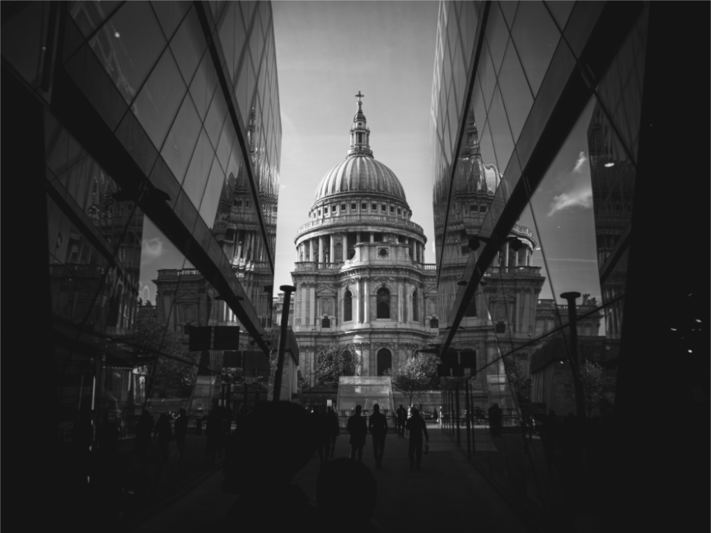
Symmetry & Stone
Othervariant black and white, london available in multiple sizes and configurations.
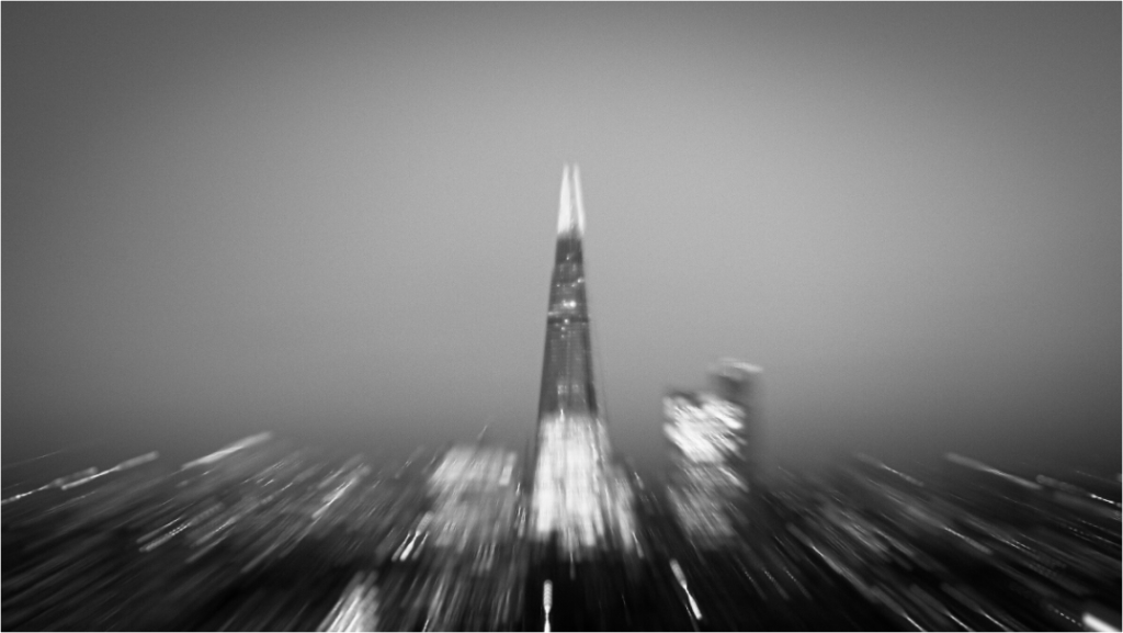
The Shard
Othervariant black and white, london available in multiple sizes and configurations.