
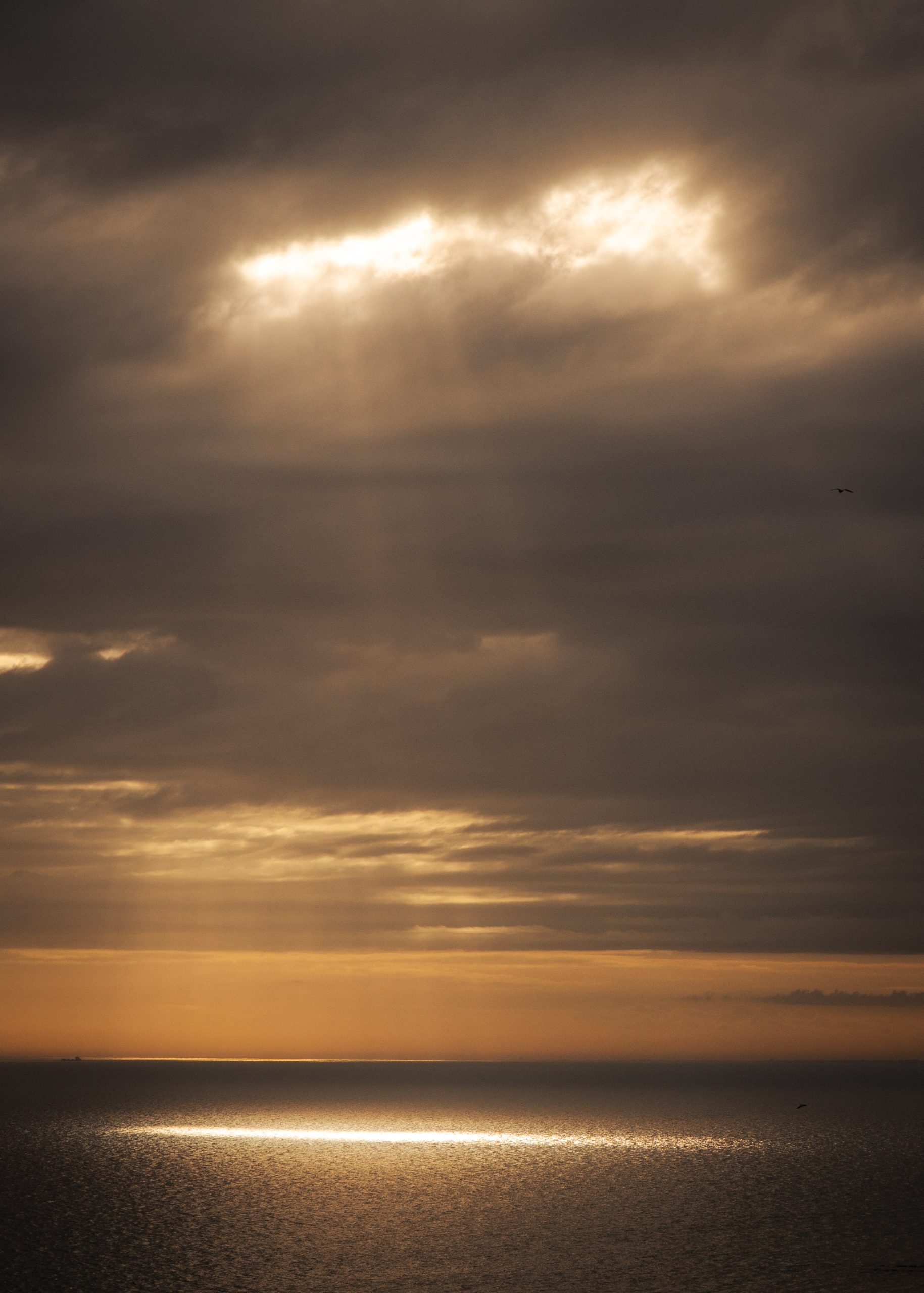
Searching for wall art prints UK can quickly become noisy. There are thousands of posters, canvases, downloadable files, framed prints and trend-led pieces that look fine on a screen but feel thin once they are on a wall. A calmer approach is to choose the room first, then the print.
The best wall art does not need to dominate a home. It should give a room a centre of gravity, add a little depth, and make the space feel more considered without shouting for attention. Photography is especially good at this because it carries a memory of real light. A landscape, a quiet piece of architecture, or a restrained black and white image can make a room feel lived-in rather than decorated.
Start with the feeling of the room
Before choosing a print, ask what the room already wants to be. A living room may need warmth and focus. A bedroom may need quiet. A hallway may need one strong image that gives the space a little confidence. This is more useful than beginning with colour matching, because a print can technically match the sofa and still feel wrong.
For a calm home, look for photography with enough space inside the frame. Sea, sky, mist, architectural rhythm, shadow, and negative space tend to sit well in real interiors. Highly saturated images can work, but they ask for more attention. If the room is already full of books, plants, objects, or patterned textiles, quieter photography usually lasts longer.
Choose scale before choosing detail
Small prints often look best in pairs, shelves, narrow walls, or intimate corners. Larger walls usually need a larger print, or a deliberate group of prints, otherwise the artwork can look like an afterthought. Above a sofa, bed, or sideboard, the print should normally feel connected to the furniture below it rather than floating alone in the middle of the wall.
As a simple rule, aim for art that is roughly two-thirds the width of the furniture below it. This does not have to be exact, but it stops the most common mistake: choosing a print that is too small because the image looked large on a product page.
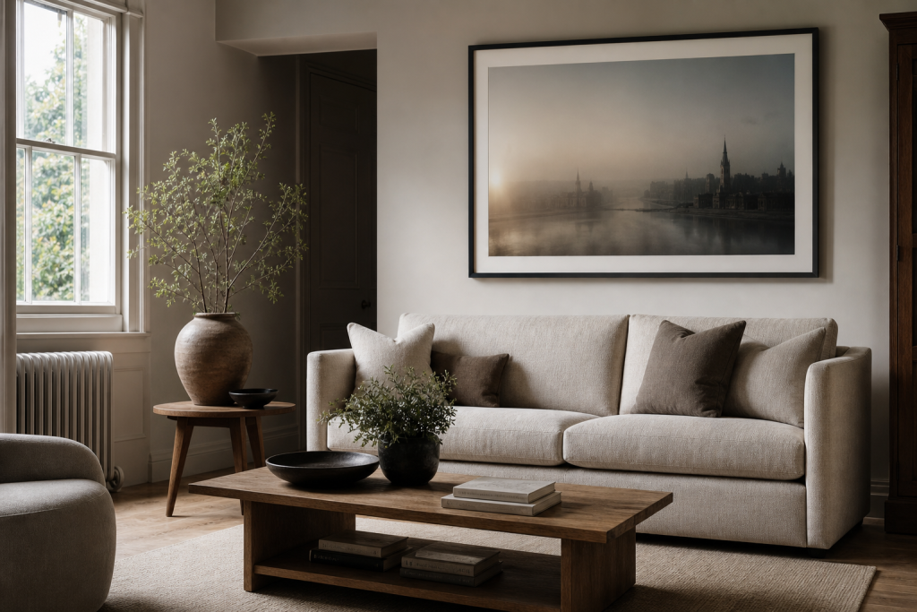
Use colour restraint, not colour fear
Calm does not mean beige. It means controlled relationships. A London dusk print can bring warmth to a neutral room. A black and white architectural print can add contrast to pale walls. A seascape can soften a room with hard edges. The important thing is not whether the image has colour, but whether the colour has somewhere to belong.
If the room has warm woods, linen, stone, cream, brown, or brass, look for prints with warmer shadows or soft golden light. If the room is charcoal, white, glass, steel, or concrete, black and white photography often feels natural. If the room is already colourful, a restrained print can give the eye somewhere to rest.
Think about framing as part of the image
A print is not only the photograph. It is the photograph, the paper, the border, the frame, and the space around it. A thin black frame can make architectural work feel sharper. A natural wood frame can make a landscape feel warmer. A wide white mount can give a smaller image more presence and make the whole piece feel more gallery-like.
This is why fine art photography often works better as a framed print than as a frameless poster. The border slows the image down. It gives the photograph room to breathe, which is exactly what a calm interior often needs.
Choose a subject you will not grow out of quickly
Trend-led wall art can be fun, but it dates quickly when the subject is too obvious. A phrase, a slogan, or a fashionable graphic can begin to feel like last year’s room. Photography is safer when it has atmosphere rather than novelty: weather over a coastline, a London street at dusk, a piece of architecture held in shadow, or a quiet view with enough ambiguity to keep returning to it.
That is the real advantage of choosing photography prints for a calm home. They do not need to explain themselves. They can simply sit in the room and change slightly with the light.
Use UK searches as a clue, not a command
Search results for wall art prints UK are full of broad marketplaces, which is useful information but not always good taste guidance. Marketplaces show what people buy quickly. They do not always show what still feels good after the room has settled. Use them to understand common options, then slow the decision down.
If you are buying for a real home rather than filling a blank wall in a hurry, avoid choosing only by trend labels. Coastal, botanical, abstract, London, monochrome and landscape can all work. The better question is whether the print gives the room a clearer mood. A good photograph should make the room feel more like itself.
Where photography works best
Photography is strongest in rooms where you want a connection to place, weather or memory. A seascape can make a room feel more open. A city print can add structure. A black and white photograph can bring contrast without adding another colour. A landscape can soften a room that has too many straight lines.
If you are unsure, choose the quieter option. Prints that whisper usually last longer than prints that perform.
If you are choosing wall art prints in the UK for a quieter room, start with images that feel spacious, restrained and easy to live with.