
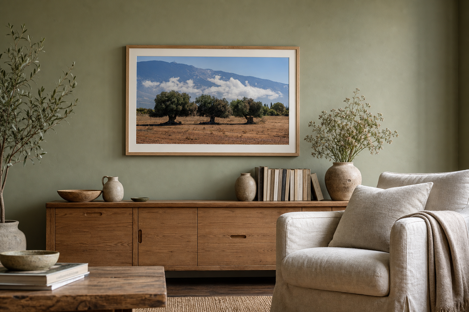
Green walls already bring colour and atmosphere into a room. The wall art does not need to compete. It needs to give the green either more depth or a clean point of contrast.
That sounds simple, but sage, olive and deep forest green behave differently. A pale green wall can carry a quiet landscape. A darker one may need more light, structure or space around the image.
Start with the kind of green on the wall
Do not treat green as one colour. Sage can feel light and chalky. Olive is warmer and earthier. Emerald and forest green carry more visual weight. The same photograph will feel different against each one.
Sage green
Look for soft skies, pale water, weathered stone and restrained nature photography.
Olive green
Warm landscapes, mist, cream highlights and muted earth tones usually sit comfortably here.
Dark green
Use a clear highlight, strong geometry or a pale mount so the print does not disappear.
Decide whether the print should blend or break
There are two useful directions. The first is harmony. A landscape with olive trees, mist or soft hills can continue the natural feeling of a green room. The second is contrast. Black-and-white photography can give the eye a pause from the colour and make the room feel more structured.
Neither approach is automatically better. Ask what the room lacks. If it already feels soft and layered, a precise architectural photograph may hold it together. If the furniture is clean and minimal, a quieter landscape may stop the space feeling too controlled.
Wall art for sage green walls can stay light
Sage green is usually gentle enough to work like a neutral. It does not need an exact colour match. Prints with open sky, pale sea, limestone, fog or muted foliage can sit naturally without turning the room into a green theme.
Keep some separation between the paint and the image. A warm white mount or a light oak frame creates a small visual pause. That pause matters when the photograph contains similar green tones.
Dark green walls need light inside the image
Deep green paint can make a room feel calm and enclosed. Very dark or low-contrast photography may sink into it, especially in the evening. Look for a photograph with one clear source of light: a pale sky, bright water, a lit building or a strong white shape.
Black-and-white architecture is useful here because it introduces structure without adding another competing colour. A print such as Symmetry & Stone has a clear centre and enough pale stone to remain readable against a deep wall.
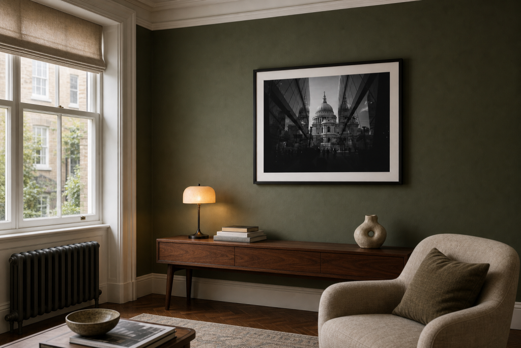
The contrast comes from tone, not decoration. The pale stone and warm-white mount keep the photograph legible, while the black frame gives the arrangement a clear edge against the green.
Do not match every shade of green
The most common mistake is making every choice too literal. Green walls, green cushions, botanical art and green accessories can flatten into one idea. Photography works better when it adds something the paint cannot: distance, weather, human structure or changing light.
A nature print can still work beautifully. Just choose one with tonal variation. Three Olive Trees includes green, but the pale mist, mountain layers and open ground stop it becoming a simple colour match.
If the rest of the room is already quiet, the guide to neutral wall art for living rooms offers a useful second check: restrained does not have to mean bland.
Use the frame to control the contrast
The frame changes how directly the photograph meets the wall. Light oak softens both sage and olive green. A slim black frame gives dark green a sharper edge. White can feel fresh, but a warmer off-white often sits more comfortably with earthy paint and natural materials.
| Wall colour | Photography direction | Frame or mount |
|---|---|---|
| Pale sage | Soft coast, open sky or muted landscape | Light oak or warm white |
| Warm olive | Stone, mist, dusk light or natural detail | Oak, walnut or cream mount |
| Forest green | Black-and-white architecture or a bright horizon | Slim black frame with a pale mount |
Check the print in the room’s real light
Green paint can shift through the day. Sage may look grey in cool morning light and warmer beside a lamp. Deep green can become almost black after sunset. View the wall when you use the room most, not only at midday.
Print size matters too. A small, dark image on a large green wall can feel lost. If the photograph is restrained, give it enough scale or a wider mount. Presence can come from proportion rather than louder colour.
Two print directions for green walls
These two photographs show the main choice clearly: continue the natural palette, or use monochrome structure as contrast.
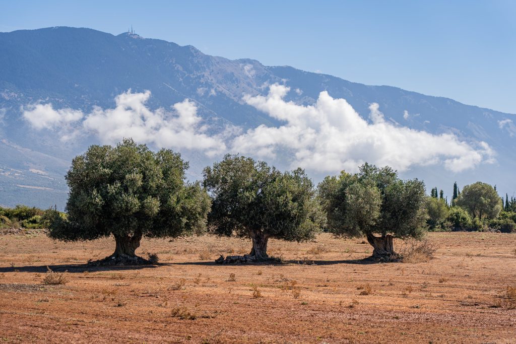
Three Olive Trees
A soft, layered landscape for sage or olive rooms that need depth without another hard edge.
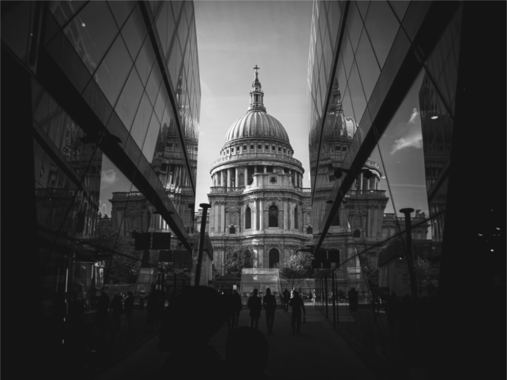
Symmetry & Stone
A structured black-and-white photograph that gives a dark green wall a calm, clear centre.
Explore nature photography prints
Browse landscape and coastal photographs with soft light, open space and enough structure to sit comfortably beside colour.