
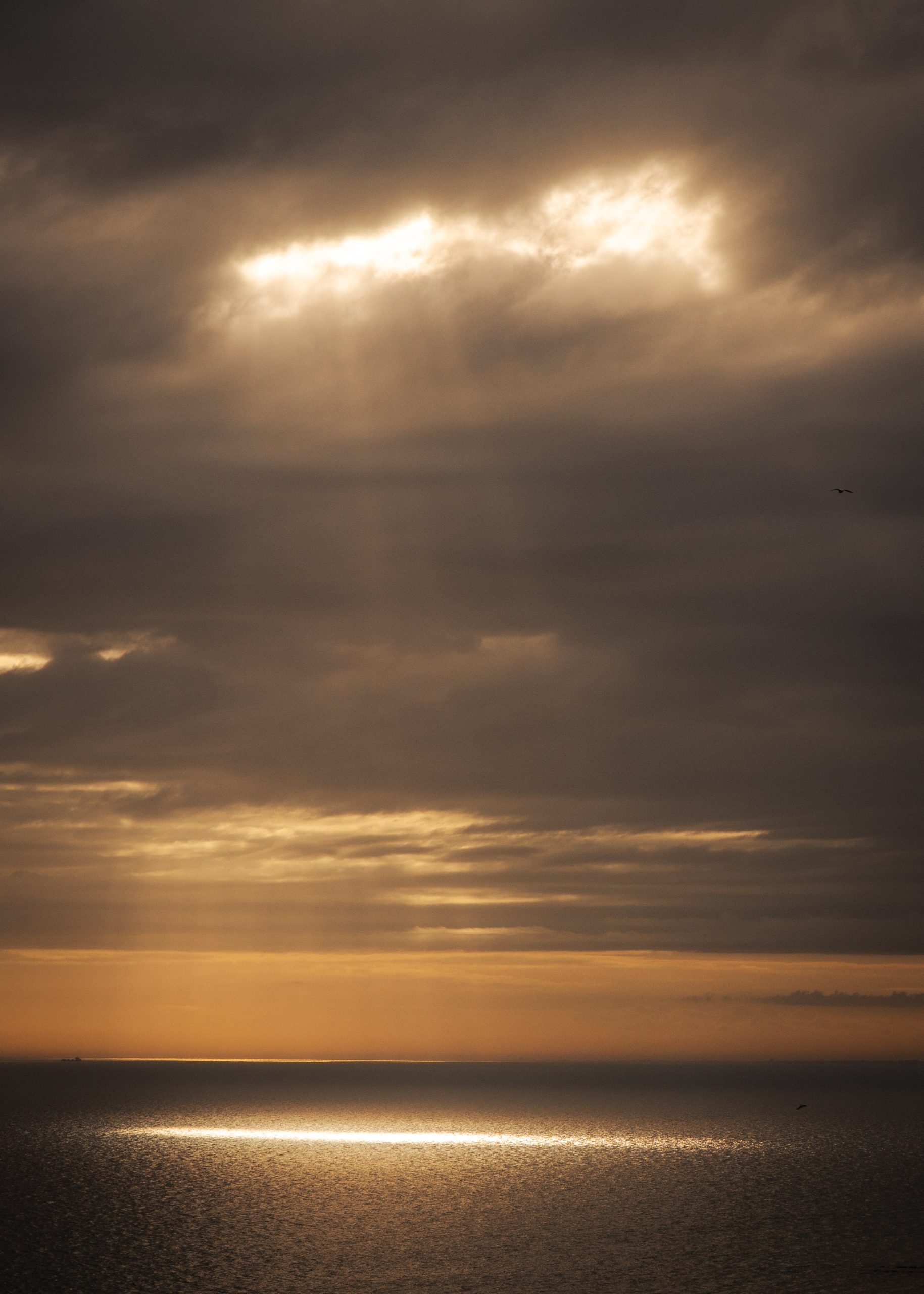
An awkward wall is usually a wall with competing boundaries: a slope, door, radiator, window or shallow alcove. The answer is not to force a standard arrangement into it, but to identify the clean usable shape that remains.
Find the usable shape
Draw the wall and mark every fixed boundary: ceiling slope, skirting, switch, radiator, door swing, shelf and furniture edge. The area left between them is the real canvas. It may be a tall narrow rectangle, a low horizontal strip or a small square.
Measure that shape and centre the artwork within it rather than within the full wall. This prevents a frame from appearing strangely offset when the architecture is doing the offsetting. It also reveals when no framed work should be used.
Protect movement and heat zones
A print should not sit where a door handle strikes it, where people brush past it or directly above a strong heat source. Radiators create rising heat and can make a low hanging position unsuitable. Sloping walls beside stairs or loft beds may be within shoulder reach.
Use paper templates and walk the route several times. Open doors, pull out chairs and carry a bag through the space. Practical clearance matters more than perfect symmetry because an awkward wall is often awkward precisely because the room is moving around it.
Use orientation to cooperate
A vertical photograph can make an alcove feel intentional without demanding width. A horizontal image can sit below a slope if the outer frame follows the low usable band.
Avoid cropping a photograph merely to imitate the wall shape when the crop damages its composition. Choose an image already made for that orientation. Generous negative space can help a small frame feel less cramped, while a dense city scene may need more physical room around it.
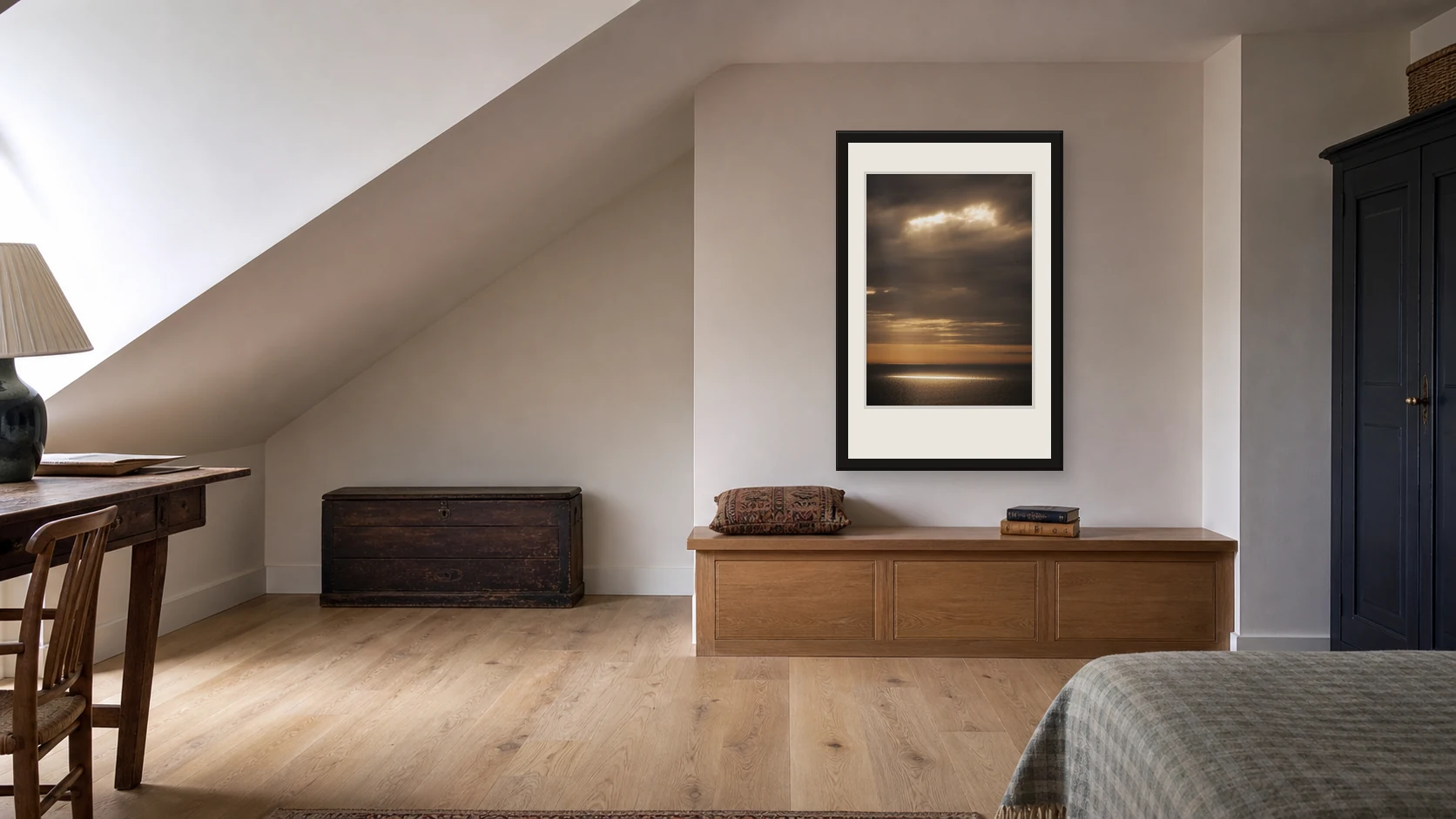
The vertical photograph follows the usable wall rather than the roof angle. Keeping the triangular slope clear protects the composition and makes the alcove easier to read.
Keep the arrangement simple
Complex architecture already supplies angles and interruptions. One photograph is often stronger than a miniature gallery wall in an alcove. If several small works are necessary, align them to one clean edge rather than following every slope.
A picture ledge may work where drilling positions are limited, provided the ledge and wall can safely carry the load. Do not use decorative clutter to disguise a difficult boundary. Let the shape remain visible and use the art to give it one clear point of rest.
Check light from unusual angles
Alcoves can be dim, while sloping spaces near roof windows can receive intense light and glare. View the proposed position through the day.
A photograph with very deep shadow may disappear in a recess; a glossy surface may reflect a roof light. Choose a print whose tonal range survives the available light and use framing appropriate to the actual product and room. Keep photography away from persistent damp or condensation, especially in poorly ventilated corners.
Accept when the wall should stay empty
Not every narrow return needs art. If the usable area is too close to heat, movement or a door, move the photograph to a nearby wall where it can be seen properly.
An empty awkward space can act as breathing room between stronger elements. The goal is not to prove that every surface can be decorated. It is to give the chosen photograph a safe, convincing place.
Make a full-size safety mock-up
Tape a paper rectangle at the proposed outer frame size and leave it in place through a normal day. Open every nearby door, use the stairs, sit in the chair and notice where bags, shoulders or cleaning tools pass. Check the rectangle from low and high viewpoints because sloping spaces can distort apparent centring.
If the paper is touched or feels visually trapped, reduce the size or move the work. This simple rehearsal is especially important in compact homes, where a few centimetres determine whether art feels intentional or obstructive. Only mark fixing points after the route and light have both been tested.
Two real print directions
These two current Othervariant photographs show how the decision can lead to different subjects without losing clarity. Use the product pages to compare the full image, available presentation and the shape of the work.
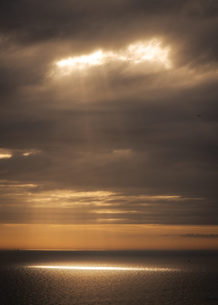
Light Break — Seven Sisters Seascape Photography Print
A vertical coastal composition and open air can bring light into a narrow alcove without dense detail.
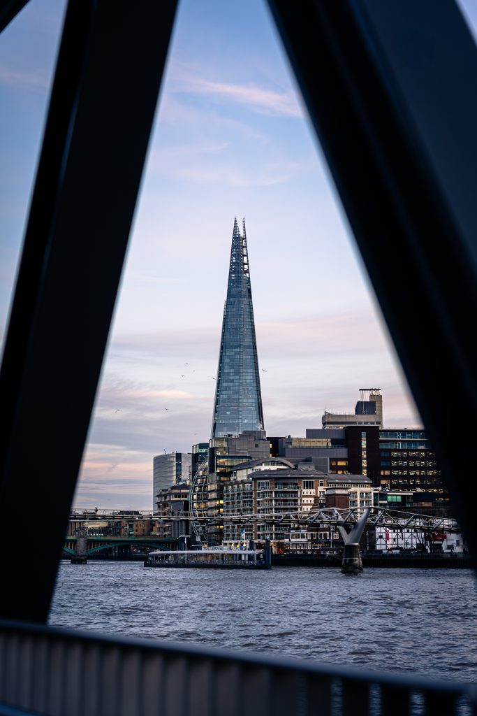
Shard Between Shadows — London Architecture Photography Print
A tall architectural subject uses a narrow return wall with stronger contrast and structure.
For a broader decision sequence, read the guide to choosing photography art for your home before measuring the final position.
Choose the photograph before filling the wall
Compare the image, room and scale slowly. The current collection is available to browse without urgency.