
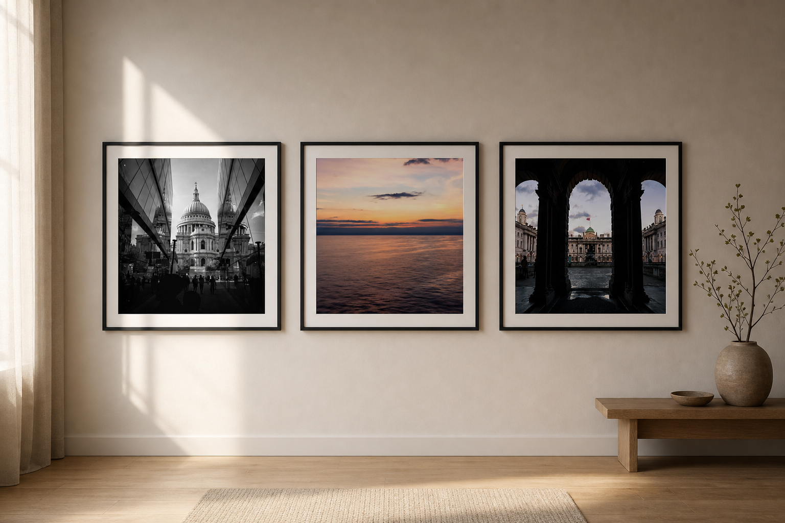
A photography gallery wall can look calm, but only if it has rules. Without a clear rhythm, multiple prints quickly become visual noise. The aim is not to fill the wall. It is to make the prints speak to each other.
The best gallery walls usually feel edited. Fewer pieces, stronger spacing and a shared mood often work better than trying to show every favourite image at once.
Simple rule: keep one thing consistent. That might be frame colour, mount size, subject type, or spacing. If everything changes at once, the wall starts to feel busy.
Start with an anchor print
Choose the strongest image first. This is the print that gives the wall its structure. It might be the darkest piece, the largest piece, or the image with the clearest subject.
A structured black-and-white print such as Symmetry & Stone can act as an anchor because the architecture gives the wall a clear centre of gravity.
Use contrast, but not chaos
A good gallery wall does not need every print to match. In fact, a little contrast makes the arrangement more human. A black-and-white city image can sit beside a soft horizon if the frames, spacing or scale connect them.
The mistake is mixing too many differences: different frame colours, different sizes, different subjects, different mounts and different moods all at once.
| Gallery wall choice | Best approach | Why |
|---|---|---|
| Three prints | Same frame size and consistent spacing | Simple rhythm keeps the wall calm. |
| Mixed subjects | Keep the palette quiet | The images can vary without clashing. |
| Mixed sizes | Use one clear anchor print | The wall needs a visual centre. |
Let one print breathe
If every print is equally strong, the wall can feel restless. Include one quieter image that gives the eye a pause. A soft horizon such as Crossing at Dawn can do that job well.
Architecture can then bring the structure back. A print such as London Arches at Dusk adds depth and shadow without needing bright colour.
Measure the gaps
Gallery walls often fail because the spacing is almost consistent but not quite. That small uncertainty makes the wall feel accidental. Choose a gap and repeat it. The more consistent the spacing, the calmer the wall feels.
Final thought
A calm photography gallery wall is not about having more prints. It is about editing. Choose an anchor, repeat one visual rule, and let the wall have enough silence between the images.
Choose a layout before choosing every image
The layout should come before the final print list. A straight row feels calm and architectural. A grid feels more formal. A looser salon-style arrangement can feel personal, but it needs more discipline to avoid clutter.
For photography, a row of two or three frames is often the safest gallery-wall format. It lets the images relate without making the wall feel decorative for the sake of it.
Use repeated frames to calm mixed photographs
If you want to mix London architecture, seascapes and landscapes, keep the frames consistent. The repeated frame tells the eye that the wall is one collection, not three unrelated decisions.
Black frames feel crisp and gallery-like. Oak frames feel warmer and more domestic. Either can work, but mixing both in a small arrangement makes the wall harder to control.
Leave enough wall between the images
Breathing room matters. If the prints are too close, the arrangement feels cramped. If they are too far apart, they stop feeling connected. Consistent spacing makes even different subjects feel deliberate.
Before hanging anything, lay the frames on the floor and photograph the arrangement. If it already feels busy there, it will feel busier on the wall.
Keep the story loose
A gallery wall does not need a literal theme, but it should have a feeling. London architecture, quiet water and soft evening light can sit together if the overall mood is calm. What matters is that the collection feels edited rather than random.
Think of the wall as a small conversation between photographs. Each image should add something different without changing the tone completely.
If the collection still feels too busy, remove the loudest print first. Editing is usually what makes the wall feel more expensive.
Prints mentioned in this article
A quick visual reference for the Othervariant prints linked above.
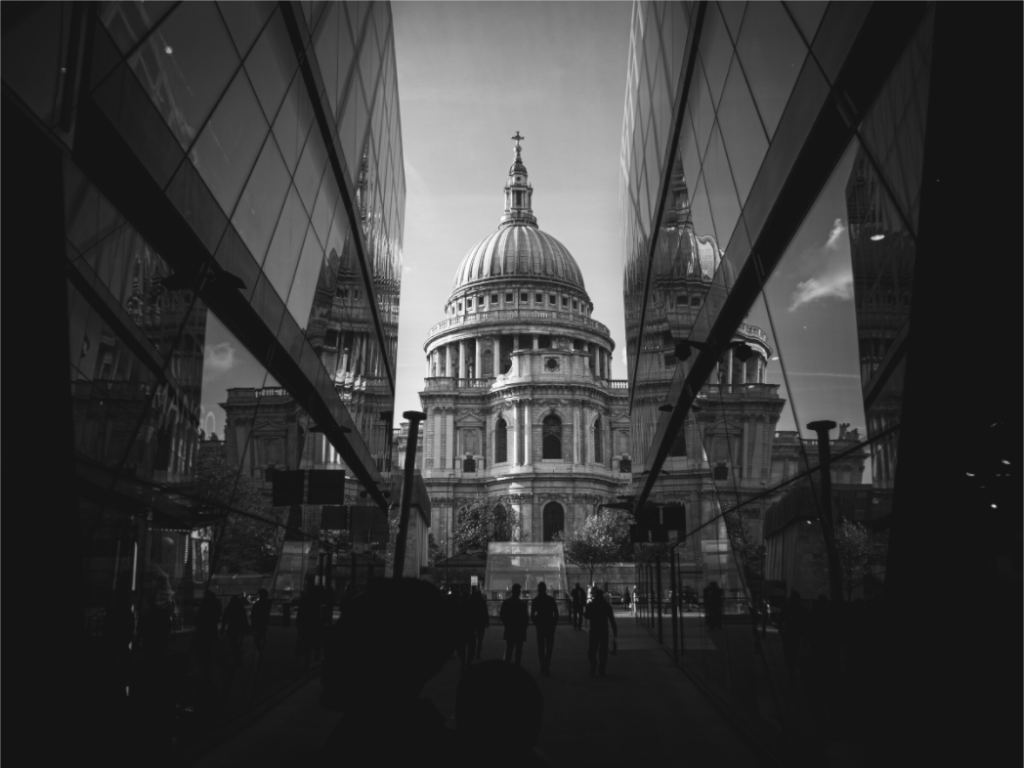
Symmetry & Stone
A structured black-and-white architecture print that gives a gallery wall a strong anchor.
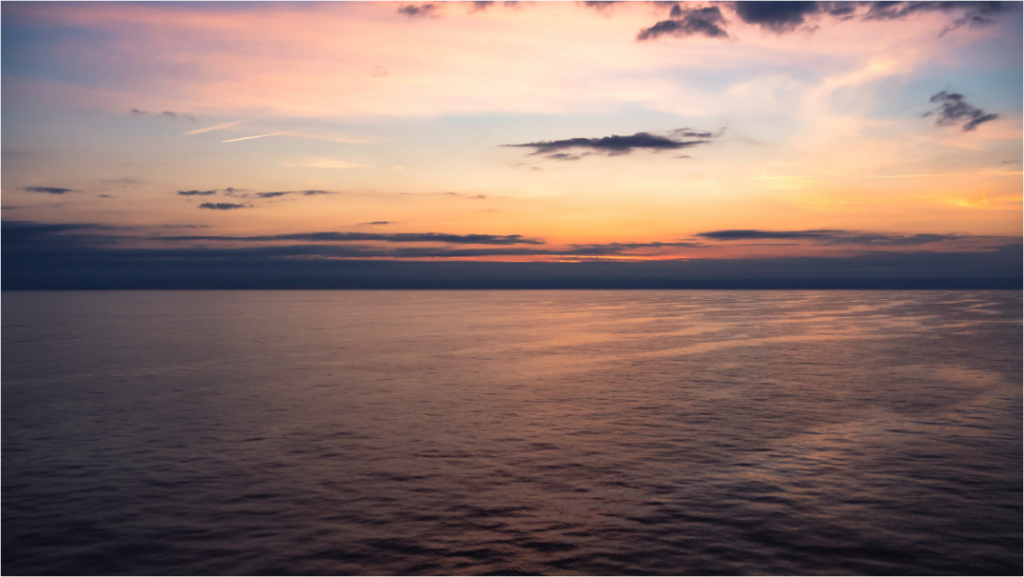
Crossing at Dawn
A quiet horizon print that adds space and calm without making a bedroom wall feel busy.
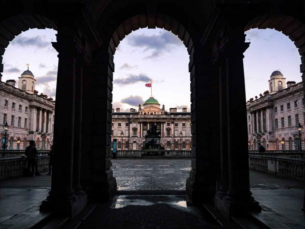
London Arches at Dusk
An architecture print with depth and shadow, useful when a wall needs structure rather than decoration.
Explore photography prints for calm interiors
Browse quiet London, landscape and nature photography prints for rooms that need structure, space and atmosphere.