
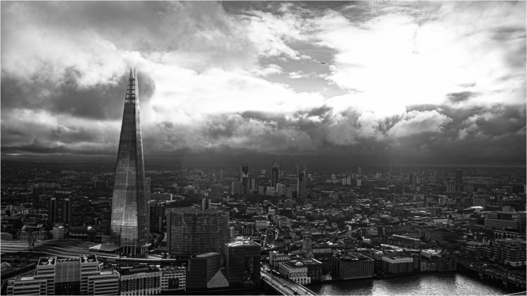
Neutral wall art for living room searches often lead to beige posters, abstract shapes and safe pieces that match everything but add very little. A neutral room does not need neutral art in the flat sense. It needs art that adds depth without breaking the quiet.
This is where photography can work beautifully. A photograph can stay within a restrained palette while still bringing weather, architecture, distance, shadow and real atmosphere into the room. It can make a neutral living room feel calmer, but also more personal.
Neutral does not mean empty
The biggest mistake with neutral interiors is removing all contrast. Cream walls, pale sofas, linen curtains, oak furniture and soft rugs can feel beautiful, but without one or two darker notes the room can become too polite. Wall art is a good place to add that weight.
A black and white photograph, a muted city scene, or a landscape with deeper shadows can give the room structure. It does not need bright colour. It needs enough tonal range to stop the wall from disappearing.
Use photography as a quiet focal point
A living room usually needs one place for the eye to rest. This might be a fireplace, a window, a shelf, or a large artwork. If the room already has strong architecture, choose a quieter print. If the room is plain, choose a photograph with a little more presence.
Architecture photography works well in neutral rooms because it brings line and rhythm. Landscape photography works when the room needs softness. Black and white photography works when the room needs definition but not more colour.
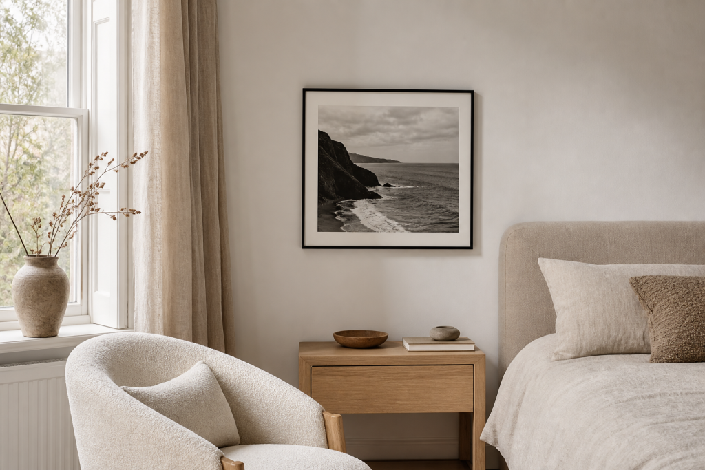
Choose warm neutrals or cool neutrals deliberately
Neutral rooms are not all the same. Some lean warm, with cream, taupe, oak, terracotta, brass and soft brown. Others lean cool, with white, grey, black, steel, glass and stone. The print should understand that temperature.
For warm neutral rooms, look for photographs with soft dusk light, natural landscapes, weathered stone, or gentle highlights. For cooler neutral rooms, black and white architecture, London skyline prints, and sharper compositions often feel more at home.
Avoid art that only matches the cushions
Matching art to cushions, throws or rugs can make a room feel staged. It is better to choose a print that relates to the whole atmosphere of the room. A photograph of water, mist, stone, or city light can sit with many colours because it feels natural rather than manufactured.
This is one reason restrained photography tends to last longer than trend-led prints. It does not depend on one seasonal palette. It can survive a change of sofa, rug, or wall colour because the subject is not just a colour block.
Think about the frame as the final neutral
For a neutral living room, the frame can be as important as the image. A black frame adds definition. A natural wood frame adds warmth. A white or pale frame can disappear into the wall and make the image feel softer. If the photograph is already quiet, a slightly stronger frame can help it hold the wall.
The aim is not to make the art invisible. The aim is to make it belong.
Let one piece do more work
Neutral rooms often become cluttered when people try to solve the problem with many small decorative pieces. A larger, calmer photograph can do more work than five small prints because it gives the eye one clear place to land. This is especially true above a sofa, console, or low cabinet.
If you choose one larger print, give it enough breathing space. Do not crowd it with too many objects around the frame. A neutral room looks stronger when the art feels intentional rather than arranged by accident.
Use black and white carefully
Black and white photography is not automatically cold. In a neutral living room, it can be the thing that makes cream, oak and linen feel richer. The key is choosing an image with soft mid-tones, not only hard black and white contrast. Architecture, skyline, stone, sea and shadow all work well when the print has enough grey between the extremes.
For a room that already feels warm, a black frame can add definition. For a room that feels too sharp, a lighter mount or wood frame can soften the result.
It should feel like a considered pause in the room, not another beige object added to the wall.
The strongest choice is usually simple, but not empty.
If your living room is calm but needs more depth, choose photography with restraint, shadow and a little structure.
Print mentioned in this article
A quick visual reference for the Othervariant print linked above.
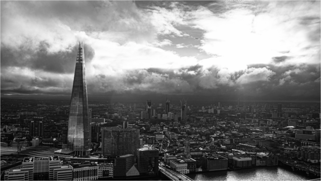
The Shard from Sky Garden
Othervariant london available in multiple sizes and configurations.