
A pair of photography prints can look more considered than one large image. It can also become busy very quickly. The difference is not the number of prints. It is how clearly they belong together.
<strong>Short answer:</strong> To pair two photography prints, give them one shared visual thread, let one image lead, and use calm spacing. A pair should feel like a conversation, not a competition.
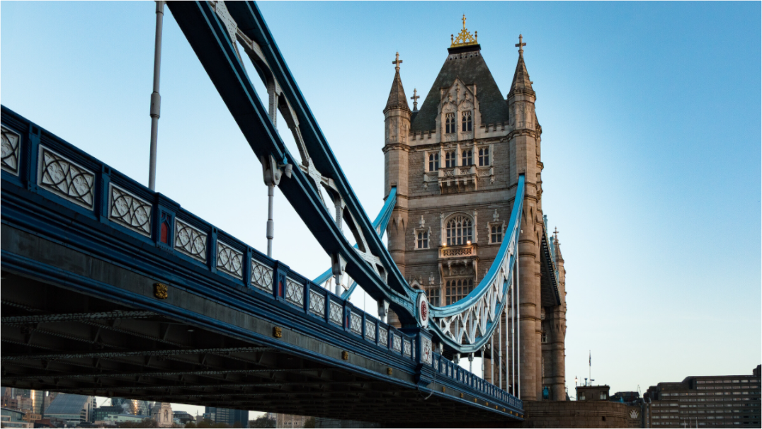
Pair by mood first
The easiest mistake is pairing by subject only: two London prints, two landscapes, two black and white images. Subject helps, but mood matters more.
Ask whether the images feel like they belong in the same room emotionally. Quiet with quiet. Graphic with graphic. Soft with soft.
Keep one thing consistent
A good pair usually shares at least one strong connection: colour temperature, contrast, location, season, frame style, or amount of negative space.
Do not make every element identical. That can feel flat. One shared thread is enough.
Avoid two competing centrepieces
If both prints shout, neither gets space. A strong architectural print can pair well with a calmer detail. A dramatic landscape can pair well with a quieter horizon.
Think of one image as the lead and the other as the echo.
Use spacing as part of the design
Two prints hung too close together can feel like one confused image. Too far apart, and they stop feeling connected.
A good starting point is a modest gap that is smaller than the outer margins around the pair. The pair should read as one arrangement.
Match frame language
Frames do not need to be identical, but they should not argue. Slim black with slim black is safe. Oak with oak is warm. Black with walnut can work if the photographs share tone.
Avoid mixing heavy ornate frames with minimal photography unless the contrast is intentional.
A quieter way to choose
To pair two photography prints, give them one shared visual thread, let one image lead, and use calm spacing. A pair should feel like a conversation, not a competition.
If you want a calm starting point, browse the Othervariant photography print collection and choose the image by mood first. The size, frame, and placement should support that feeling, not replace it.