
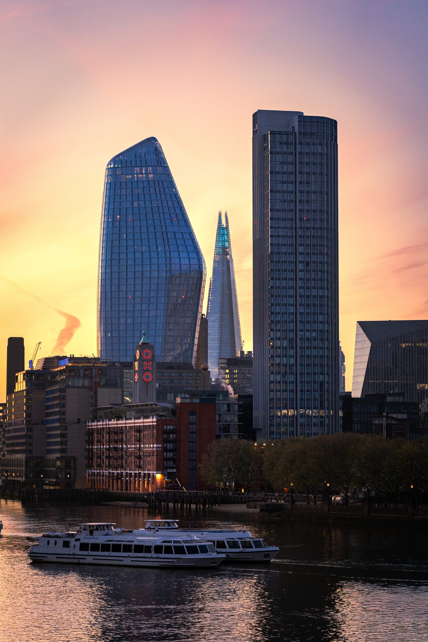
How to light wall art well is mostly a question of restraint. The photograph should become easier to see, not look as though it is standing under a shop spotlight.
A framed photograph changes through the day. Morning light may reveal detail that disappears by evening. A ceiling light may brighten the room but leave the print flat. A narrow spotlight can do the opposite and create a hard pool of light with glare across the glass.
The useful goal is not to make the artwork the brightest object in the room. It is to give the image enough light to keep its contrast, colour and quieter details.
Start with the photograph and the room
Some prints need more help than others. A pale seascape already carries light. A darker city photograph may rely on small highlights, shadow detail and reflections. Both can work in the same room, but they may not want the same lamp position.
Look at the print from the place where you normally sit or enter. Then check it again after sunset. If the image reads clearly without a dedicated light, leave it alone. If the frame becomes a dark rectangle, add a small amount of focused light rather than increasing every lamp in the room.
Choose an LED that shows colour honestly
LED is the practical choice for most homes, but the label matters. Look for a colour rendering index, usually written as CRI or Ra, of at least 90. This gives colour and subtle tonal changes a better chance of looking natural. Cheap light can make warm stone look grey or turn a dusk sky strangely flat.
Colour temperature is more about the room than a universal rule. Around 3000 K is a calm all-purpose starting point. Warmer light can suit timber and evening rooms. Cooler light may feel cleaner beside white walls, but it can also make a relaxed interior feel clinical. Keep the lights in one room at the same colour temperature so the print does not sit inside a different colour cast.
The Canadian Conservation Institute’s detailed guide to LED lighting in museums and art galleries recommends CRI 90 or above for good-quality light and notes that 3000 K is a useful general choice. A home is not a museum, but the same principles are sensible.
Colour and tone
Choose CRI or Ra 90+ for natural colour. Try 3000 K as a calm starting point, then judge it beside the other lights in the room.
Beam and brightness
Cover the frame without making a sharp halo. Use the lowest comfortable level that keeps the print readable.
Angle the light to reduce frame glare
Glare is usually a geometry problem. If the lamp, glass and your eyes line up, the frame behaves like a mirror. Moving the light slightly forward, higher or to one side can shift that reflection away from the main viewing position.
A picture light mounted above the frame creates a traditional, contained look. An adjustable ceiling spotlight feels quieter because the fitting sits away from the artwork. Either can work. The important part is to test the reflection from the sofa, doorway and dining table before fixing the final angle.
Picture light
Useful when you want the frame and light to read as one object. Choose a fitting wide enough to spread light across the photograph rather than burning a bright patch into the centre.
Ceiling spotlight
Cleaner for a minimal wall. Use an adjustable beam and aim it across the print, then check the glass from normal viewing positions.
Ambient lamp
Often enough for a quiet print near a sideboard or reading chair. Soft room light can feel more natural than dedicated art lighting.
Direct sunlight is different from a picture light
Daylight can make a photograph look beautiful for an hour, but strong direct sun is not a good long-term lighting plan. Light exposure builds over time, and vulnerable colours can fade. Heat and daily temperature changes near a window add another reason to choose the wall carefully.
You do not need to hide a print in a dark corridor. Place it out of the direct beam, use blinds when the sun is strongest, and avoid leaving a dedicated light on when nobody is using the room. Good lighting is enough light for the moment, not constant illumination.
Let darker prints keep their atmosphere
A dusk photograph should not be lit until every shadow disappears. Its darker areas are part of the image. Add just enough light to reveal the structure and highlights.
City Glow at Dusk is a useful example. The warm windows and skyline should stay visible, while the darker sky keeps the scene settled. A monochrome architecture print such as Symmetry & Stone depends more on texture and tonal separation. Accurate, even light matters more than raw brightness.
If the whole room has limited natural light, the guide to choosing wall art for dark rooms looks at the print itself: contrast, mounts, framing and subject choice.
A quiet final check
Switch on the room as you normally use it. Stand at the doorway. Sit down. Look for glare, a hard halo around the frame, or a colour cast that changes the photograph. Then dim or move the light before buying a stronger lamp.
The best art light is the one you stop noticing once you start looking at the photograph.
Two prints with different lighting needs
The right light depends on the photograph. A dusk skyline needs enough illumination to reveal warm highlights without flattening the dark sky. A black-and-white architecture print needs even light that keeps stone texture and tonal separation visible.
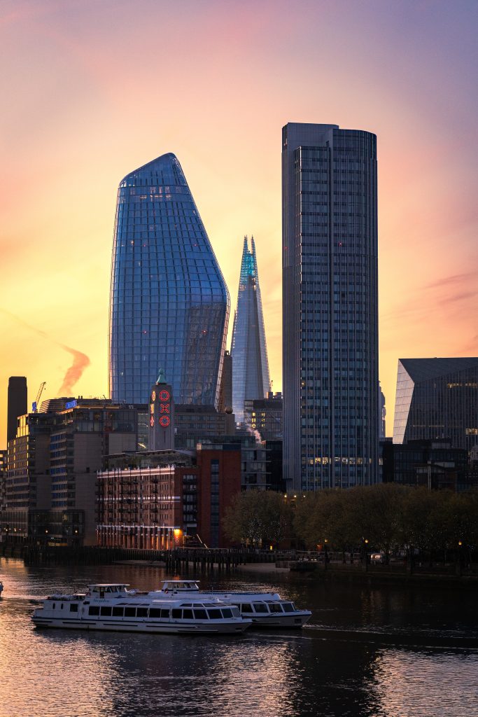
City Glow at Dusk
Warm windows and a dark evening sky. Gentle picture lighting should reveal the skyline while preserving its dusk atmosphere.
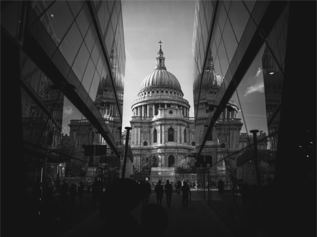
Symmetry & Stone
A monochrome architectural study that benefits from even, neutral light so the stone texture and tonal structure remain clear.
Find a print that works with the light you already have
Explore London photography with clear structure, evening colour and quieter black-and-white tones.