
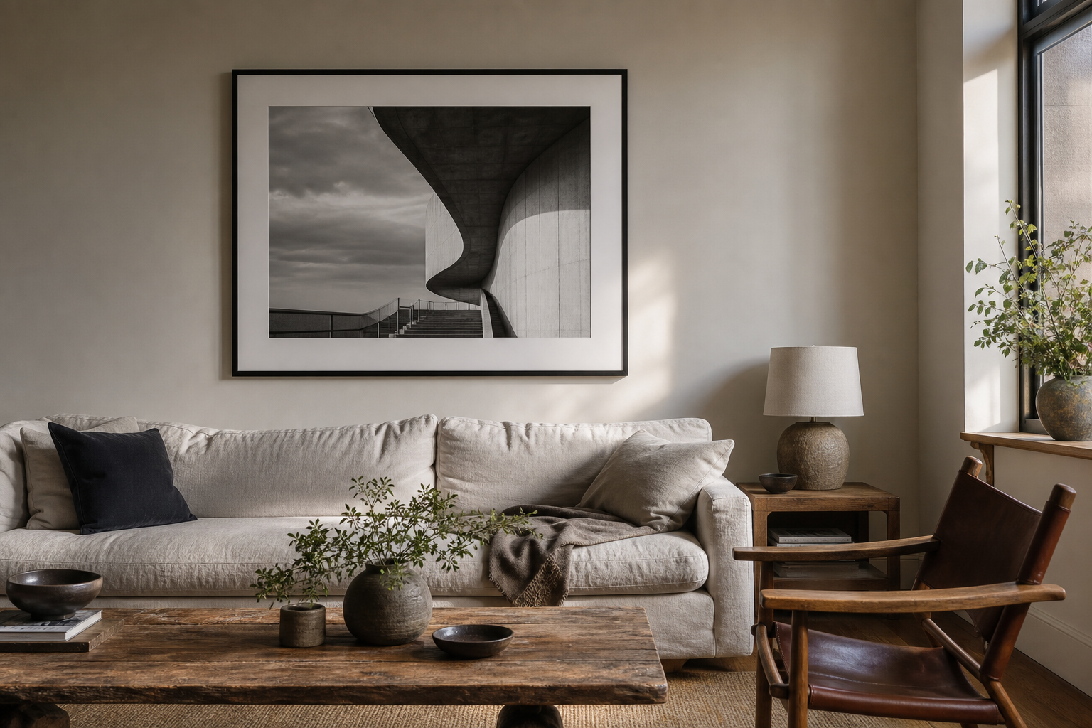
Choosing photography art for your home is less about matching a sofa and more about choosing the kind of presence you want the room to have.
Most people start too late in the process.
They look at a blank wall, search for something that fits the colours, and hope it works. Sometimes it does. Usually it feels like decoration. Fine, but forgettable.
Photography can do more than fill space. It can make a room feel quieter, sharper, warmer, stranger, calmer, more architectural, or more personal. The useful question is not “what looks nice?” It is: what do you want this room to feel like when you walk in?
That is a better place to start.
Choose the feeling before the subject
A photograph carries atmosphere before it carries information. You notice the mood first. Then you notice the place, the building, the weather, the person, the coastline, the street.
If the room already feels busy, a quiet image can give it breathing room. A pale coastal photograph, a soft horizon, or an image with a lot of negative space can slow the room down.
If the room feels too plain, architecture can give it structure. Lines, shadows, bridges, towers, windows, stone, and steel all add a kind of visual discipline. That is why London architecture photography often works well in modern interiors. It has detail, but it still feels ordered.
If the room feels cold, look for warmth in the light rather than only in the colour. A dusk photograph, street light, sunset reflection, or soft morning scene can make a room feel lived in without turning it decorative.
For calm rooms
Look for open space, soft water, mist, sky, distance, and fewer hard edges.
For minimal rooms
Choose strong composition: one subject, clean lines, controlled contrast, no clutter.
For darker rooms
Use contrast carefully. Black and white can look premium when the image has enough light inside it.
Decide whether you want memory or structure
There are two broad reasons a photograph works at home.
The first is memory. A place matters to you. London. The sea. A country you return to in your head. A city you lived in. A street you know. The image works because it is connected to something real.
The second is structure. The place may not matter personally, but the photograph holds the room together. A bridge creates symmetry. A cathedral gives weight. A skyline adds rhythm. A monochrome image removes distraction and makes the composition do the work.
Neither is better. They do different jobs.
A print like Symmetry & Stone — St. Paul’s Cathedral is mostly structure. It is measured, architectural, and calm. It suits a room that needs a centre without needing colour to create interest.
A coastal image such as Light Break — Seven Sisters does a different thing. It opens the room. It feels less like a landmark and more like weather, distance, and air.
Use black and white when colour would get in the way
Black and white photography is not automatically timeless. Bad black and white can look flat or nostalgic in the wrong way.
It works when the image has strong bones: light, shadow, shape, texture, and a reason to remove colour. Architecture is especially good for this because the subject already has form. When colour disappears, the eye reads proportion, repetition, stone, glass, clouds, and negative space.
This is why black and white photography can feel calm even when the scene is detailed. It reduces the number of things competing for attention.
If the room already has colour from books, furniture, plants, or textiles, monochrome art can keep the space grounded. If the room is very neutral, a black and white print can add depth without making the room feel busy.
For a deeper guide, the Journal piece on black and white London wall art covers how to choose monochrome work that does not feel generic.
Let the photograph create a direction for the room
A strong photograph gives the eye somewhere to go.
Vertical architecture lifts a room. Rivers and horizons make it feel wider. A single landmark creates a fixed point. Abstract city details make the room feel more designed. Nature photographs soften hard interiors. Street scenes add human life without needing portraits.
That direction matters more than people think. A room full of objects can still feel vague if nothing leads the eye. A photograph with a clear visual path can quietly organise the space.
| Room needs | Photography style to consider |
|---|---|
| More calm | Coastal, landscape, mist, water, soft horizons |
| More structure | Architecture, bridges, symmetry, strong shadows |
| More depth | Black and white, dusk scenes, layered city views |
| More warmth | Golden hour, street lights, sunset reflections |
Do not choose the most impressive image by default
The strongest photograph in a portfolio is not always the best photograph for your home.
Some images want attention every time you enter the room. That can be good in a hallway, workspace, or open-plan area. It can be too much in a bedroom or reading corner.
Other images are slower. They do not announce themselves immediately. They become better after you live with them for a while. Those are often the photographs that work best at home.
Look for an image you can return to. Something with enough detail to keep revealing itself, but enough restraint that it does not exhaust the room.
Build a small visual language
If you plan to collect more than one photograph over time, choose a language rather than a random set of favourites.
That language might be London architecture in black and white. It might be coastal light and empty horizons. It might be city landmarks at dusk. It might be nature images with quiet colour.
This does not mean every print has to match. It means they should speak to each other. Similar contrast, related subject matter, or a shared mood is usually enough.
The guide to London prints for dark and minimal interiors is a useful starting point if you like architectural work but want the room to stay restrained. You can also browse the current London photography print collection or the black and white print collection.
Start with the room, not the wall
The right photograph should feel like it belongs to the room before anyone asks where it was taken. Choose the feeling first. Let the subject follow.
Prints mentioned in this article
A quick visual reference for the Othervariant prints linked above.
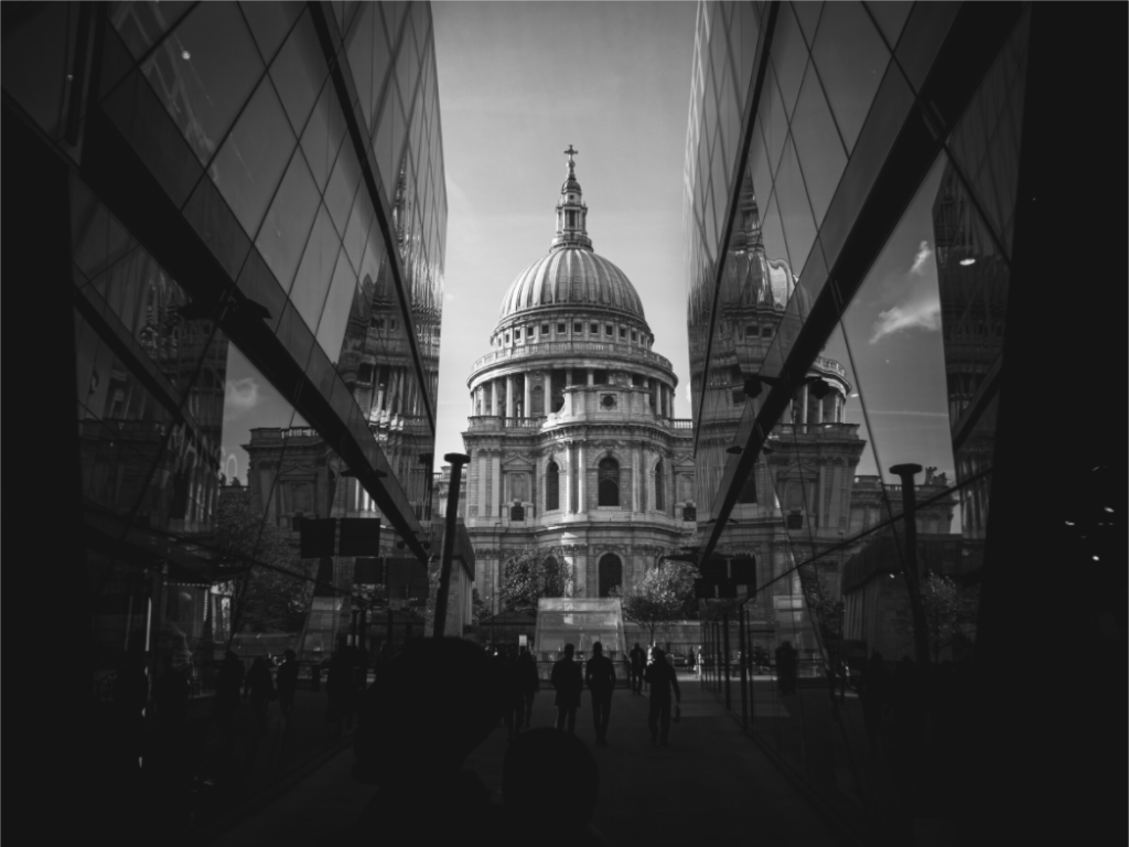
Symmetry & Stone
Othervariant black and white, london available in multiple sizes and configurations.
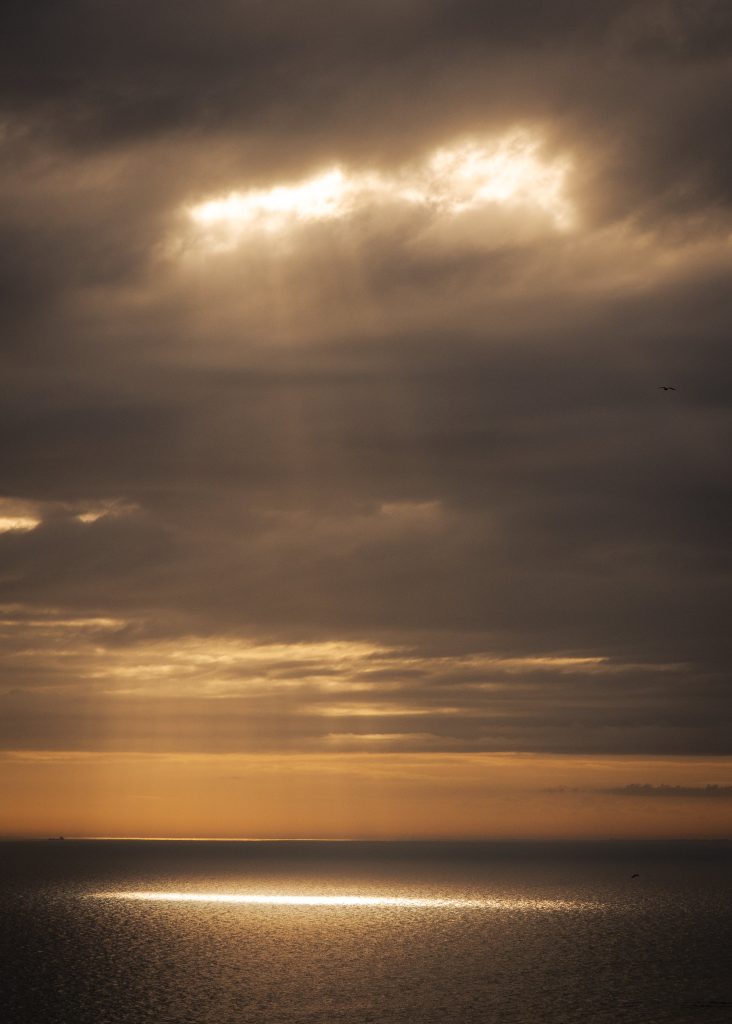
Light Break
Othervariant nature available in multiple sizes and configurations.