
The right landscape print does not just fill a wall. It changes the feeling of the room.
That sounds obvious until you start shopping.
Then everything becomes size charts, paper types, frame colours, ratios, prices and too many images that all look good for about twelve seconds.
Choosing photography for your home should be simpler than that.
Start with the room. Then choose the print.
Not the other way round.
Decide what the room needs to feel like
A landscape photograph carries mood before it carries subject.
A stormy coastal print feels different from a misty forest. A black and white mountain image feels different from a warm golden-hour field. A quiet reservoir print does something different from a dramatic ridgeline.
Before choosing the image, ask what the room needs.
If the room needs calm
Choose mist, water, negative space, softer contrast and quieter compositions.
If the room needs weight
Choose mountains, dark skies, cliffs, black and white, strong lines and structure.
If the room needs warmth
Choose low sun, autumn colour, golden light, dry grass, stone and earth tones.
If the room needs space
Choose open coast, wide skies, distant hills and minimal scenes.
Most people choose wall art by subject. They ask, “Do I like this place?”
That helps.
But the better question is:
Do I want this feeling in this room every day?
Match the print to the room’s job
Different rooms ask for different images.
Living room
A living room can handle a stronger focal point.
This is where a dramatic landscape print works well: a castle on the coast, a Highland mountain, a ridgeline in storm light, or a wide atmospheric view above the sofa.
Above a sofa or sideboard, a wide composition can become a calm anchor because it echoes the furniture line. Choose an image with enough depth or atmosphere to make the wall feel open rather than simply decorated.
Bedroom
A bedroom usually needs something quieter.
Mist. Water. Soft woodland. A print that slows the room down instead of pulling attention every time you walk in.
Above the bed, opposite it, or beside a reading chair can all work. Keep the placement connected to the furniture and let softer light and quieter contrast do the work.
Hallway
A hallway needs clarity.
People do not stand in hallways for long. Strong shapes work better than complex scenes. A simple black and white landscape can be perfect here.
Do not squeeze a wide print into a narrow passage. Simple horizons, paths, water and weather create a sense of continuation without making the wall feel crowded.
Home office
A home office can take more atmosphere.
A landscape near the desk gives the eye somewhere to rest, especially in a small or screen-heavy room. Avoid very small detail directly behind a monitor; calm depth matters more than drama.
The print should support the room. Not fight it.
Size matters more than people think
Most people buy prints too small.
A small print can work on a shelf, desk or narrow wall. But above a sofa, bed, fireplace or sideboard, it often looks apologetic.
As a rough rule, the artwork should take up around two-thirds of the width of the furniture below it.
For a more precise starting range, enter the sofa, sideboard or usable wall width into the wall art size calculator. It also suggests orientation, hanging position and common Othervariant dimensions.
If your sofa is 180cm wide, a 40cm print will look lost. You either need a larger print or a set of two or three images that work together.
Landscape photography often benefits from size because detail and atmosphere need room. A wide ridgeline, open beach or mountain scene feels different when it has space to breathe.
If you are unsure, go slightly larger than feels comfortable.
Walls are bigger than they look.
Choose colour carefully
A print does not have to match the room exactly.
In fact, it usually should not.
Matching everything too closely can make a space feel flat. The better approach is harmony.
| Room palette | Prints that usually work well |
|---|---|
| Warm wood, cream walls, soft fabrics | Autumn landscapes, golden-hour images, gentle earth tones |
| Grey, black, white or modern interiors | Black and white prints, muted landscapes, strong structure |
| Earth tones, leather, natural textures | Moody British landscapes, coast, stone, cloud, grass and weather |
| Minimal rooms | Simple compositions, negative space, wide skies and quiet water |
Let the room light guide the final choice. A darker room can benefit from open sky, water or lighter tones. A bright room can carry deeper shadows and more contrast without losing the photograph. Check the intended wall in daylight and with the lamps on.
Be careful with extremely saturated prints. They grab attention online but can become tiring on a wall.
Muted colour tends to age better.
That is one reason British landscape photography works so well in interiors. The palette is naturally restrained: grey, green, brown, stone, water, cloud.
It does not need to shout.
Think about orientation
The shape of the wall should guide the shape of the print.
- Wide wall above a sofa: choose a landscape orientation or panoramic image.
- Narrow space between doors: choose portrait orientation.
- Square wall or shelf arrangement: a square crop can work well.
- Staircase or hallway: consider a small series rather than one large piece.
The best print in the wrong shape will always feel slightly off.
Landscape photography gives you options because scenes can often be cropped differently. But not every photograph should be forced into every ratio.
Some images need width. Some need height. Some need space around the subject.
Let the photograph keep its natural shape where possible.
Pick an image you can live with
Some images are impressive immediately.
That does not mean they make good wall art.
A print has to survive repetition. You will see it on good days, tired days, ordinary mornings, late nights, in different seasons, with different light in the room.
The best wall art keeps working quietly.
It does not rely on novelty.
That is why simple landscape photographs often age better than overly dramatic ones. A misty ridge. A quiet beach. A dark mountain. A line of trees in fog.
These images give you space to return to them.
They do not use themselves up in the first glance.
Paper and finish
For fine art landscape photography, matte paper is usually the safest choice.
Gloss can make colours punchier, but it also reflects light and can make darker images harder to view in bright rooms.
Matte or fine art paper gives a softer, more considered finish. It suits moody landscapes, black and white work, mist, cloud and subtle tones.
If the image has a lot of shadow detail, paper choice matters. A good matte paper holds blacks without turning everything into a flat dark patch.
The print should feel like an object. Not just a picture.
Framing
Simple framing is usually best.
Black frames work well with black and white, dramatic skies and modern interiors.
Natural wood frames suit warmer landscapes, coastal prints and softer rooms.
White frames can work in light spaces but may feel too clean for darker, moodier images.
Mounts give the image breathing room. They are especially useful for smaller prints or detailed photographs.
Avoid over-decorative frames unless the room specifically asks for them.
The frame should support the image. Not compete with it.
Why British landscape prints work well in homes
British landscapes have restraint built into them.
The colours are rarely too loud. The weather adds atmosphere. The places feel familiar even when you have not stood in that exact spot.
A Peak District ridge, a Northumberland beach, a Scottish Highland valley — these images bring the outside in without turning the room into a postcard.
They work because they are grounded.
Stone. Cloud. Water. Grass. Weather.
Things we recognise.
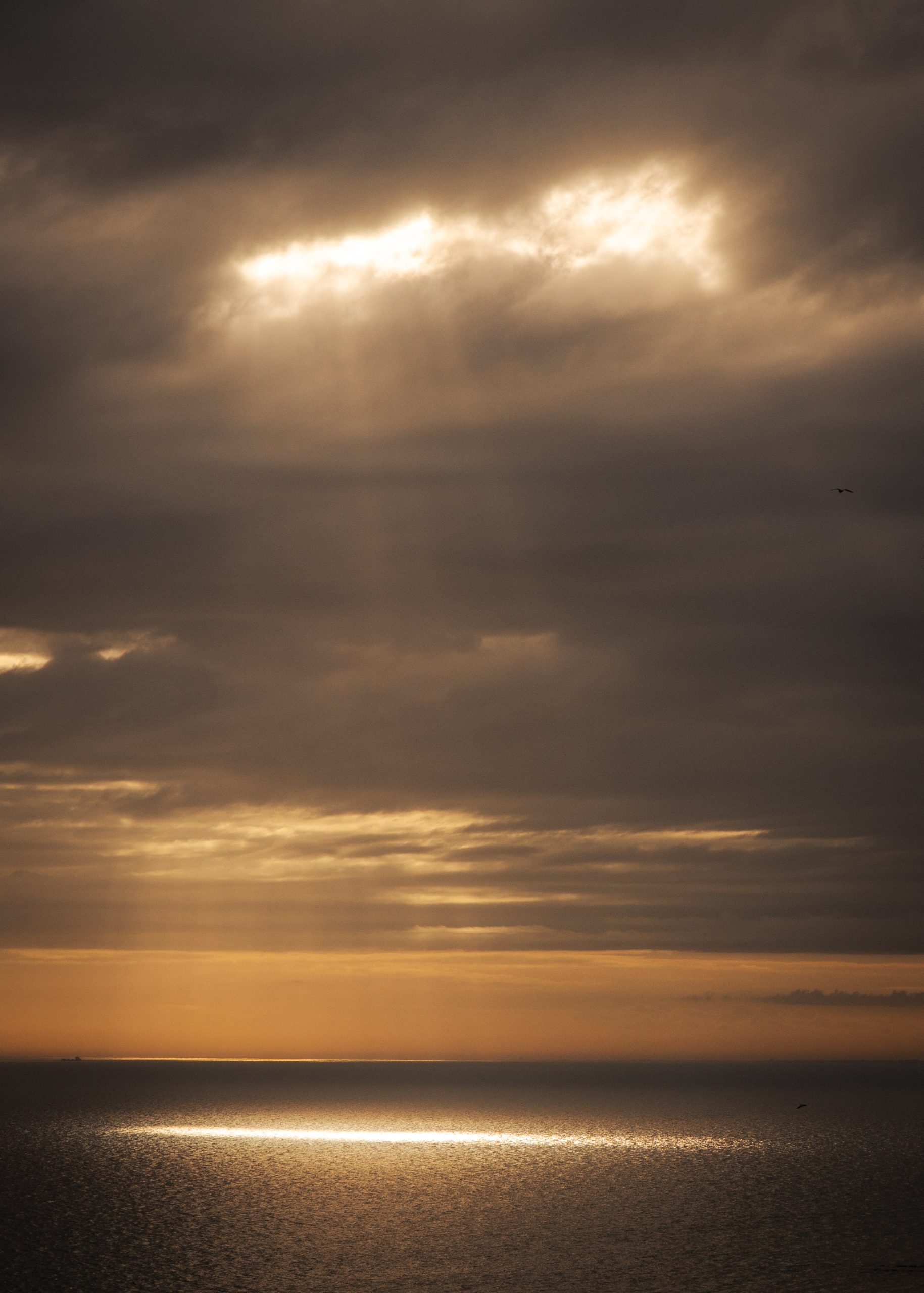
Landscape print shown in this guide
Light Break
A coastal landscape built around open distance, weather and a quiet horizon.
Choosing a print from The Other Variant
The Other Variant focuses on British landscape photography prints with atmosphere: moody coastlines, quiet hills, early light, mist, weather and the kind of scenes that still feel good after the first look.
If you are choosing your first print, start with the room:
- For calm: choose water, mist or soft woodland.
- For drama: choose mountains, castles, storm light or black and white.
- For warmth: choose autumn, low sun or golden-hour landscapes.
- For space: choose coast, wide skies or minimal compositions.
Then choose the image that feels like somewhere you would want to return to.
That is usually the right one.