

Kitchen wall art has a harder job than most rooms. It has to sit with light, cupboards, worktops, steam, movement and daily mess. The right photography print should make the room feel calmer, not busier.
Most kitchen art advice goes straight to coffee quotes, fruit illustrations or loud colour.
That can work if the room already has a playful mood. But a kitchen is usually full before anything goes on the wall. Handles. Tiles. appliances. Open shelves. Reflections. Small objects that never quite disappear.
So the better question is not just “what looks nice?”
It is: what kind of image can live in this room without fighting it?
Start with the kitchen you actually have
A clean white kitchen, a dark kitchen and a warm wooden kitchen do not need the same print. Before choosing a piece, look at the room when it is being used. Not when it is perfectly staged.
If the surfaces already have strong grain, patterned tiles or visible shelving, choose a quieter photograph. A seascape, a distant landscape, a simple skyline or a print with one clear subject will usually sit better than a crowded scene.
If the kitchen is very plain, the print can carry more structure. Architecture works well here. Lines, windows, bridges and city shapes give the wall something to hold without turning the room into a theme.
Kitchen wall art should survive quick glances
You rarely stand in a kitchen and study a print for ten minutes. You pass it while making coffee. You see it from the dining table. You catch it from the hallway.
That makes clarity important.
A good kitchen photography print usually reads from a distance. It has one of these things:
Open space
Sea, sky, mist or quiet distance. Good for small kitchens, narrow walls and rooms that already feel busy.
Clean structure
Bridges, arches, streets or buildings. Good for modern kitchens that need weight without extra colour.
Soft warmth
Low sun, stone, trees or muted natural colour. Good for kitchens with wood, cream, brass or warm lighting.
Small detail can be beautiful, but it often disappears in a kitchen. Especially if the print is above a sideboard, near a breakfast bar or across an open-plan room.
Choose the image that still works when you only give it two seconds.
Be careful with colour
Kitchens already have colour temperatures built in. Cool daylight from windows. Warm under-cabinet lighting. Stainless steel. Stone. Wood. Painted units.
A very saturated print can look good online and too loud once it is next to all of that.
For most kitchens, safer colours are muted blues, soft greens, warm stone, low sunset tones, black and white, or natural neutrals. That does not mean boring. It means the print can breathe next to the rest of the room.
If you want a stronger image, keep the rest simple. One confident print is usually better than three small pieces all asking for attention.
Think about where the print will hang
Not every kitchen wall is a good wall for photography. Avoid places where steam, oil or direct splashes are likely. A fine art print deserves a calmer position: the dining end of the kitchen, a breakfast nook, a side wall, an open-plan transition, or a wall opposite the main work surface.
If the print is near the cooking area, framing matters. Glass or acrylic glazing gives the surface more protection than an exposed print. It also makes cleaning around the area less stressful.
| Kitchen situation | Print direction |
|---|---|
| Small kitchen | Light landscape, open sky, soft seascape |
| Modern plain kitchen | Architecture, black and white, clean city lines |
| Warm wood or cream kitchen | Natural colour, stone, olive trees, low sun |
| Open-plan kitchen diner | One stronger print that also works from the dining area |
Two Othervariant print directions that work
For kitchen wall art, I would keep the edit tight. One calm natural print or one structured city print is usually enough.

Three Olive Trees
Warm, natural and quiet. A good direction for cream, wood or neutral kitchens that need softness rather than decoration.
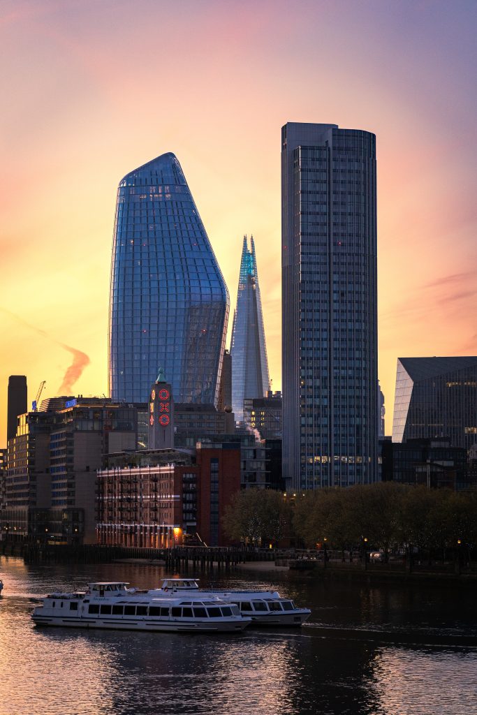
City Glow at Dusk
Clean city structure with warmer evening light. Better for modern or open-plan kitchens where the wall needs weight without becoming loud.
The quiet test
A kitchen print should make the room feel more settled when life is happening around it.
If the image only works in a perfectly tidy room, it may be the wrong image. If it still feels calm next to plates, light, movement and noise, it is probably closer.
Good kitchen wall art does not need to announce itself. It just needs to make the room feel a little more considered.
For kitchens, I would start with quiet nature prints or structured London photography. Browse the current nature prints or London photography prints, then choose the one that makes the room breathe.