
Framed photography prints work best when the frame supports the photograph instead of trying to become the room. The right choice is usually quieter than people expect: a strong image, enough space around it, and materials that do not fight the wall.
Most people start with the frame. Black, oak, white, metal, thin, thick. It feels like the practical part, so it becomes the first decision.
But the better question is simpler: what should the photograph do in the room?
A framed photography print can make a space feel calmer, sharper, more architectural, more personal, or more open. The frame matters, but it is not the main event. The photograph carries the mood. The frame gives it a boundary.
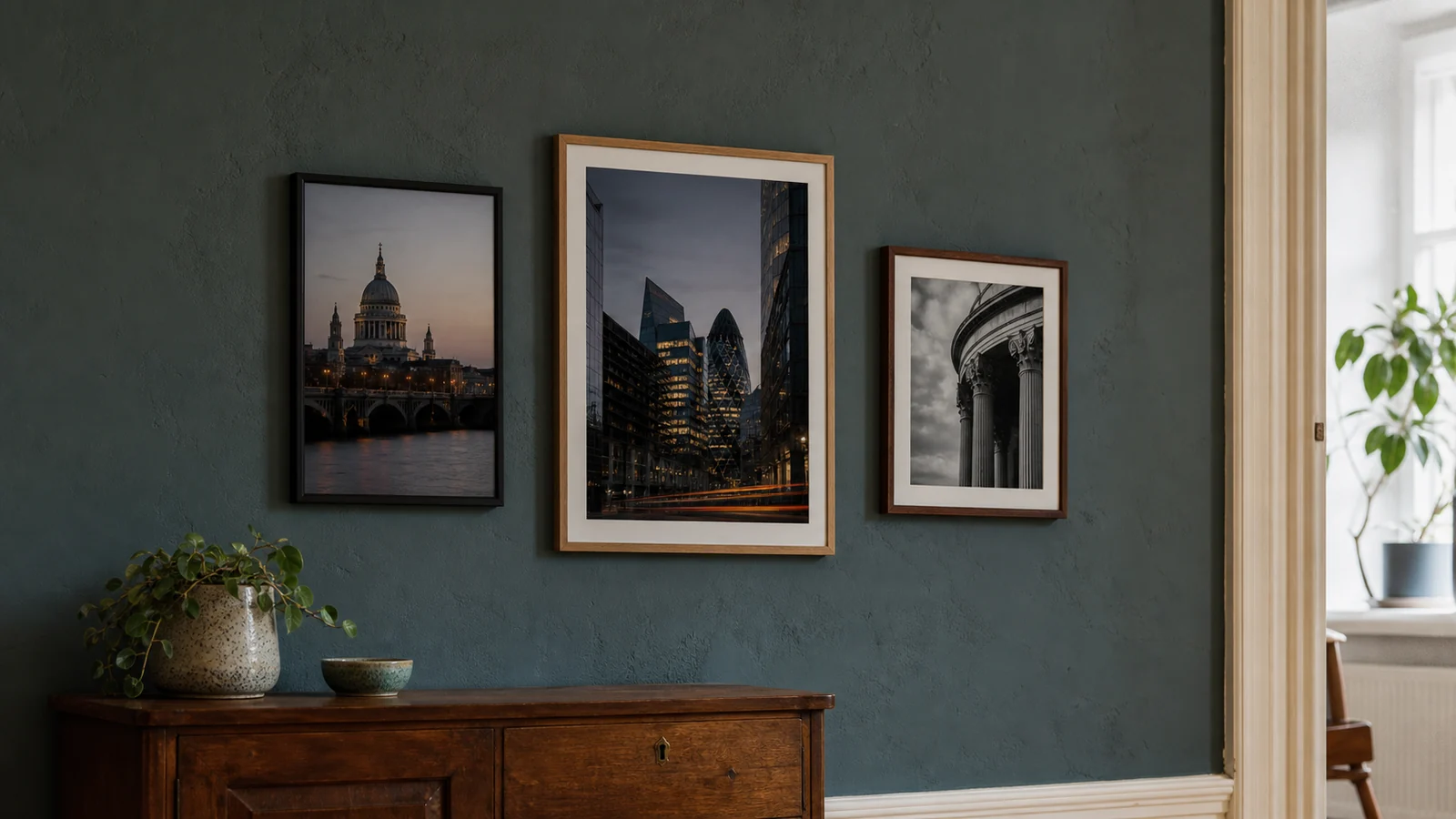
Start with the feeling, not the colour match
A common mistake is buying wall art only because it matches the sofa, curtains, or cushions. That can work for decorative prints. It often makes photography feel flat.
Photography has its own atmosphere. A black and white city print can add structure to a soft room. A quiet seascape can make a bedroom feel less busy. A London architecture print can bring weight and memory into a hallway without turning the wall into a tourist poster.
Choose the image before the frame
The frame should follow the photograph. A clean black frame often suits high-contrast architecture, monochrome city scenes, and images with strong lines. A lighter wood frame can soften landscape, coastal, and nature prints. A white frame can work when the room is already bright and minimal, but it can also make a photograph feel more decorative and less grounded.
For example, a print like The Shard from Sky Garden in black and white has a built-in sense of height, glass, and distance. It does not need an ornate frame. A quiet black or dark neutral frame would let the skyline stay sharp.
Something more symmetrical, like Symmetry & Stone, can also take a restrained frame because the composition already has formality. The more ordered the photograph is, the less decoration the frame needs.
Black frame
Best for contrast, architecture, London prints, monochrome work, and rooms that need more visual structure.
Natural wood frame
Best for landscapes, coastal images, warmer rooms, and spaces where the print should feel calm rather than graphic.
White frame
Best for bright minimal interiors, pale walls, and photographs with enough contrast to avoid disappearing into the frame.
Think about mount and breathing room
The mount, or mat, is the quiet space between the photograph and the frame. It is easy to ignore, but it changes the whole feel of the print.
A generous mount makes a photograph feel more considered. It gives the image breathing room. It also helps smaller prints feel intentional rather than undersized.
Full-bleed framing, where the photograph runs close to the frame edge, can feel more modern and direct. That can suit graphic architecture or large statement pieces. But for many fine art photography prints, especially black and white work, a mount adds a calmer gallery feel.
The Ansel Adams Gallery has a useful note on hanging and framing photography: the frame should depend on both the photograph and the room it will live in. Framing is part of how the image is read.
Match the scale to the wall
Small framed prints can look beautiful, but they need intention. A small print alone on a large wall often feels lost. It may work better as part of a pair, a small gallery arrangement, or a quiet corner.
Larger framed photography prints need more wall space, but they can make a room feel calmer because there is one clear visual decision instead of several small competing ones. This is especially true in living rooms, dining spaces, and bedrooms where the print sits above a sofa, sideboard, or bed.
A simple rule: the artwork should usually feel connected to the furniture below it. Not tiny above it. Not wider than everything around it. Somewhere between half and two-thirds of the furniture width is often a safe starting point.
| Room | Good framed print direction |
|---|---|
| Living room | One larger print or a calm pair with enough spacing. |
| Bedroom | Softer tones, landscapes, coastal images, or quieter black and white work. |
| Hallway | Vertical architecture, London details, or smaller framed prints in sequence. |
| Home office | Structured city scenes, architectural lines, or a print with personal meaning. |
Do framed photography prints need to match the room?
They need to belong in the room. That is not the same as matching everything.
If the room is already warm, a framed print can add contrast. If the room is minimal, the photograph can bring depth. If the room is dark, black and white photography can either sharpen that mood or give the wall a quieter focal point.
This is why black and white photography prints are useful in interiors. They remove the problem of colour matching and make the decision more about light, shape, and feeling.
For location-led work, the choice can also be personal. A London photography print might work because of the architecture, but also because the place means something. That kind of connection usually lasts longer than a colour trend.
What to check before buying
Before choosing a framed photography print, check four things.
First, does the image still interest you after the first look? Good photography often has a second layer: light, weather, geometry, distance, or a small detail you only notice later.
Second, can you imagine living with it when the room is quiet? Wall art is not only for guests. You will see it on normal mornings, tired evenings, and uneventful days.
Third, does the frame support the print? If the frame colour, width, or finish is shouting, simplify it.
Fourth, is the print made properly? Paper, print quality, and finishing matter. A strong photograph deserves a physical version with depth, clean detail, and a surface that does not make it feel disposable.
The safest choice is usually simple
For most homes, the best framed photography print is not the loudest one. It is the one with enough presence to hold a wall and enough restraint to live with.
Choose the photograph first. Give it space. Let the frame support it. Avoid chasing a perfect colour match. A room feels more personal when the art has a reason to be there.
Browse Othervariant’s current photography prints, including London architecture, black and white, landscape, and coastal wall art.
Prints mentioned in this article
A quick visual reference for the Othervariant prints linked above.
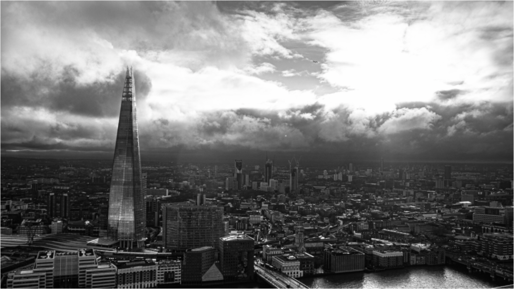
The Shard from Sky Garden
Othervariant london available in multiple sizes and configurations.
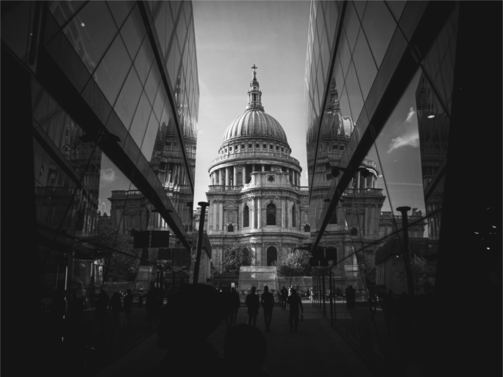
Symmetry & Stone
Othervariant black and white, london available in multiple sizes and configurations.