
Fujifilm gets attention because the images often feel finished before they are edited. The colour is not always perfectly neutral. That is part of the appeal. It can make ordinary streets, soft evening light, rain, stone, and small human details feel like they already belong in a frame.
The word Fuji has become bigger than the camera brand itself. People use it as shorthand for a look: warm but not loud, nostalgic but not fake, cinematic without trying too hard. That is why Fujifilm keeps pulling people into photography forums, YouTube reviews, film simulation recipes, and camera comparison articles.
For a print shop, that interest matters. Not because a wall print needs to be shot on a Fujifilm camera. It does not. A good print can come from any camera if the image has enough feeling, structure, and tonal depth. But the popularity of the Fujifilm look says something useful about what people are responding to visually.
They are not only looking for sharpness. They are looking for atmosphere.
Why Fujifilm colours feel different
Fujifilm built part of its digital camera identity around film simulations in cameras such as the Fujifilm X-series. These are colour profiles inspired by the company’s long history with film stocks. Names like Classic Chrome, Provia, Velvia, Acros, and Classic Neg have become familiar even to people who are not deep into cameras.
The important thing is not the exact technical recipe. It is the restraint. Many Fujifilm images have colour that feels shaped rather than pushed. Greens can sit back. Reds can hold weight without becoming plastic. Blues can feel slightly softened. Shadows often carry mood instead of just disappearing into black.
That kind of colour works well in print because a photograph on a wall has to live with furniture, daylight, lamps, paint, wood, fabric, and empty space. A screen can handle aggressive colour for a few seconds. A room has to live with it every day.
The Fuji aesthetic is really about mood
When people search for the Fujifilm aesthetic, they are often chasing more than a preset. They want photographs that feel observed rather than manufactured. Street corners. Rain on pavement. Buildings in soft light. Small moments that would be easy to miss.
This is why the Fuji look connects naturally with city photography. London, for example, rarely needs more drama added to it. The city already has layers: old stone, glass towers, buses, wet roads, evening reflections, and people moving through all of it. A quieter colour treatment lets those layers breathe. A print like St. Paul’s Cathedral at Dusk works for that reason: the subject is recognisable, but the feeling comes from dusk colour, movement, and restraint.
In a print, that matters. The image should not only shout for attention when someone enters the room. It should keep giving small details after the first glance.
Warmth
A little warmth can make a print feel human. It works especially well with evening streets, old architecture, and interior spaces with soft lamps or natural wood.
Muted contrast
Strong contrast can be beautiful, but a slightly softer tonal range often feels easier to live with on a wall. It gives the eye somewhere to rest.
Imperfect colour
Perfectly accurate colour is not always the goal. Sometimes a print works because the colour feels remembered rather than measured.
Why this matters for choosing photography prints
A common mistake with wall art is choosing only by subject. A person likes London, so they search for a London print. They like the coast, so they search for a seascape. That is a good starting point, but it is not enough.
The treatment of the image changes how it feels in the room. A bright, high-saturation skyline can make a space feel energetic. A black and white architectural print can make it feel more graphic and calm. A softer colour photograph can sit somewhere between the two: still recognisable, still atmospheric, but not too loud.
This is where the Fujifilm conversation becomes useful even if the final print was not shot on a Fuji camera. It gives language to something buyers already notice but may not know how to describe.
| Visual choice | What it can do in a room |
|---|---|
| Muted colour | Feels calm, lived-in, and easier to pair with furniture. |
| Warm evening tones | Adds softness without making the image sentimental. |
| Deep shadows | Creates structure and atmosphere, especially in architecture. |
| Black and white | Removes colour noise and makes shape, light, and composition stronger. |
Fuji-style colour does not have to mean vintage
One trap with the word aesthetic is that it can become costume. Grain, faded colour, and heavy nostalgia can look good in the right image, but they can also become a filter placed on top of a weak photograph.
The better lesson from Fujifilm is not “make everything vintage.” It is to be more intentional with colour. Let some colours step back. Let light do more work. Avoid making every image look like it is competing for attention on a phone screen.
For prints, this restraint is often what makes a photograph age well. A wall print is not a social media post. It does not need to win a scroll. It needs to keep feeling right after months or years in the same room.
How to use the Fuji idea when buying wall art
If you are drawn to Fujifilm images, look for prints with a similar sense of restraint. Not necessarily the same camera. Not necessarily the same film simulation. Look for the feeling underneath it. If you came here through camera research, the earlier guide to Fujifilm X100VI alternatives is more technical. This one is about what that look can do once the photograph leaves the screen.
Does the colour feel natural enough to live with? Do the shadows add mood without becoming muddy? Is there a small detail that rewards a second look? Would the image still work if it were not trendy?
Those questions are more useful than asking whether a print matches a specific recipe or camera profile. The camera can start the look. The final photograph has to carry it.
Explore atmospheric photography prints
If you like quiet colour, evening light, city atmosphere, and images that feel lived-in rather than generic, browse the current London photography collection.
Print mentioned in this article
A quick visual reference for the Othervariant print linked above.
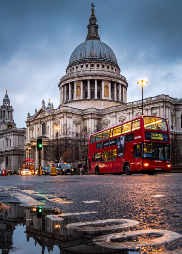
St. Paul’s Cathedral at Dusk
Othervariant london available in multiple sizes and configurations.