
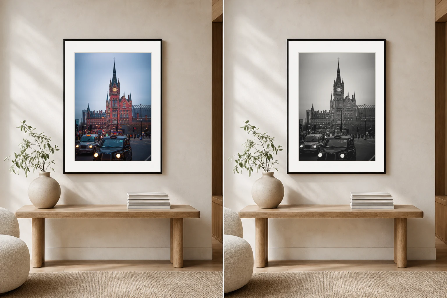
Colour and black and white photography are not just two versions of the same image. They ask for attention in different ways.
Colour adds energy
A colour print can make a room feel more alive. Warm evening light, blue shadows, red buses, green landscapes and golden skies all create mood before the viewer studies the subject.
The risk is that colour can compete with the room. If the sofa, rug, cushions and artwork all demand attention, the wall can start to feel noisy.
Black and white simplifies the room
Black and white removes one layer of information. That can make architecture, light and shape feel stronger. It often works well in calm interiors because it gives the wall structure without adding another colour palette.
How to decide
Choose colour if
The room needs warmth, a focal point or a stronger sense of place.
Choose black and white if
The room is already colourful or you want the print to feel quieter and more architectural.
Trust the subject
Some images are about colour. Others are about form. Let the photograph decide.
For London prints
London works both ways. Colour can hold the feeling of dusk, rain and street light. Black and white can make the city feel more timeless, graphic and calm.
Explore London prints in colour and black and white
A good print should feel considered before anyone notices the technical choices behind it.