
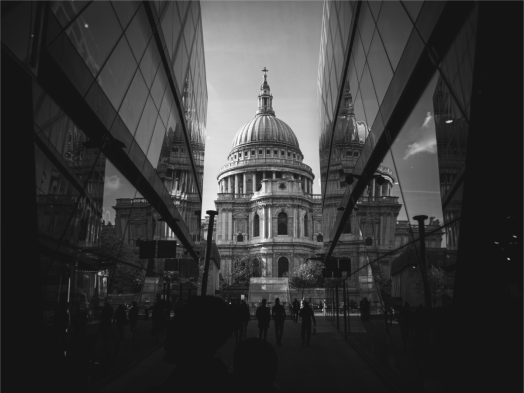
Black and white London wall art works best when it feels like a finished object, not just a famous landmark converted to monochrome. The strongest prints use shape, contrast, negative space, and atmosphere to make the room quieter rather than busier.
Start with the room, not the landmark
A common mistake with London wall art is choosing the landmark first: Big Ben, Tower Bridge, St. Paul’s, The Shard. That can work, but it often leads to generic prints that feel more like souvenirs than art.
The better question is: what does this wall need? A dark hallway may need a print with a clear centre of gravity. A bright office may take a stronger black and white architectural study. A bedroom usually needs quieter contrast and more breathing room.
Why monochrome London prints can work so well
London has a lot of visual noise: traffic, signs, glass, stone, people, reflections, weather. Black and white removes some of that noise and leaves the structure. The city becomes less about colour and more about rhythm — arches, towers, silhouettes, streets, river lines, and the weight of buildings.
That is why monochrome London photography can suit interiors better than very saturated city images. It does not shout for attention every time you walk past it. It sits in the room and rewards a second look.
For a minimal room
Choose a print with strong geometry and controlled contrast. Symmetry, stone, and negative space help the image feel deliberate rather than decorative.
For a modern office
Sharper city architecture works well in a workspace because it adds structure without adding clutter. Look for skyline lines, glass, and architectural scale.
For a hallway
Hallways can take bolder contrast because people pass through them quickly. A recognisable London subject can work here if the composition is still strong.
Look at the print from across the room
A photo can look impressive close up and still fail as wall art. Before choosing a print, imagine it from three or four metres away. Does it still have a readable shape? Does it become a dark rectangle? Does the subject survive at a glance?
This matters especially with black and white photography. The print needs enough tonal separation to stay clear, but not so much contrast that it dominates the wall.
Choose London without choosing a cliché
Recognisable subjects are not the problem. The problem is choosing them in the most obvious way. A good London print can include St. Paul’s, Big Ben, Tower Bridge, or The Shard while still feeling personal, architectural, and composed.
The aim is not to hide the city. It is to avoid the postcard version of it.
Size and finish matter
Smaller prints can work well in groups, on shelves, or in narrow spaces. Larger prints need simpler compositions because they become part of the room’s architecture. If the image is already busy, going bigger can make it feel louder.
For monochrome London prints, matte and fine art finishes usually make more sense than glossy surfaces. They keep attention on tone and structure rather than reflections.
Browse black and white London photography prints
Othervariant is a small independent print shop by Jiri Packa, focused on London architecture, monochrome studies, seascapes, and quiet landscape photography made to live on a wall.
Prints mentioned in this article
A quick visual reference for the Othervariant prints linked above.
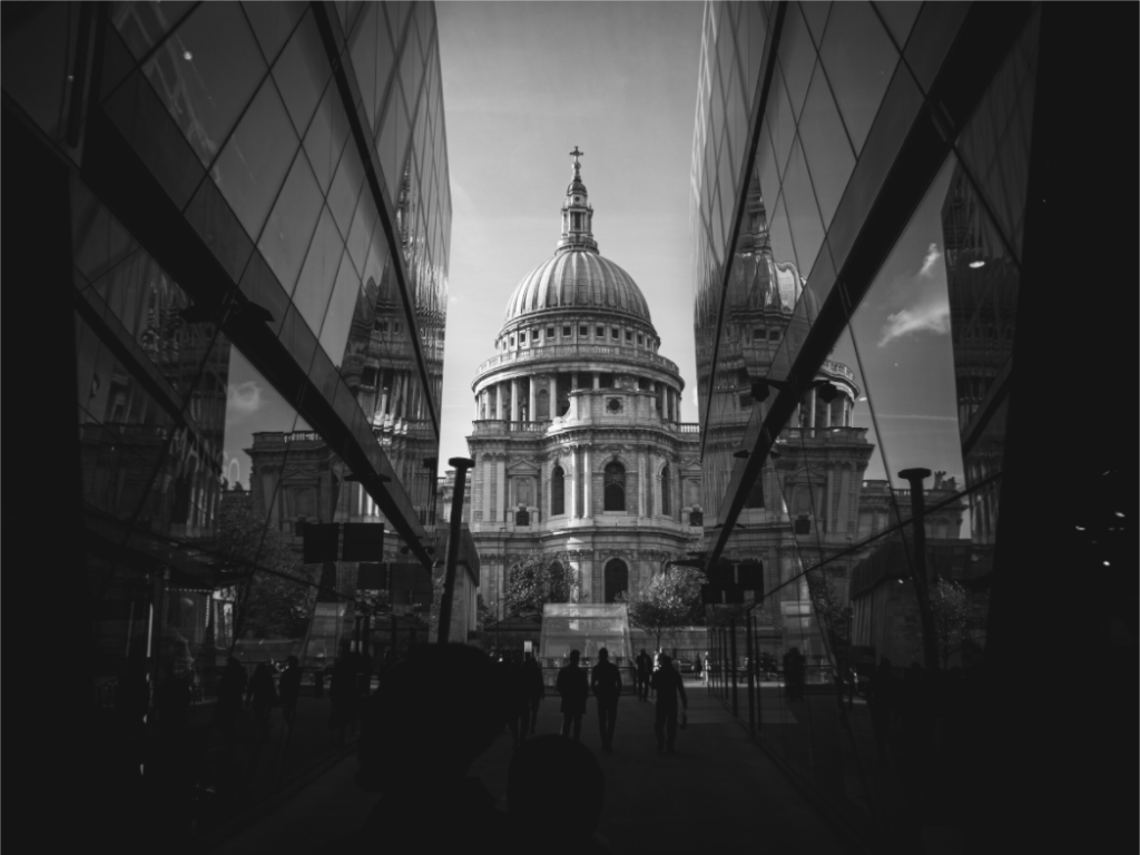
Symmetry & Stone
Othervariant black and white, london available in multiple sizes and configurations.
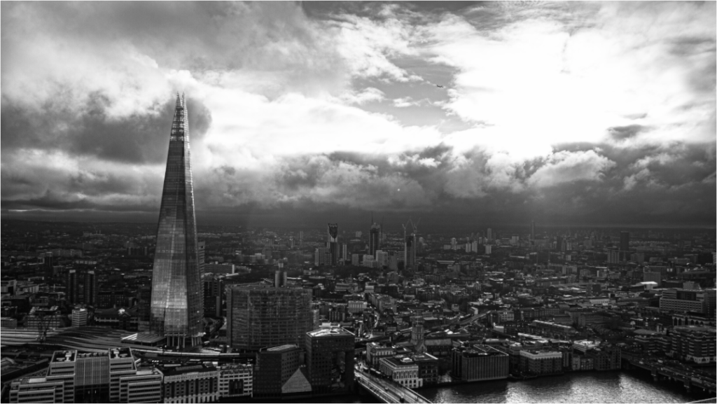
The Shard from Sky Garden
Othervariant london available in multiple sizes and configurations.
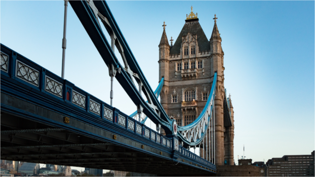
Tower Bridge Steel
Othervariant london available in multiple sizes and configurations.