
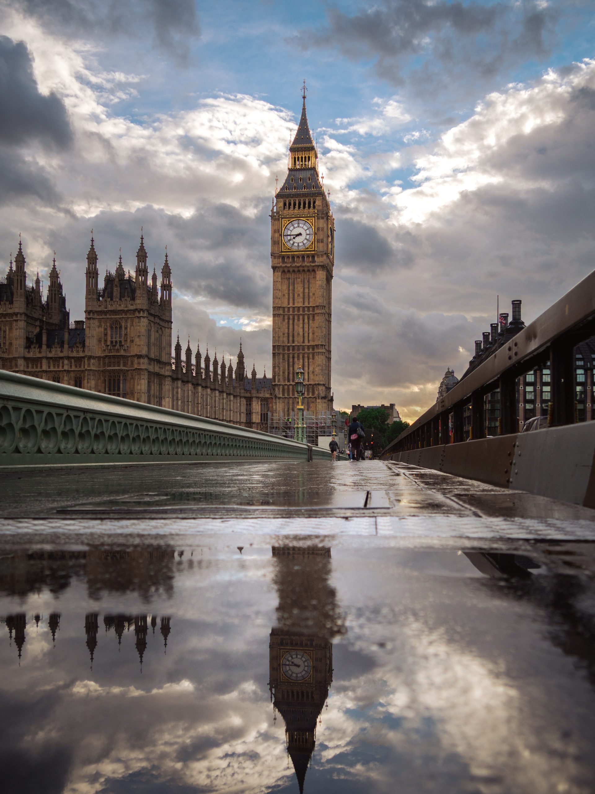
Industrial interiors already have strong materials: brick, steel, concrete, dark timber and exposed structure. The right photography should work with that weight without turning the room into a theme. Start with the mood the space is missing, then choose subject, scale and framing.
Industrial wall art can go wrong when it repeats every obvious cue. Gear motifs, factory signs and distressed metal may match the label, but they can make a real home feel staged. Photography offers a quieter route. It can echo the architecture while still bringing weather, distance and human observation into the room.
Begin with the material that leads the room
Look at the room before looking at prints. Which surface carries the most visual weight?
Exposed brick has colour and texture already. Black steel frames doors, shelving and windows with hard lines. Concrete and pale plaster feel quieter, but can also feel cold. Reclaimed timber introduces warmth and irregular detail.
The photograph does not need to match all of them. Let it answer the strongest material. A structured city image can sit naturally beside steel. A photograph with rain, cloud or evening light can soften brick. A lighter horizon can give a concrete room somewhere for the eye to travel.
Repeat one quality from the room. Let the photograph bring the other half.
Decide whether the room needs structure or relief
More structure
Choose architecture, a clear silhouette or a strong vertical composition. This suits open rooms where furniture and objects feel visually scattered.
More warmth
Look for wet streets, warm windows, dusk light or restrained colour. These details can take the edge off black metal and cool grey surfaces.
More space
Use open sky, water or distant landscape when the room already contains many lines, shelves and textured materials.
This is more useful than choosing an image because it is described as industrial. A photograph should change the balance of the room, not simply repeat its furniture.
Architecture works best when it feels observed
Bridges, stations, towers and older masonry fit industrial interiors because they share line, scale and material. The image still needs a point of view. Weather, an unusual angle or a quiet moment can stop a familiar landmark becoming generic decoration.
London photography is especially varied in this setting. Stone sits beside glass. Victorian structure meets steel and modern towers. A photograph can carry that contrast without filling the wall with slogans or imitation workshop graphics. The guide to choosing London architecture photography goes further into finding a landmark print without the tourist-poster feel.
Use black and white carefully
Monochrome is an obvious choice, but it is not automatically calm. A dense black-and-white street scene can make a room with open shelving, brick and dark furniture feel even busier.
Look for separation between light and shadow. Strong geometry should have enough open space around it. If the room is already dark, choose a print with a clear pale area or a mount that keeps the image from disappearing into the wall.
If you want the room to feel softer, colour may be the better decision. Deep blue sky, warm windows or reflected light can connect black metal with timber, leather or warm bulbs. The existing guide to black-and-white photography in minimal interiors explains how shape and tone affect a restrained room.
Let the frame finish the relationship
A slim black frame can repeat window bars, ironwork or dark shelving. Natural timber can stop a brick-and-metal room feeling too severe. A pale mount creates separation when both the wall and photograph contain strong texture.
Avoid adding a heavy distressed frame simply because the interior has an industrial label. The frame should make the photograph easier to see. It should not become another themed object.
Check the complete outer dimensions, not only the printed image size. A mount and frame can make a modest photograph much larger on the wall. The guide to choosing framed photography prints covers frame colour, image shape and room fit in more detail.
Use furniture as the scale reference
Industrial rooms often have long, low furniture: a leather sofa, media unit, sideboard or bench. Use that piece as the visual anchor. A small frame floating above it can feel temporary, even when the photograph is strong.
Mark the proposed outer frame size with paper or low-tack tape. View it from the doorway and the main seat. A horizontal skyline can follow a long sofa. A vertical architectural print can hold a narrower section between a door and shelving. Leave enough clear wall around the frame for the building lines inside the image to remain legible.
Start with one print. Add a second only when the wall genuinely needs rhythm rather than a stronger scale.
Two London print directions for industrial interiors
These current Othervariant photographs use the city in different ways. One brings rain, stone and a clear vertical landmark. The other uses warm windows and a darker skyline to connect cool structure with evening light.
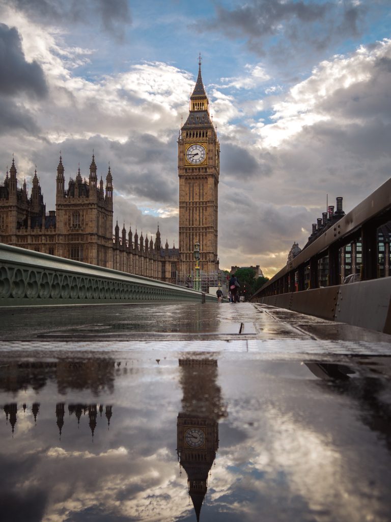
Big Ben After Rain
Wet pavement, heavy cloud and stone architecture bring atmosphere to brick, steel and darker interior materials.
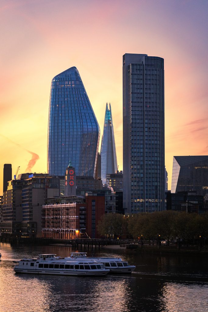
City Glow at Dusk
Warm windows within a dark city structure suit rooms that need warmth without losing their architectural character.
Keep the room, not the label
The strongest industrial interior does not need every object to announce the style. Brick, steel or concrete already sets the direction. Let the photograph add a viewpoint the materials cannot provide: weather, distance, light or a quieter sense of place.
Choose one print with a clear job. Give it enough scale. Keep the framing restrained. The room will still feel industrial, but it will also feel lived in.
Find a city photograph with structure and atmosphere
Compare London architecture, skyline and street photographs at your own pace. Start with the material and light already in the room.