
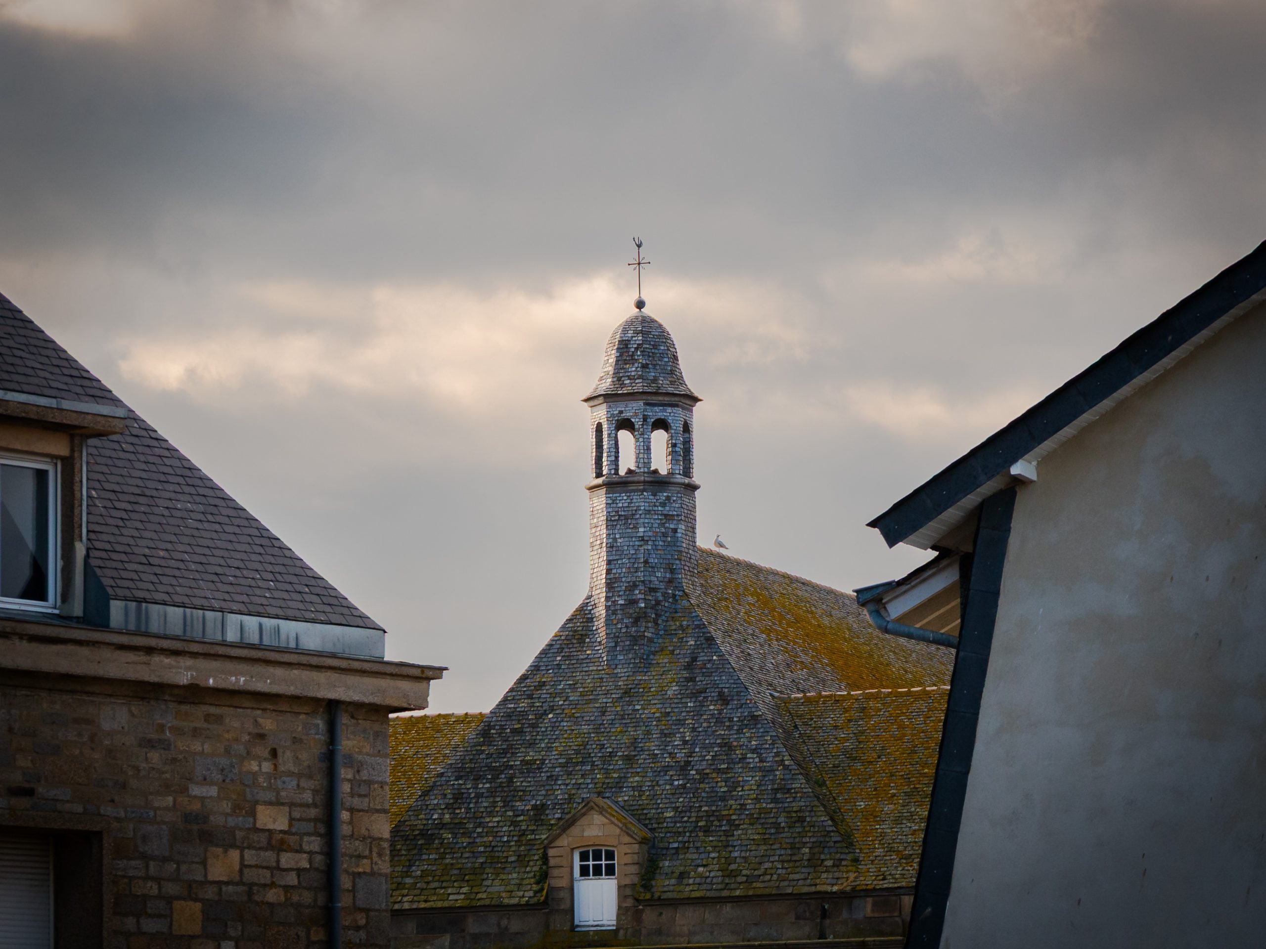
Original photography prints and mass-produced wall art can occupy the same wall, but they ask for different kinds of attention. The useful distinction is not status. It is whether the image, authorship and presentation are specific enough to support a lasting choice.
Authorship changes what you can know
With an original photography print, there is a traceable relationship between the person who made the image, the place or subject and the finished work. That does not make every photograph better, but it gives you clearer information. You can ask what the picture actually shows, whether the location is accurate and why the composition looks as it does.
Mass-produced wall art is often selected to fit a trend or broad palette. The maker may be distant from the listing, and many sellers may carry the same file. The practical difference is specificity, not a claim that one object grants better taste.
Look for an image rather than a theme
Generic wall art is frequently sold by theme: beige abstract, coastal blue, Paris, botanical or industrial. A photograph can also become generic if it relies only on a famous landmark. Look for decisions inside the frame.
Weather, viewpoint, negative space, timing and the relationship between light and structure should make the picture feel observed rather than assembled. A familiar subject can still be particular. Big Ben after rain is not simply a London motif when the wet pavement, cloud and warm clock detail determine the image. Specificity gives the eye something to return to after the room styling has changed.
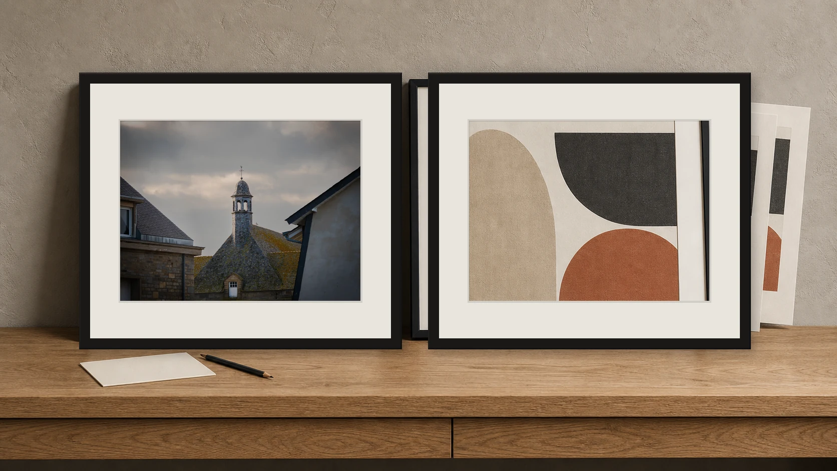
Both pieces are given equal frames, mounts and light here. The visible difference is the specificity of the observed photograph on the left and the repeatable decorative motif on the right.
Print information should be concrete
The phrase fine art is useful only when the listing explains the print and presentation clearly. Compare available sizes, image ratio, finish and framing options. Check whether the work arrives framed or unframed and whether the displayed price changes with the selected configuration.
Mass-produced art can be well made, while an original file can be poorly printed, so authorship alone is not enough. The product page should allow you to understand what is included without vague promises about museum quality or permanence. Clear current specifications are more trustworthy than prestige language.
Original does not have to mean limited
A photograph can be an original work by a photographer without being sold as a numbered limited edition. Edition size, authorship and print quality are separate questions. If a work is limited, the edition terms should be explicit.
If it is open, that does not erase the choices made in the photograph. For a home buyer, the more relevant question may be whether the image feels personal and whether the available presentation suits the wall. Do not pay for a suggestion of rarity that the listing does not document, and do not reject an open edition simply because it is accessible.
Think about how the room will change
Trend-led wall art can solve an immediate colour gap, but it may feel tied to one version of the room. A more specific photograph often survives changes because it carries subject, atmosphere and composition rather than only palette. Test the image mentally against a different wall colour, frame or home.
If the photograph still has a reason to exist, it is less dependent on styling. This does not mean choosing only neutral work. Strong orange light or deep storm cloud can last when the picture has structure and the colour belongs to the scene.
Choose without turning the purchase into a status test
The best reason to choose original photography is that a particular photograph matters to you, not that it signals exclusivity. It might hold a place you know, a kind of weather you miss or a visual order that settles the room. Keep the decision grounded.
Compare real images, read the listing and measure the wall. A calm, well-described purchase is more valuable than a grand story about collecting. The wall has to work in daily life, where the print will be seen in changing light rather than in a single styled photograph.
A practical comparison exercise
Place two candidate listings side by side and remove the brand names from the decision for a moment. Can you identify the subject, maker, image shape and available presentation from each page? Does the photograph still hold together when it is shown without a styled room?
Write one sentence about the visual reason for each choice. Then restore the practical information and compare what you would actually receive. This exercise keeps the distinction grounded in evidence. Original authorship matters because it connects a real image to a maker, but the purchase still has to work through clear information, sound presentation and a photograph you want to live with.
Two real print directions
These two current Othervariant photographs show how the decision can lead to different subjects without losing clarity. Use the product pages to compare the full image, available presentation and the shape of the work.
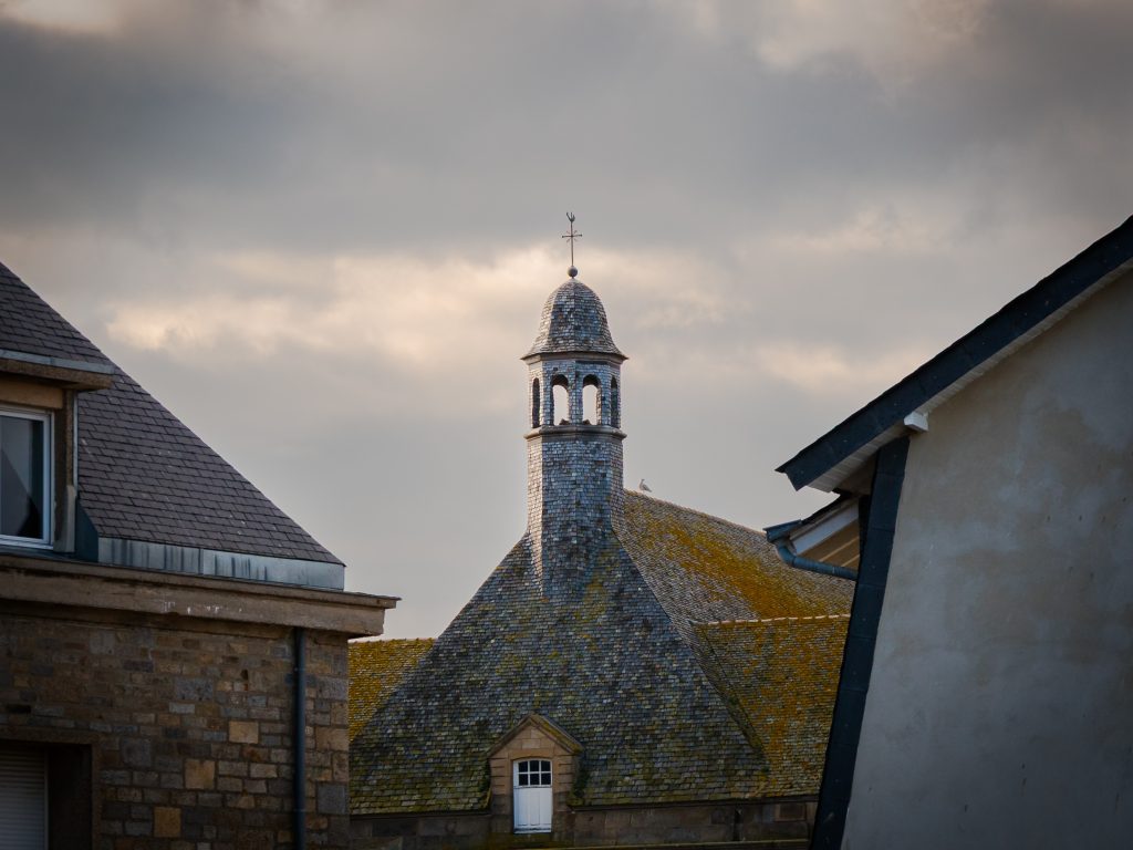
Storm Over the Belfry — Mont Saint-Michel Photography Print
Stone rooftops, a small belfry and a heavy Normandy sky make this a place-specific photograph rather than a generic medieval theme.
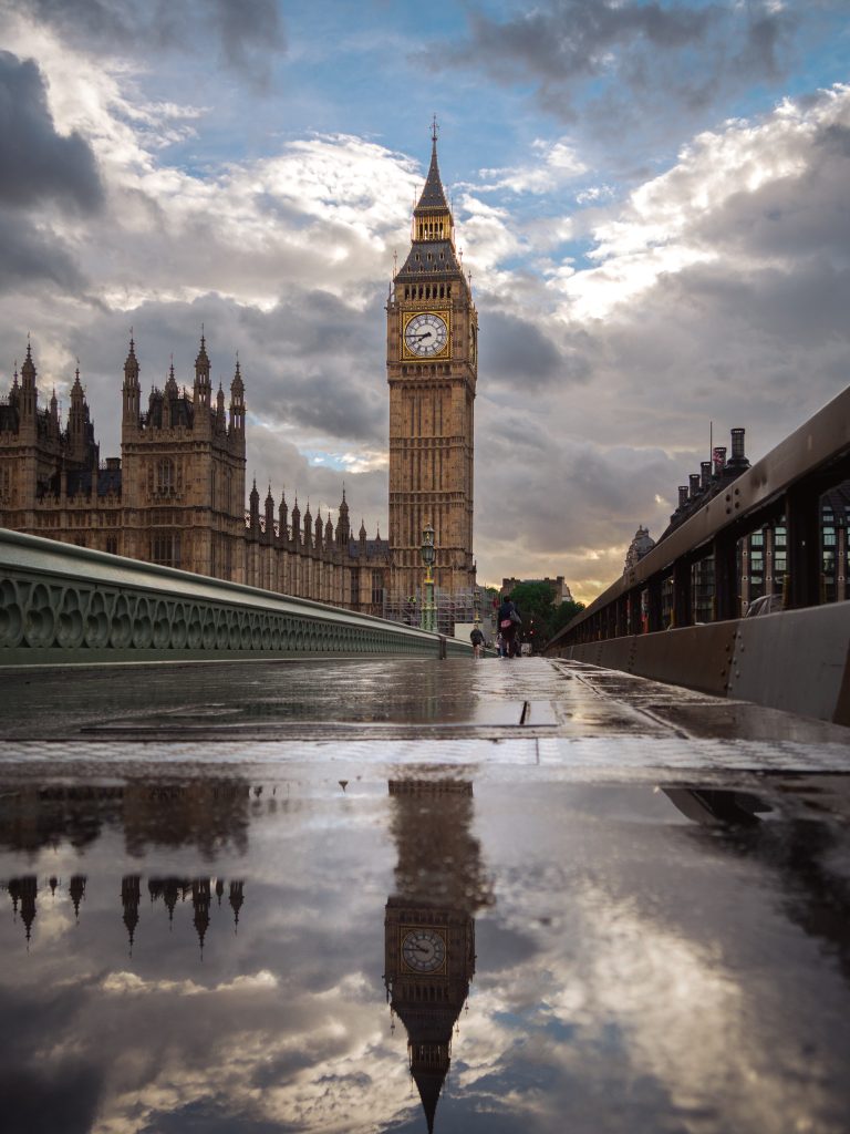
Big Ben After Rain — Westminster Bridge Photography Print
Wet reflections and dramatic cloud turn a familiar landmark into a particular London moment.
For a broader decision sequence, read the guide to choosing photography art for your home before measuring the final position.
Choose the photograph before filling the wall
Compare the image, room and scale slowly. The current collection is available to browse without urgency.