
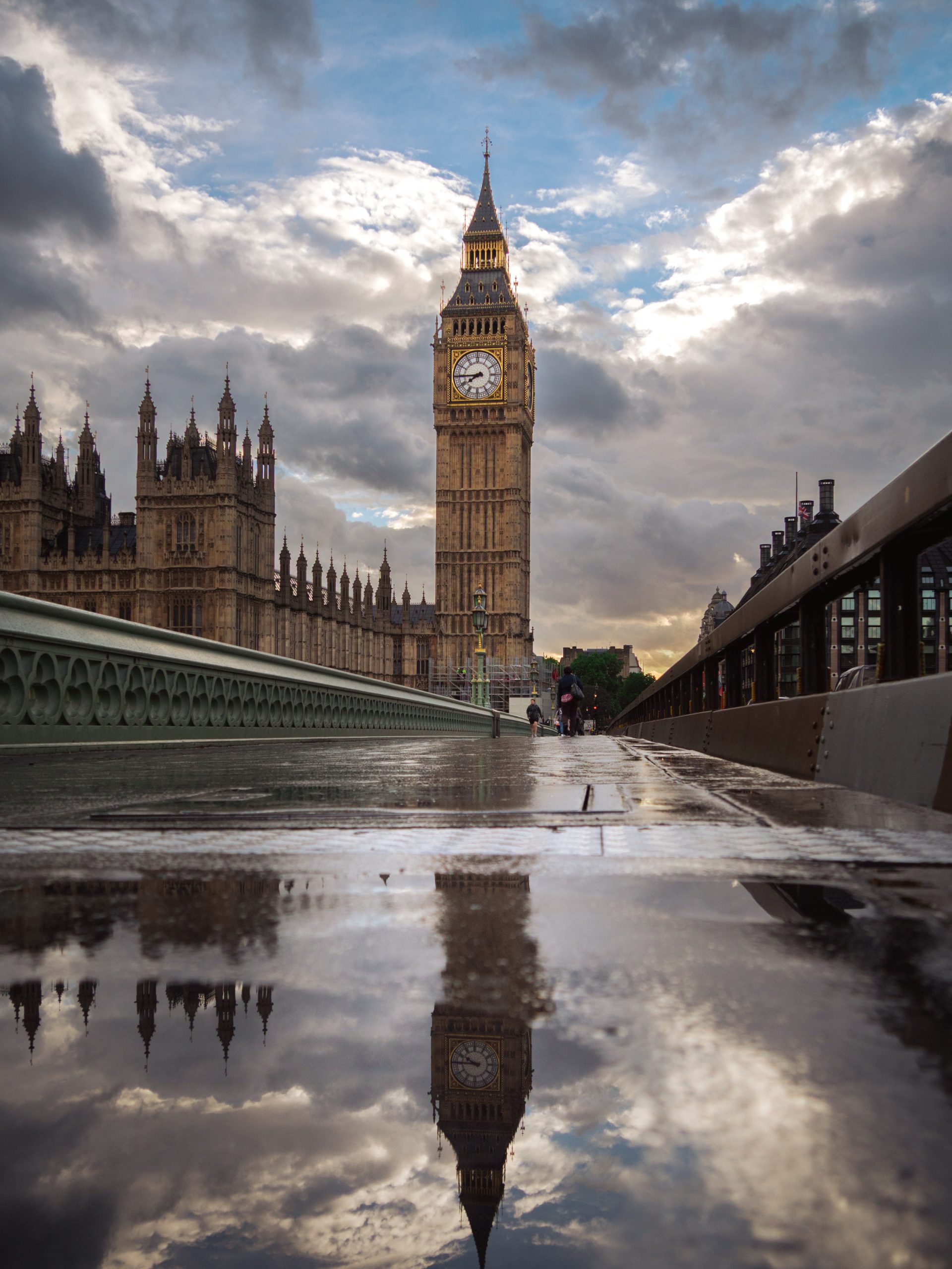
Grey walls can make a room feel calm and settled, but they can also leave it looking flat. The right photography print should add light, warmth or structure rather than simply repeating the paint.
That choice starts with the grey itself. A pale warm grey behaves differently from a blue-grey or deep charcoal. Once you notice that difference, choosing wall art becomes much simpler.
Start with the temperature of the grey
Grey is rarely just grey. Some paints carry beige, taupe or brown underneath. Others lean towards blue, silver or green. Charcoal has more weight again, especially after sunset.
Warm grey
Look for stone, soft blue, muted green and restrained black-and-white photography. Avoid making every element beige.
Cool grey
Add measured warmth through amber windows, evening light, old brick or a pale natural frame.
Charcoal
Choose a photograph with a clear highlight, open sky or pale mount so the image remains readable.
Do not solve a grey room with more grey
A grey photograph on a grey wall can work, but only when there is enough separation. If the print, mount, frame and paint all sit at the same middle tone, the arrangement can lose its edge. The image starts to look like part of the wall rather than a deliberate choice.
Contrast does not need to mean bright colour. It can come from a patch of light, a strong horizon, pale stone or a clean black frame. Even a quiet photograph can hold the wall when its lightest and darkest areas are clear.
The guide to neutral wall art for living rooms goes deeper into this balance. A restrained room still needs variation in texture, tone and distance.
Use warm light to soften cool grey walls
Blue-grey paint often feels clean in daylight but cooler in the evening. Photography made around dusk can help. Amber windows, wet pavements, warm stone and a remaining strip of blue sky introduce warmth without turning the room into a colour scheme.
Keep the warm notes contained. One photograph with a few points of gold or orange usually feels calmer than a print dominated by saturated red. The aim is not to fight the wall. It is to stop the room feeling cold.
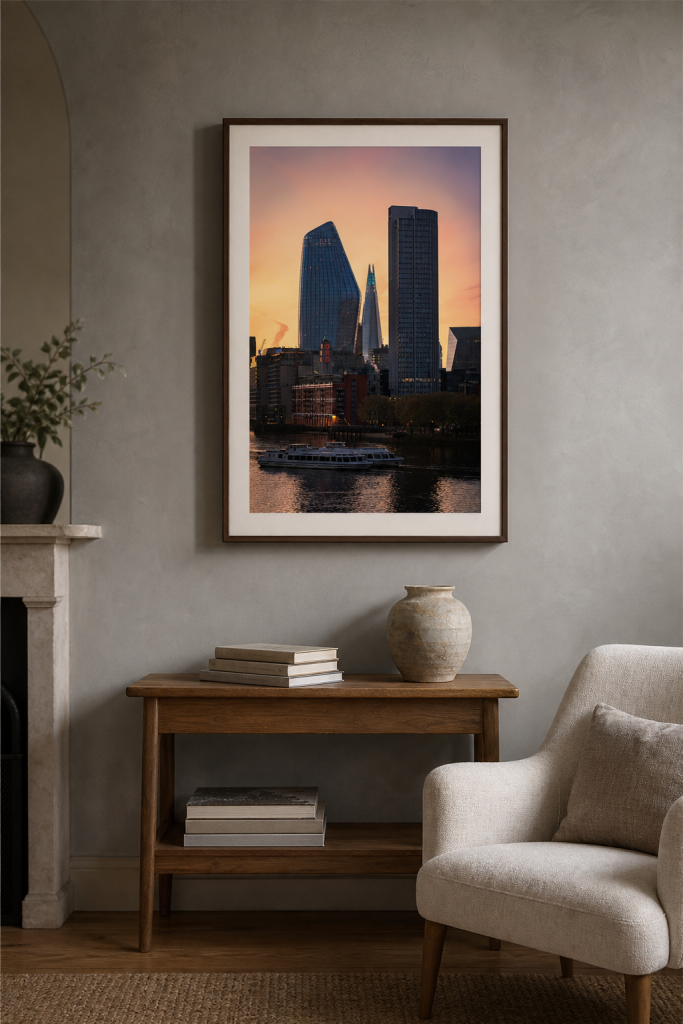
The warmth stays inside the photograph, while the walnut frame and pale mount connect it gently to the room.
Black and white photography can add structure
Monochrome prints are a natural fit for grey walls, but the frame and mount matter. A photograph with a broad tonal range will read more clearly than one made almost entirely from mid-grey. Look for pale sky, bright stone, deep shadow or a strong architectural line.
A warm-white mount creates breathing room between the image and the paint. Light oak can soften the arrangement. A narrow black frame makes the edge more precise. If the room already has black metal, dark lamps or strong window frames, that repeated line can make the print feel connected rather than severe.
For a fuller treatment, see the guide to keeping black-and-white wall art warm in a living room.
Choose the frame after the photograph
It is easy to choose a frame because it matches the furniture. Start with the photograph instead. A dark image may need a pale mount before it reaches a charcoal wall. A warm city photograph may sit comfortably in black because the light inside the image already softens it.
| Grey wall | Photography direction | Frame or mount |
|---|---|---|
| Pale warm grey | Muted landscape, stone or soft monochrome | Light oak or warm white |
| Cool blue-grey | Dusk light, amber windows or warm architecture | Black, walnut or a cream mount |
| Deep charcoal | Open sky, bright water or high tonal separation | Pale mount with a slim dark frame |
Let the room decide how much colour it needs
Look beyond the wall. A grey room with oak, linen and plants may already have enough warmth. In that case, a precise black-and-white print can give it a calm centre. A room with chrome, glass and cool artificial light may benefit from a photograph made at dusk.
Check the choice when you use the room most. Grey paint can look light and soft at midday, then much darker beside a lamp. A print that feels balanced in daylight may disappear in the evening. The answer may be a wider mount or a slightly larger size, not a louder image.
Two photography directions for grey walls
These prints show two useful approaches. One adds contained warmth. The other uses monochrome shape and open skyline to give a grey wall more structure.
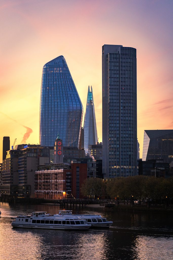
City Glow at Dusk
Small points of warm city light give a cool grey room contrast without making it feel loud.
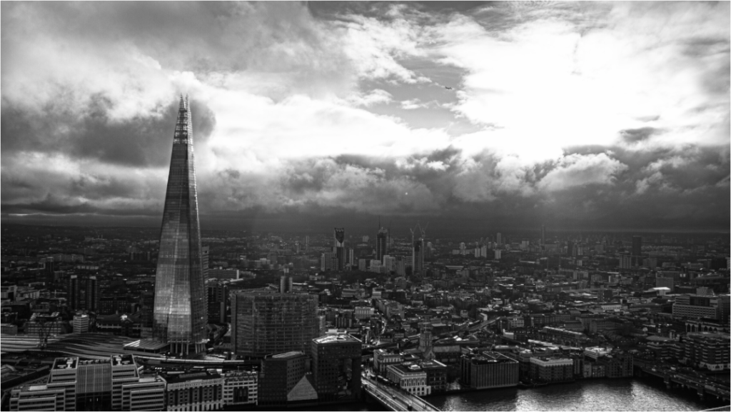
The Shard from Sky Garden
A wide skyline with clear light and dark areas for a warm-grey wall that needs a steady horizontal line.
Explore London photography prints
Browse city photographs with dusk light, quiet structure and enough tonal range to sit clearly against a grey wall.