
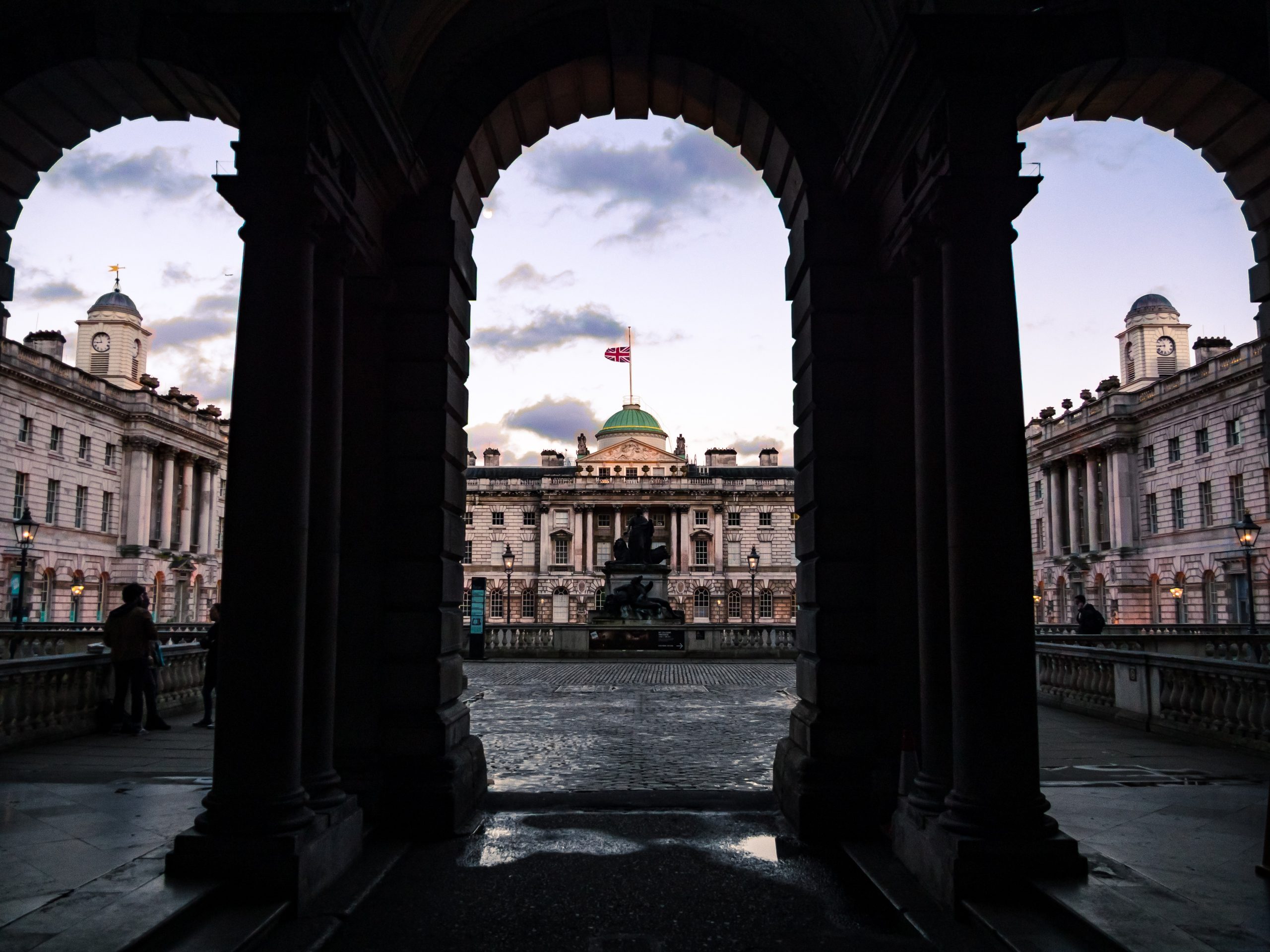
The safest wall art above a fireplace is not always the loudest piece in the room. It is the print that can hold the centre of the wall without fighting the fire, the mantel, the TV, or the furniture around it.
A fireplace already acts like punctuation in a room.
Even when it is not lit, the eye reads it as a centre point. That makes the wall above it feel important. It also makes it easy to overdo.
Too much colour, too much detail, or the wrong shape can make the whole room feel heavier. The print might be beautiful on its own, but above a fireplace it has to do a more specific job. It has to sit still.
For photography prints, that usually means thinking less about decoration and more about balance: shape, distance, tone, and how the image behaves from across the room.
Start with the shape of the fireplace
Before choosing the image, look at the shape underneath it.
A wide mantel often wants a horizontal or gently panoramic print. A narrow chimney breast can take a vertical print, but only if the surrounding wall has enough breathing room. A small fireplace in a larger room usually needs something restrained rather than tiny. Small art above a strong fireplace can look accidental.
If there is a TV above the fireplace, the decision changes. A print may work better on the adjacent wall instead. If the fireplace has a mirror, shelving, candles, or objects on the mantel, the photograph needs to be calmer. The wall already has visual noise.
Choose a print that reads from the sofa
Fireplace art is rarely viewed close up first. Most people see it from the sofa, the doorway, or across the room.
That is why structure matters.
A strong photography print for this position usually has one clear read: an architectural line, a quiet horizon, a calm skyline, a simple block of light, or a subject with enough space around it. If the image only works when you stand close and inspect the detail, it may be better for a hallway, study, or smaller wall.
London architecture can work well here because it brings shape without needing loud colour. A bridge, arch, skyline, or black and white city image can give the wall weight while still feeling grown-up.
Nature prints can work too, especially when the room already has hard edges. A seascape or open landscape softens the fireplace without making the room feel themed.
Be careful with colour near firelight
Warm rooms can make warm prints feel even warmer.
That is not always bad. A dusk skyline above a fireplace can feel natural because the light in the image echoes the room. But orange, red, and strong gold tones need space. If the fireplace surround is brick, terracotta, oak, or brass, a very warm image can start to compete with it.
Black and white photography is often safer above a fireplace because it removes one decision. You are choosing shape, tone, and atmosphere instead of trying to match every colour in the room.
Neutral does not mean bland. It means the print gives the wall presence without shouting at the furniture.
| Room situation | Print direction |
|---|---|
| Traditional fireplace, warm mantel | Black and white architecture, soft skyline, or restrained landscape |
| Modern fireplace, plain wall | Stronger geometry, wide city print, or clean abstract structure |
| Small room | Quiet horizon, negative space, lighter tones |
| Dark room | Prints with visible light, contrast, and clear edges |
Do not hang it too high
The common mistake is treating the empty wall above the fireplace as a full vertical space.
The print does not need to float near the ceiling. It should feel connected to the mantel while still leaving enough air around the frame. If it sits too high, the fireplace and the art become two separate objects. If it sits too low, the wall can feel cramped.
There is no single measurement that works for every fireplace, especially with different mantel heights. But the feeling is simple: the print should belong to the fireplace, not hover above it.
If you are unsure, use paper or masking tape first. Mark the outside size on the wall. Then sit where you normally sit. If the outline feels too small or too high from there, the actual print will feel the same.
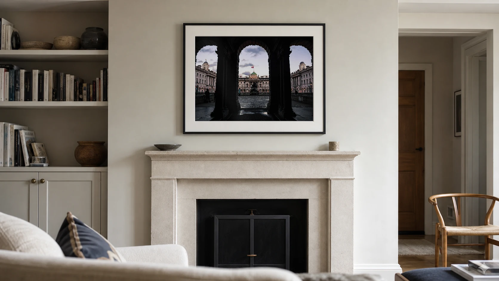
Here, the frame is wide enough to answer the mantel without competing with the stonework. Its lower edge stays visually connected to the fireplace, while the sofa establishes the distance from which the photograph needs to read.
Two Othervariant print directions that work above a fireplace
For this wall, I would usually start with structure or quiet light. One gives the fireplace a clear centre. The other softens it.
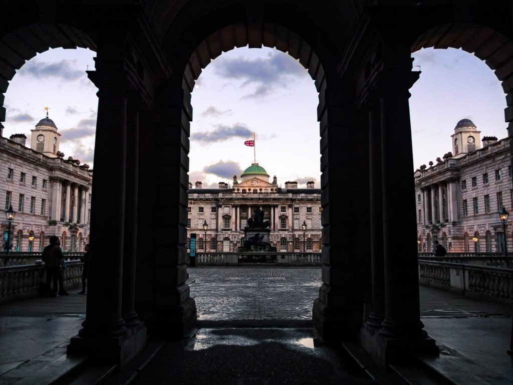
London Arches at Dusk
Structured, calm, and architectural. A good direction when the fireplace needs shape without busy colour.
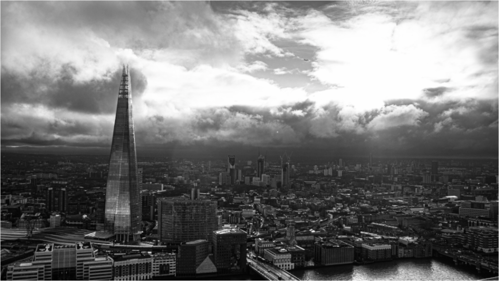
The Shard from Sky Garden
A wider black and white skyline with enough tonal control for a mantel wall, especially in a minimal room.
The print should feel permanent, not loud
Wall art above a fireplace has to live with the room every day.
That is why the best choice is often the one that looks almost too simple at first. A clear skyline. A quiet architectural rhythm. A landscape with air in it. A black and white print that gives the wall structure without asking for attention every time you walk past.
If you want the fireplace to stay the anchor, choose a photograph that respects that. If you want the wall to become the anchor, choose a stronger print, but keep the surrounding mantel simple.
The mistake is trying to make every part of the room important.
Pick one centre. Let the rest breathe.
For mantel walls, start with prints that have strong shape, controlled tone, and enough distance to read from across the room.