
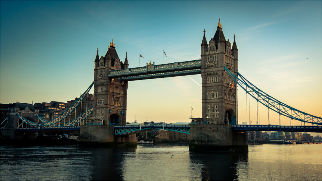
Golden hour photography uses the low, warm light around sunrise or sunset. It can make a familiar place feel softer, deeper and more inviting, which is also why it often works well as wall art.
The phrase sounds more exact than it is. Golden hour is not always a neat sixty-minute window. It changes with season, location, weather and the shape of the horizon.
What matters is the angle of the sun. When it sits low, light travels across the scene rather than falling straight down. Shadows stretch. Stone, glass and water pick up colour. Small details become easier to notice.
Why does golden hour light look different?
At midday, the sun is high and shadows tend to fall beneath objects. Buildings can look flat on one side and very bright on another. In a landscape, pale skies and deep foreground shadows can pull the image apart.
With the sun closer to the horizon, the light arrives from the side. That creates longer shadows and reveals surface detail. Brickwork, clouds, ripples and the edges of a skyline gain more shape.
The light also often appears warmer. Yellows, oranges and reds become more visible as the sun drops. Adobe’s practical guide to golden hour photography describes the same three qualities: softer, directional and warmer light.
None of this guarantees a good photograph. Warm light can still produce an empty composition. It can also become too orange if the edit pushes it too far. The light helps, but the photograph still needs structure.
Golden hour is not the same as sunset
Sunset is a moment. Golden hour is the changing period around it. A photograph made before the sun reaches the horizon may have warm side light and visible detail. A photograph made as the sun disappears may become more graphic, with silhouettes and a brighter band of sky.
After sunset, colour often cools and the scene moves towards blue hour. Street lights start to matter. Reflections become stronger. City photographs can shift from warm and open to cooler and more cinematic within minutes.
This is why two pictures made from the same spot can feel unrelated. The subject has not changed. The balance between natural light, shadow and artificial light has.
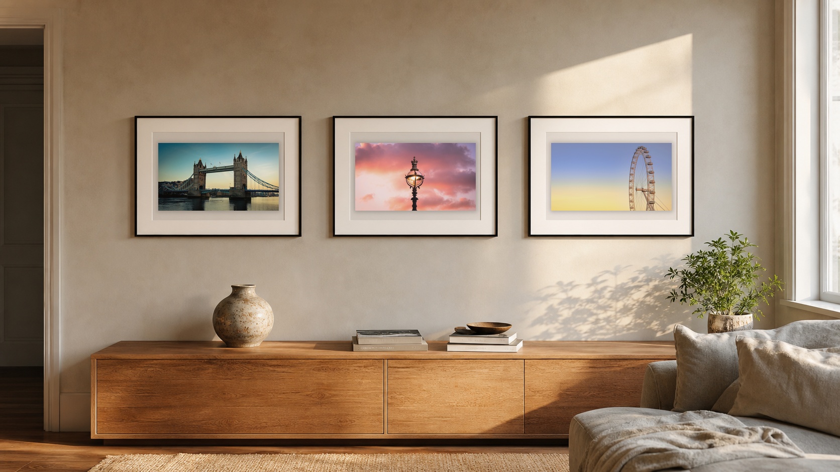
These are different scenes rather than a frame-by-frame record of one sunset. Together, they show the tonal range: balanced gold around Tower Bridge, stronger colour at the horizon, then a paler and quieter twilight. The transition is gradual, but the feeling of the finished print can change sharply.
What does golden hour change in a print?
On a wall, warm light can make photography feel less clinical. Architecture keeps its lines, but the colour gives it a softer edge. A landscape can hold more depth because the shadows separate foreground, middle distance and sky.
More shape
Side light draws out texture and gives buildings, clouds and land clearer form.
More warmth
Gold, amber and muted orange can add a gentle focal point to a neutral room.
More atmosphere
Long shadows and changing sky colour can make a familiar place feel quieter or more dramatic.
A warm print does not need to match every object in the room. In fact, a small amount of amber light can work better when the rest of the space is restrained. The photograph becomes the warm note instead of one more colour competing for attention.
If the room already contains warm wood, brass, cream fabric or soft lighting, golden hour photography can echo those materials. Against a restrained wall, it can add warmth without requiring a bright or heavily saturated image.
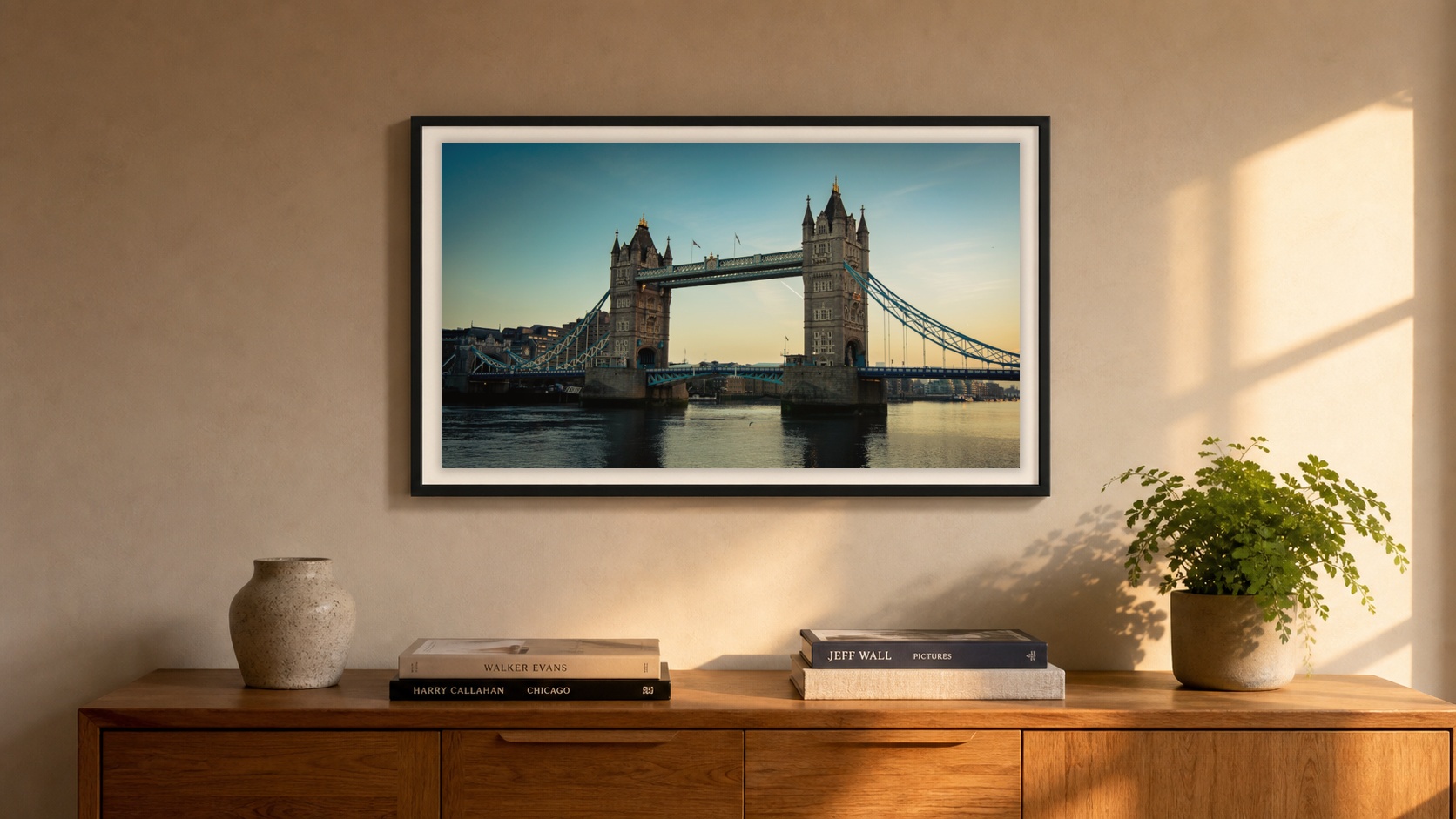
Here, the photograph does not make the entire room orange. Its amber light picks up the timber and evening sunlight, while the blue river and pale mount keep the composition balanced. That contrast is what lets a warm print feel atmospheric rather than overly matched.
How do you choose a golden hour print?
Start with the light, but do not stop there. Check whether the image still works when you look past the colour.
Is there a clear subject? Do the shadows help the composition? Does your eye have somewhere to travel? Would the photograph still hold together if the orange and gold were less intense?
This matters because strong golden hour photographs are not simply photographs of warm skies. The colour should reveal the scene. It should not cover a weak one.
For architecture, look for light that separates the building from the sky or traces its edges. In landscapes, look for layers and a clear path through the frame. The Journal guide to composition in photography explains why that underlying structure matters once an image becomes a print.
Two warm London print directions
Tower Bridge at Golden Hour uses warm morning light across the river and bridge. The symmetry keeps it controlled, so the colour supports the architecture rather than taking over.
Big Ben Under a January Sky is the stronger, more dramatic direction. The dark silhouette and orange sky create more contrast. It suits a wall that needs a clear focal point rather than a background note.
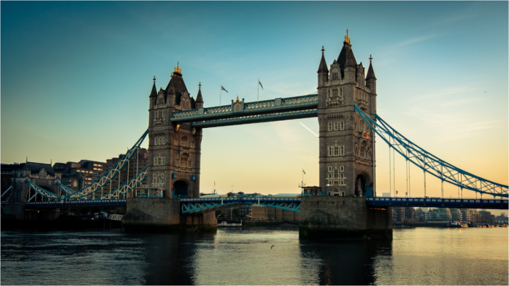
Tower Bridge at Golden Hour
A wide London river view with balanced architecture and soft morning colour.
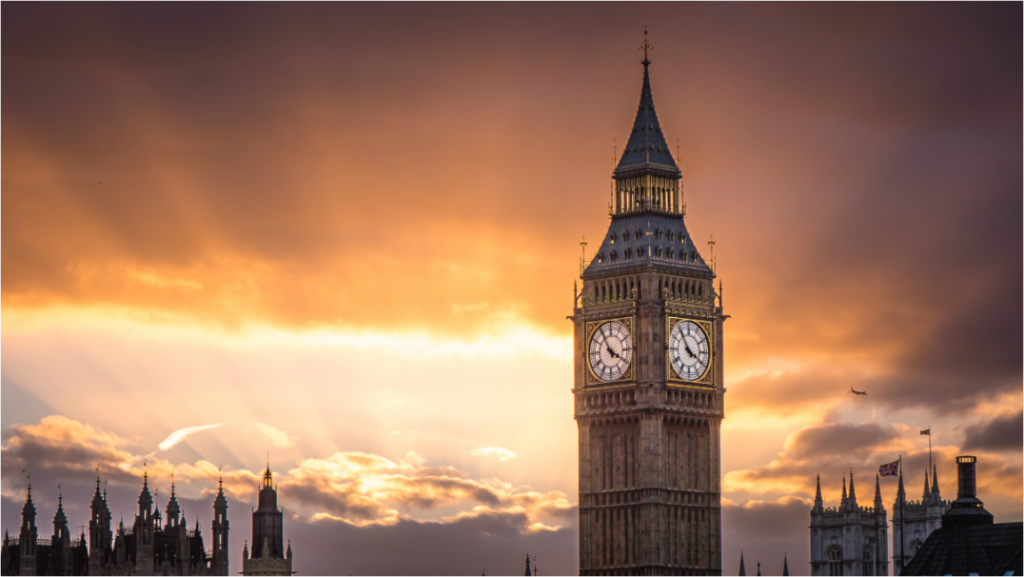
Big Ben Under a January Sky
A darker London silhouette set against a warm, layered winter sky.
Warm light should still feel believable
Golden hour already brings colour into a scene. It rarely needs an aggressive edit. If every shadow turns orange and every cloud becomes red, the photograph can lose the quiet detail that made the light worth waiting for.
The best version usually keeps some restraint. Warm highlights can sit beside cooler shadows. Dark areas can remain dark. The sky can be vivid without becoming the only reason to look.
That balance matters even more in a print than on a phone. A wall gives the image time. Colour that feels exciting for five seconds can become tiring every day. Light with shape, depth and believable warmth tends to last longer.
Look for the light, then check the photograph
Golden hour can make a scene warmer, but composition is what makes it hold the wall. Choose the image that still feels considered after the first glow has worn off.