
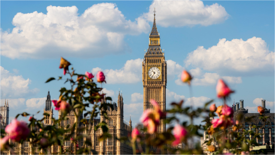
Bokeh is the soft blur that sits outside the sharp part of a photograph. It is one of the reasons some prints feel quiet, layered and easy to live with, even when the subject is a busy city or a familiar landmark.
Most people notice bokeh before they know the word for it.
A portrait with the background melted away. Street lights turning into small circles after rain. Flowers in the foreground becoming colour and shape instead of detail. The subject stays clear. Everything around it softens.
That softness matters in a print. A photograph does not only need to look good on a phone. It has to sit on a wall, across from a sofa or above a desk, without shouting at the room all day.
What does bokeh mean in photography?
Bokeh describes the look of the out-of-focus areas in a photograph. It is not just “blur”. It is the quality of that blur.
Some blur looks nervous and messy. Some looks smooth. Some turns light into hard-edged circles. Some lets the background fall away gently, so the subject has more space to breathe.
That is why photographers talk about good bokeh. They are not saying the whole photo should be out of focus. They are talking about what happens around the sharp part of the image.
Nikon has a useful plain-English explainer on bokeh for beginners if you want the more technical version. The short version is simple: lens choice, aperture, distance and background all affect how the blur looks.
Why bokeh changes the feeling of a print
A sharp photograph can feel calm or harsh. The difference often comes from how much visual noise surrounds the subject.
In a city photograph, there may be railings, signs, cars, windows, people and reflected light. If every part of the frame fights for attention, the print can feel busy. That can work in the right room, but it is not always what you want from wall art.
Bokeh gives the eye somewhere to rest.
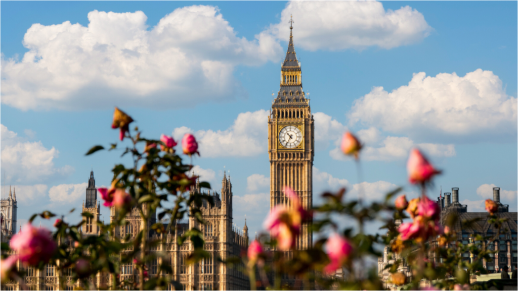
In Big Ben Through the Roses, the London subject is still recognisable. But the surrounding softness changes the image. It becomes less like a postcard and more like a memory of a place. The roses, colour and depth make the print feel warmer than a straight architectural record.
That is the useful part. Bokeh can make a familiar subject feel more personal.
Good bokeh is still controlled
Softness can go wrong quickly.
If too much of the image is blurred, the print may feel vague. If the subject is not sharp enough, the eye has nothing to hold. If the background blur is too bright or chaotic, it can become more distracting than detail.
The best bokeh usually has restraint. It supports the subject rather than replacing it.
Too little separation
The subject and background compete. The image may feel flat or crowded, especially at larger print sizes.
Too much blur
The atmosphere takes over. This can feel soft, but it can also feel empty if there is no strong subject.
Balanced bokeh
The subject stays clear. The background adds mood without demanding too much attention.
Why lights and weather make bokeh stronger
Bokeh becomes more visible when there are small points of light behind or around the subject.
Street lamps. Car headlights. Windows at dusk. Reflections after rain. Sunlight through leaves. These details can turn into soft circles or glowing patches when they fall out of focus.
This is one reason dusk and bad weather often make better city photographs. Clean blue sky is simple, but rain, mist and evening light give the lens more to work with. They create layers.
A print like Solar Drift works differently from a London street image, but the idea is related. It uses softness, colour and gradual transition rather than hard detail everywhere. The result is quieter. More atmospheric. Less demanding.

How to judge bokeh in wall art
You do not need to know lens specs to judge whether bokeh works in a print.
Stand back from the image and ask three questions.
| Question | What to look for |
|---|---|
| Where does my eye go first? | The subject should still be clear enough to anchor the image. |
| Does the blur feel calm or messy? | Soft backgrounds should reduce noise, not create a new distraction. |
| Would I want to live with this feeling every day? | Wall art needs staying power. Mood matters more than novelty. |
For a calm interior, bokeh often works well when you want softness without losing the photograph’s sense of place. It can suit bedrooms, reading corners, hallways and quieter living rooms. It is less useful when you want crisp geometry, strong contrast or a very graphic architectural image.
If you prefer that cleaner look, the London photography prints collection has more structured architecture and skyline work. If you want gentler atmosphere, the nature and coastal prints are usually the better place to start.
Bokeh is a way of removing noise
The point is not to make everything soft.
The point is to decide what deserves attention and what can become mood.
That is why bokeh works so well in certain photography prints. It turns the background into feeling. It lets a landmark, flower, coastline or patch of evening light sit in the room without becoming too literal.
If you are choosing photography for your home, bokeh is worth noticing. Not because it is a technical trick. Because it changes how the image behaves once it leaves the screen and becomes part of the room.
For softer, calmer photography prints, start with the current Othervariant collections and look for images with space, depth and atmosphere.
Prints mentioned in this article
A quick visual reference for the Othervariant prints linked above.
Big Ben Through the Roses
Othervariant london available in multiple sizes and configurations.
Solar Drift
Warm orange sunset photography print by Othervariant, available as a fine art print or framed wall art in panoramic 16:9 sizes.