
Leading lines in photography are lines, edges, shadows, paths, railings, buildings, or repeated shapes that quietly guide your eye through an image. They are one reason some photographs feel calm, intentional, and strong enough to live on a wall.
If you have ever looked at a photograph and felt your eye move naturally from the foreground into the distance, you have probably noticed leading lines before, even if you did not have the language for them. They are one of the quiet tools photographers use to make a flat image feel spatial, structured, and deliberate.
In wall art, that matters. A print is not only judged in the first second. It sits in a room for months or years. Strong leading lines give the image a route. They let the eye enter, pause, travel, and return, which is why architectural, street, bridge, coastal, and landscape photographs often work well as framed prints.
What are leading lines in photography?
Leading lines are compositional elements that guide the viewer’s attention. They can point directly to a subject, such as a road leading to a mountain, or they can create a more general sense of movement, such as shadows drawing the eye upward through a city scene.
They can be obvious, like railway tracks or a pier. They can also be subtle, like the dark edges of a building framing a small area of sky. The important thing is not whether the line is real or imagined. The important thing is whether it gives the photograph direction.
Literal lines
Roads, paths, bridges, railings, stairs, rivers, horizons, and architectural edges.
Implied lines
Shadows, light direction, repeated shapes, rows of windows, eye lines, or the way objects align.
Converging lines
Lines that move toward one point, often creating depth and making the scene feel three-dimensional.
A real example: The Shard framed by shadow
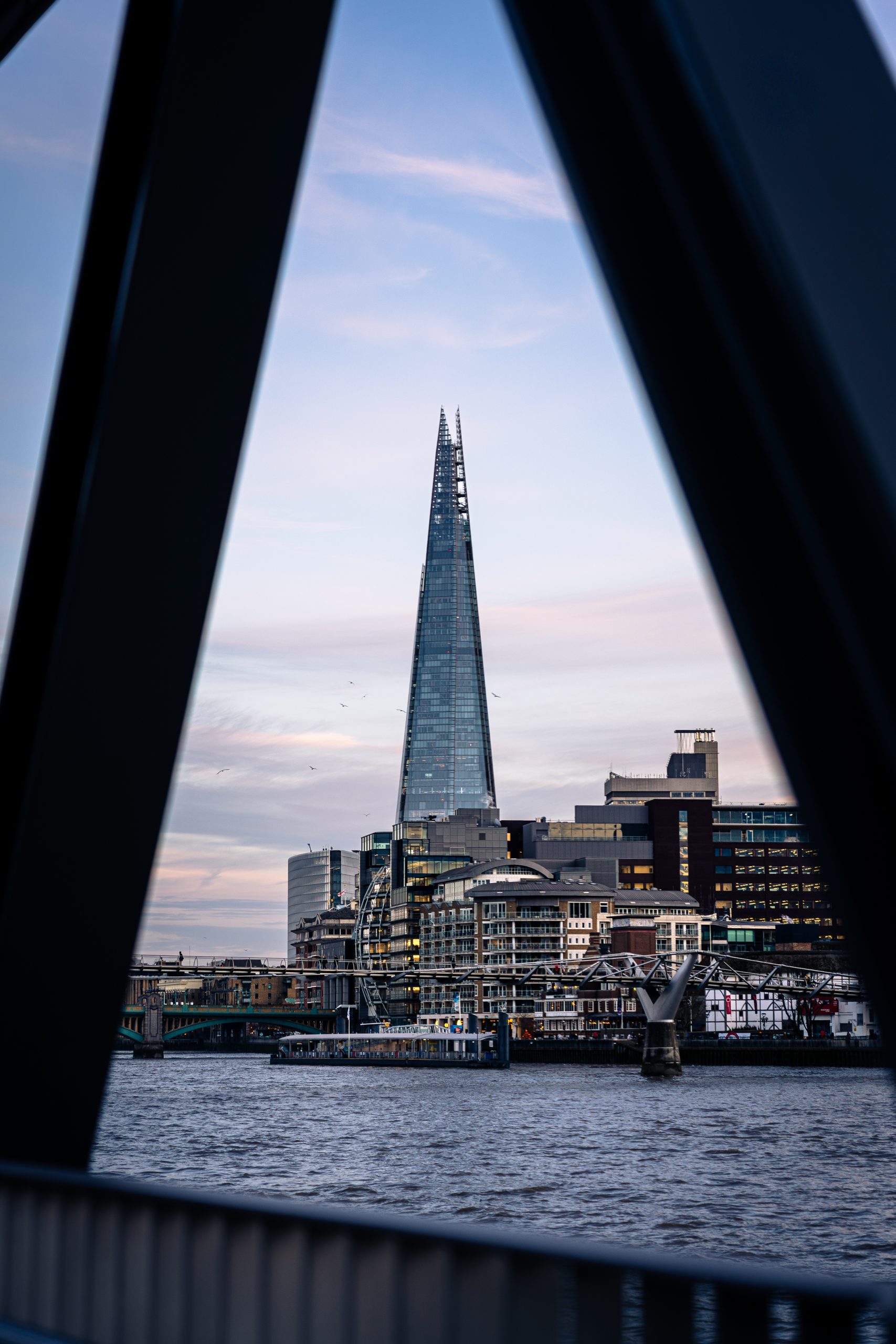
In Shard Between Shadows, the leading lines are not a road or a bridge. They are the dark architectural forms around the edge of the frame. Those strong shapes narrow the space and direct attention toward The Shard and the pale sky beyond it.
This is a good example because the lines do more than point. They create a feeling. The photograph has a quiet tension between weight and lightness: dark foreground structure on either side, then a slim piece of London architecture rising through the middle. The lines make the image feel composed rather than accidental.
That is often what separates a simple record of a place from a photograph that works as wall art. The subject may be recognisable, but the structure is what makes it hold together from across a room.
Why leading lines make prints feel stronger
A print with strong leading lines usually feels more settled because the eye knows where to go. There is a visual path instead of visual noise. This does not mean the image has to be loud, symmetrical, or perfectly balanced. Some of the best leading lines are understated.
For interiors, this can be useful. A photograph with directional structure can add quiet energy to a hallway, desk area, reading corner, or living room wall without needing bright colours or an obvious landmark. It gives the room movement, but not clutter.
| Type of leading line | How it feels in a print | Where it often works well |
|---|---|---|
| Architectural edges | Structured, clean, graphic | Home offices, hallways, modern rooms |
| Roads, paths, bridges | Open, journey-like, inviting | Living rooms, stairways, larger walls |
| Shadows and light | Atmospheric, quiet, cinematic | Bedrooms, reading corners, calm spaces |
| Repeating arches or columns | Rhythmic, symmetrical, classic | Dining rooms, corridors, architectural interiors |
How to spot leading lines when choosing wall art
A simple test is to ask where your eye enters the photograph and where it travels next. If the image has strong leading lines, you will usually feel a natural route through it. You may start at the bottom edge of a bridge, move along the railing, then arrive at the skyline. Or you may start in a dark foreground shape and be pulled toward a small area of light.
Another useful test is to look at the photograph from a distance. On a wall, you will not always inspect every detail. Strong composition needs to survive from across the room. Leading lines help because they create a shape you can read before you notice the smaller textures.
The best leading lines do not shout for attention. They make the photograph feel inevitable, as if everything in the frame is quietly pointing in the right direction.
Do leading lines always need a clear subject?
No. Many beginner examples show a path leading to a person, mountain, or building, but leading lines can also create mood without a single obvious subject. In abstract architecture photography, the lines themselves may be the main event. In landscape photography, a coastline or river might simply pull the eye through layers of space.
This is especially relevant for prints. A wall print does not always need to explain itself instantly. Sometimes the value is in the way it shapes the room: a diagonal line adding movement, a vertical line adding height, or repeated shadows adding rhythm.
Final thought
Leading lines are one of the easiest composition ideas to understand, but one of the hardest to use with taste. When they are too obvious, a photograph can feel like a tutorial. When they are handled quietly, they give the image strength without making it feel forced.
That is why they are worth noticing when choosing photography for your walls. They help a print feel intentional. They guide the eye. And in the best cases, they make a still image feel like it has somewhere to go.
For a quiet architectural example of leading lines, view Shard Between Shadows, or browse the wider London photography prints collection.
Print mentioned in this article
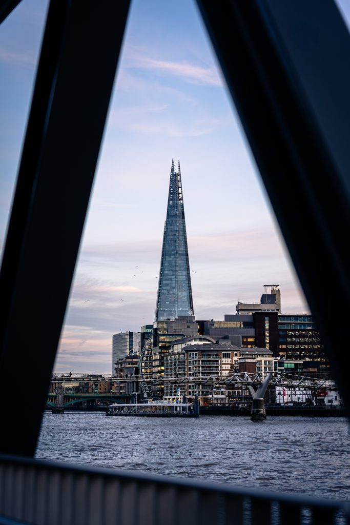
A quick visual reference for the Othervariant print linked above.
Shard Between Shadows
A minimal Shard architecture print, with London’s tallest building framed by dark structural shadows, pale evening sky and clean negative space.