
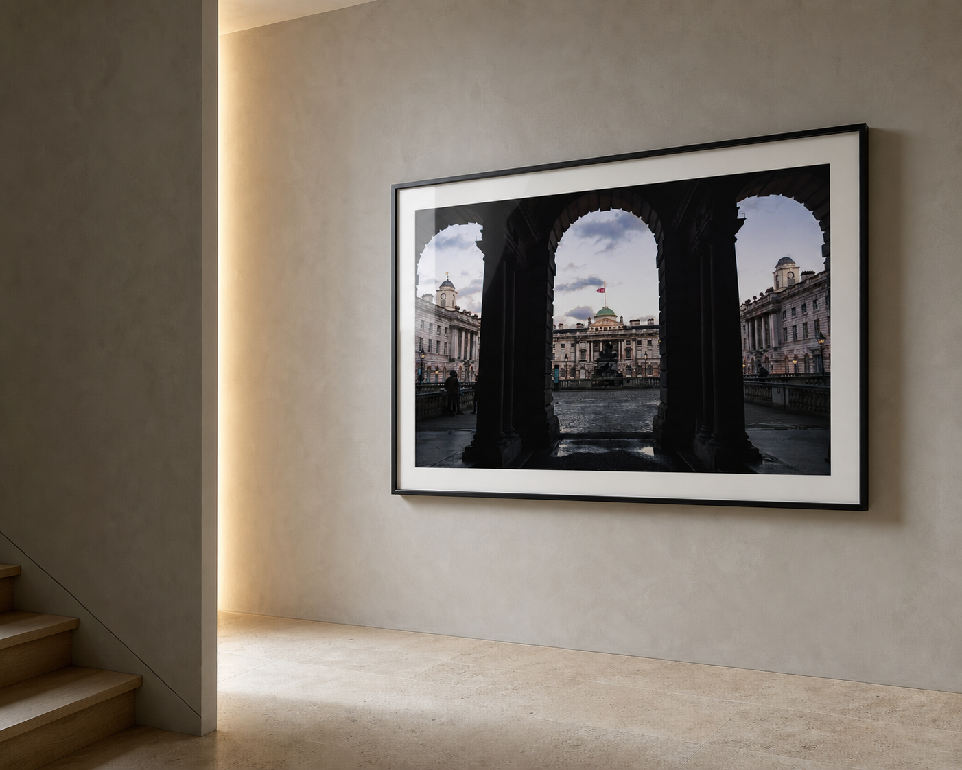
Staircase wall art has a harder job than most rooms. It has to work while you are moving past it, from below, from above, and often in awkward light.
A staircase is not a normal wall.
In a living room, you usually see a print from one main position. Sofa to wall. Chair to wall. Doorway to wall. The relationship is fairly steady.
On a staircase, the view keeps changing. You see the print from the bottom step, halfway up, from the landing, and sometimes from the hallway below. That changes what works.
This is why some wall art looks fine in a product photo but feels messy on the stairs. The image may be too detailed. The frame may be too small. The spacing may fight the angle of the stairs. Or the whole wall may start to feel like a noticeboard instead of part of the home.
Good staircase wall art usually does one thing well: it gives the eye a clear path.
Simple rule: choose photography that still reads from a few metres away. Strong lines, calm contrast, and clear structure usually work better than busy detail on a staircase.
Start with the shape of the staircase
Before choosing the print, look at the wall itself.
A straight staircase often suits one strong vertical or horizontal piece, depending on the wall height and landing. A turning staircase can handle a smaller group of prints, but only if the spacing is controlled. A narrow staircase usually needs quieter images because you are closer to the wall.
The mistake is treating the stair wall like spare space.
It is not spare space. It is a transition. People move through it. So the artwork should guide the movement, not interrupt it.
Choose images with structure
Architecture photography works well on staircases because it often has built-in direction. Arches, bridges, columns, streets, windows, and skylines give the eye something to follow.
A print like London Arches at Dusk suits this kind of space because the repeated shapes create depth. You do not need to stand still and study every detail. The image has a clear rhythm even as you pass it.
That matters on stairs.
If the photograph only works when viewed slowly and closely, it may be better in a bedroom, office, or reading corner. Staircase art needs to hold together at a glance.
One large print or a small gallery wall?
Both can work. They create different feelings.
One larger print
Cleaner. Quieter. Better for narrow staircases, modern hallways, and homes where the wall already has strong angles. A single London architecture print can make the space feel deliberate without adding clutter.
A small gallery wall
More personal. Better for wider staircases and landings. Keep the frames related by colour, subject, or print style so the wall feels collected, not random.
If you choose a gallery wall, resist the urge to fill every gap. The stairs already create movement. Too many small frames can make the wall feel nervous.
Three to five strong pieces often look better than twelve weak ones.
Follow the stair angle, but do not become a slave to it
Staircase gallery walls often look best when the centre line of the frames loosely follows the rise of the stairs. Not perfectly. Just enough that the wall feels connected to the architecture.
The centre of each frame can step upward with the stairs. Keep the spacing consistent. Use paper templates before making holes. Stand at the bottom and the landing before deciding.
For a single large print, the rule is simpler. Hang it where it feels visually anchored from the main approach. That might be the lower wall, the turn, or the landing. The best position is usually the one people see first, not the mathematical centre of the entire wall.
If you want a more detailed placement guide, the Journal piece on how high to hang photography wall art covers the eye-level rule and when to ignore it.
Use contrast carefully
Staircases often have difficult light. Some are bright at the top and dim at the bottom. Some have no natural light at all. Some catch glare from a window on the landing.
That changes the print choice.
Black and white photography can work beautifully in these spaces because it does not rely on subtle colour. A structured print like Symmetry & Stone has enough contrast to hold its shape in lower light, while still feeling calm.
Colour can work too, especially if the staircase is plain. A dusk city print or warm architectural image can stop the space feeling cold. Just avoid colours that fight with carpets, runners, bannisters, or painted walls.
Think about what the staircase connects
A staircase usually sits between two moods.
Hallway to bedroom. Living room to landing. Front door to the rest of the home.
The art can help bridge those moods. A strong London print can make the entrance feel sharper. A quieter black and white photograph can soften the move upstairs. A landscape can calm a busy hallway before the bedroom area begins.
This is the part people often miss. The question is not only “does this print fit the wall?” It is also “does this print fit the journey through the house?”
| Staircase type | Print direction | What to avoid |
|---|---|---|
| Narrow staircase | One calm, structured print | Lots of tiny frames |
| Wide staircase | Three to five related prints | Random sizes with no rhythm |
| Dark staircase | Clear contrast or lighter tones | Very dark images behind reflective glass |
| Landing wall | One stronger focal print | Artwork hung too high to read |
Choose fewer, better pieces
A staircase does not need to become a full family archive or a mini gallery. It can, but it does not have to.
For a calmer home, fewer pieces usually feel more expensive. One strong architecture print. A pair of related black and white images. A small sequence of London photographs with similar tones.
The wall should feel intentional before it feels full.
If the rest of the home already has a lot going on, keep the staircase simple. If the hallway is very plain, the staircase can take a stronger image. The right answer depends less on the trend and more on the room around it.
Prints mentioned in this article
A quick visual reference for the Othervariant prints linked above.
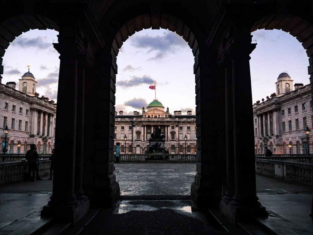
London Arches at Dusk
A landscape London architecture print framed by dark archways at dusk, with wet stone, classical buildings and evening light after rain.
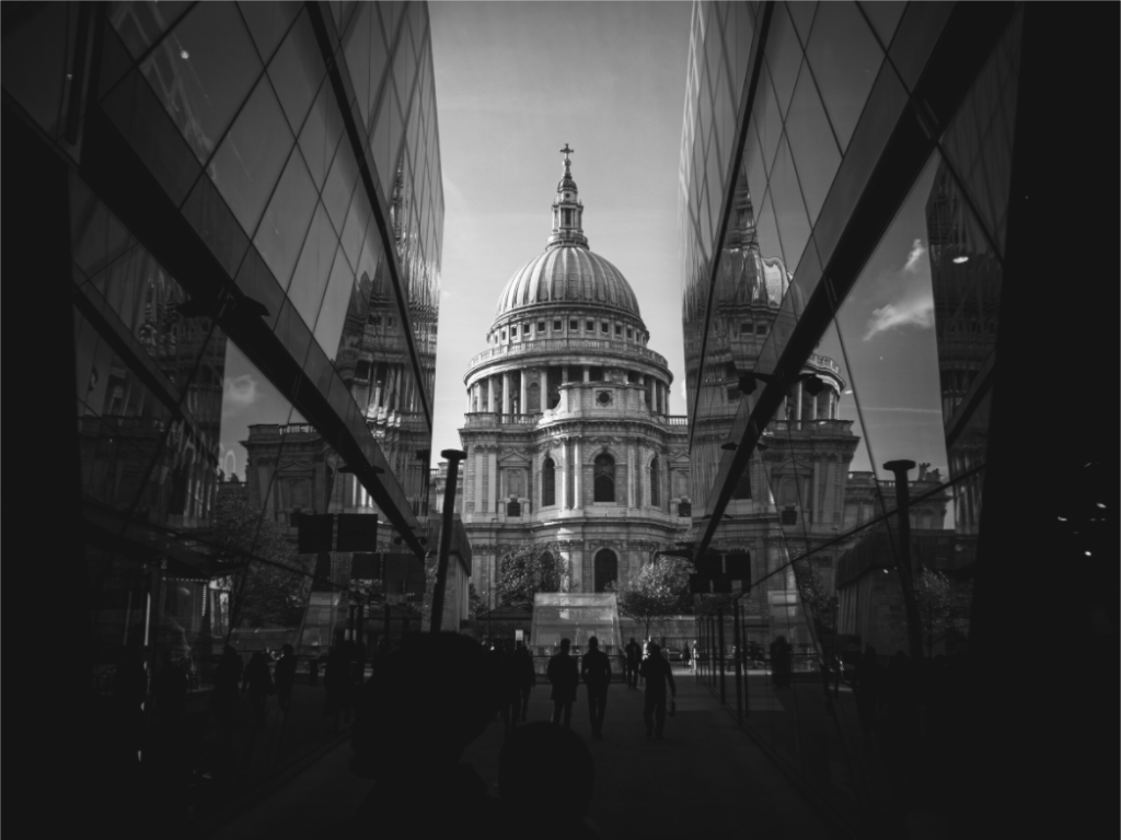
Symmetry & Stone
Othervariant black and white, london available in multiple sizes and configurations.
Looking for staircase wall art with structure?
Start with the London photography prints for architectural lines, dusk light, bridges, arches, and city shapes that hold up well in transitional spaces.