
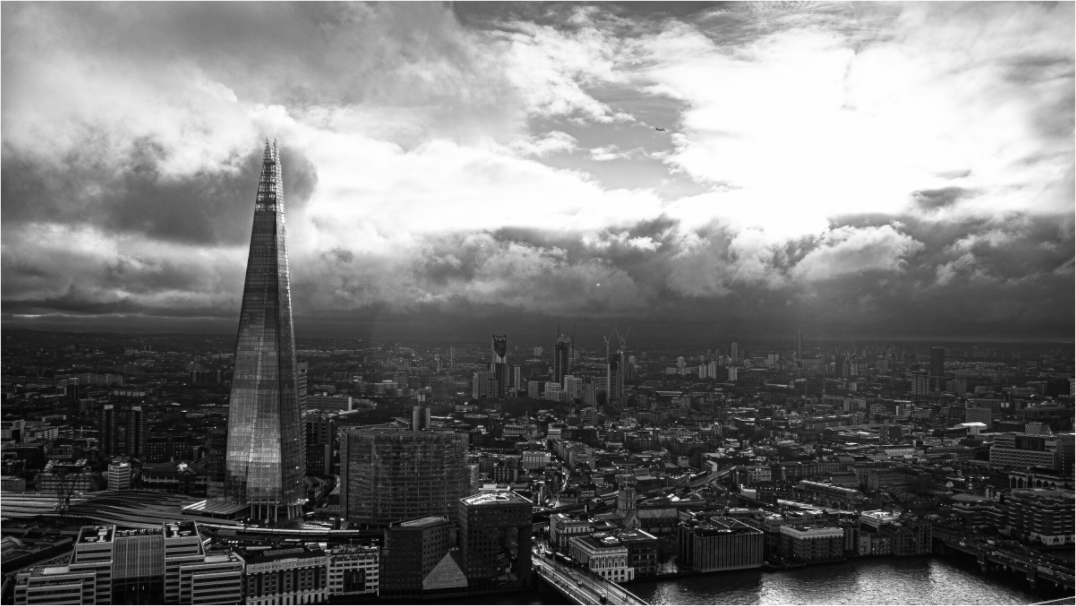
Choosing living room wall art is less about filling an empty space and more about deciding what kind of room you want to live with. The right photograph should give the room structure, mood, and a point of quiet attention without making the wall feel over-decorated.
If you are searching for how to choose living room wall art, the usual advice is often too simple: match the colours, pick the right size, and hang it above the sofa. Those things matter, but they are not enough. A good print also needs to feel like it belongs to the pace of the room.
A living room is not a corridor or a hotel lobby. It is where you sit, read, talk, watch the weather change, and leave things slightly unfinished. The art has to work in that slower rhythm. It should hold attention when you look at it, but it should also be comfortable when you are not looking directly at it.
Start with the feeling of the room, not the colour palette
Colour matching can help, but it is a weak starting point. A photograph can match the cushions and still feel wrong. Before choosing a print, decide what the wall needs to do emotionally.
If the room already feels busy
Look for calmer photographs: open skies, simple architecture, negative space, quiet water, or black and white prints with clean structure.
If the room feels flat
Choose an image with depth, contrast, shadow, or a strong line. London architecture prints can work well because the geometry gives the room a visual anchor.
If the room feels too styled
A less perfect photograph can help. Weather, grain, movement, or a human trace can make a polished room feel lived in.
This is why photography often works better than generic abstract decor. A photograph has a place, a moment, and a point of view. Even when the image is minimal, it carries a little bit of the outside world into the room.
Choose a size that relates to the furniture
Size is the most common place people go too small. A small print can be beautiful, but above a sofa, sideboard, or fireplace it often looks accidental unless it is part of a group.
As a simple rule, wall art above furniture usually feels more settled when it is around half to two-thirds of the furniture width. It does not need to be exact. The point is proportion. A print should feel connected to what sits below it, not like it is floating on the wall by itself.
If you want a more detailed sizing guide, read how to choose the right photography print size for a living room. For this article, the main point is simple: choose the print as part of the room, not as an isolated object.
Use black and white when the room needs calm structure
Black and white photography is often a strong choice for living room wall art because it removes one layer of decision-making. Instead of competing with fabrics, rugs, books, plants, and lamps, the image works through light, shape, shadow, and texture.
That does not make it neutral or bland. A good black and white print can still be dramatic. The difference is that the drama comes from structure rather than colour. A skyline, cathedral, bridge, or street scene can become quieter and more architectural when colour is removed.
If your room already has warm wood, patterned textiles, or several accent colours, start with the black and white photography prints. They are often easier to live with for years because they do not depend on a temporary colour scheme.
Use city photography when the wall needs a stronger anchor
Some rooms need calm. Others need definition. A living room with pale walls, simple furniture, and soft textures can sometimes feel unfinished without a stronger focal point.
This is where architectural photography works well. Bridges, towers, stations, and skyline forms bring verticals, diagonals, and repetition into the room. The image does not need to be loud. It just needs enough structure to give the wall confidence.
For example, a print such as Tower Bridge Steel works because the subject is recognisable, but the appeal is not only the landmark. The steel, shadow, and line make it feel graphic. A London skyline print such as The Shard from Sky Garden works differently: more open, more panoramic, and better suited to a long wall or a sofa-width composition.
Browse the London photography prints if the room needs place, structure, or a stronger city mood.
Use landscape or coastal prints when the room needs distance
Not every room needs architecture. Some living rooms benefit from a feeling of air: water, cliffs, mountains, sky, or an open horizon. These images can make a room feel less enclosed, especially in smaller homes or flats where the view outside is limited.
Landscape photography works best when it does not become visual wallpaper. Look for a clear horizon, a strong weather mood, or one simple movement through the frame. The print should give the eye somewhere to rest, not just another surface to process.
If you want the room to feel slower, softer, or more open, start with the nature photography prints.
One large print or a small group?
A single large print is usually the cleaner choice. It gives the room one point of attention and avoids the problem of too many small frames competing with one another. This works especially well above a sofa, bed, or dining bench.
A pair or small group can work when the images share a visual language. They do not need to be identical, but they should agree with each other. Similar tones, subject matter, horizon height, or framing style will make the group feel intentional.
| Room situation | Best starting point |
|---|---|
| Large blank wall above sofa | One statement print or a calm panoramic photograph |
| Small reading corner | One quieter vertical print with texture or shadow |
| Minimal room with little contrast | Black and white architecture or a stronger city image |
| Busy room with many colours | Simple monochrome, open landscape, or negative space |
Avoid art that only works online
Some images look good as small rectangles on a phone but lose their strength as wall art. They may rely on a tiny detail, heavy editing, or a colour effect that feels exciting for a few seconds and tiring after a week.
Before choosing a print, ask whether the image still works from across the room. Is there a clear shape? Does the mood survive when you are not studying it closely? Would it still feel right in winter light, evening light, and on a normal untidy day?
The best living room wall art does not need to impress instantly. It needs to last.
Final rule: choose the print you want to keep noticing
A living room print should not be chosen only to match the room today. Furniture changes. Cushions change. Paint colours change. A good photograph has enough independence to survive those changes.
Choose something you want to keep noticing: a line, a piece of weather, a city shape, a quiet horizon, a small imperfection, or a feeling you cannot quite reduce to decor language. That is usually the difference between wall filler and a print that becomes part of the room.
Find a quieter print for your living room
Explore fine art photography prints for calm interiors, London walls, black and white rooms, and landscape-led spaces.
Prints mentioned in this article
A quick visual reference for the Othervariant prints linked above.
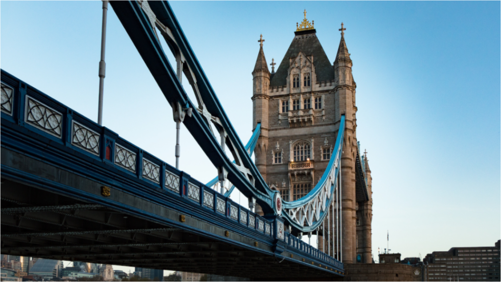
Tower Bridge Steel
Othervariant london available in multiple sizes and configurations.
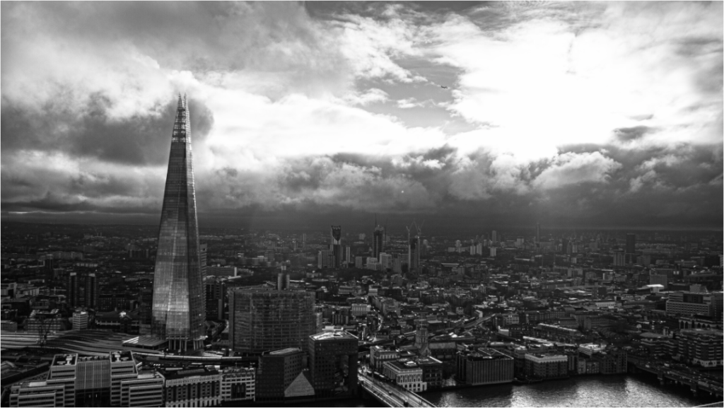
The Shard from Sky Garden
Othervariant london available in multiple sizes and configurations.