
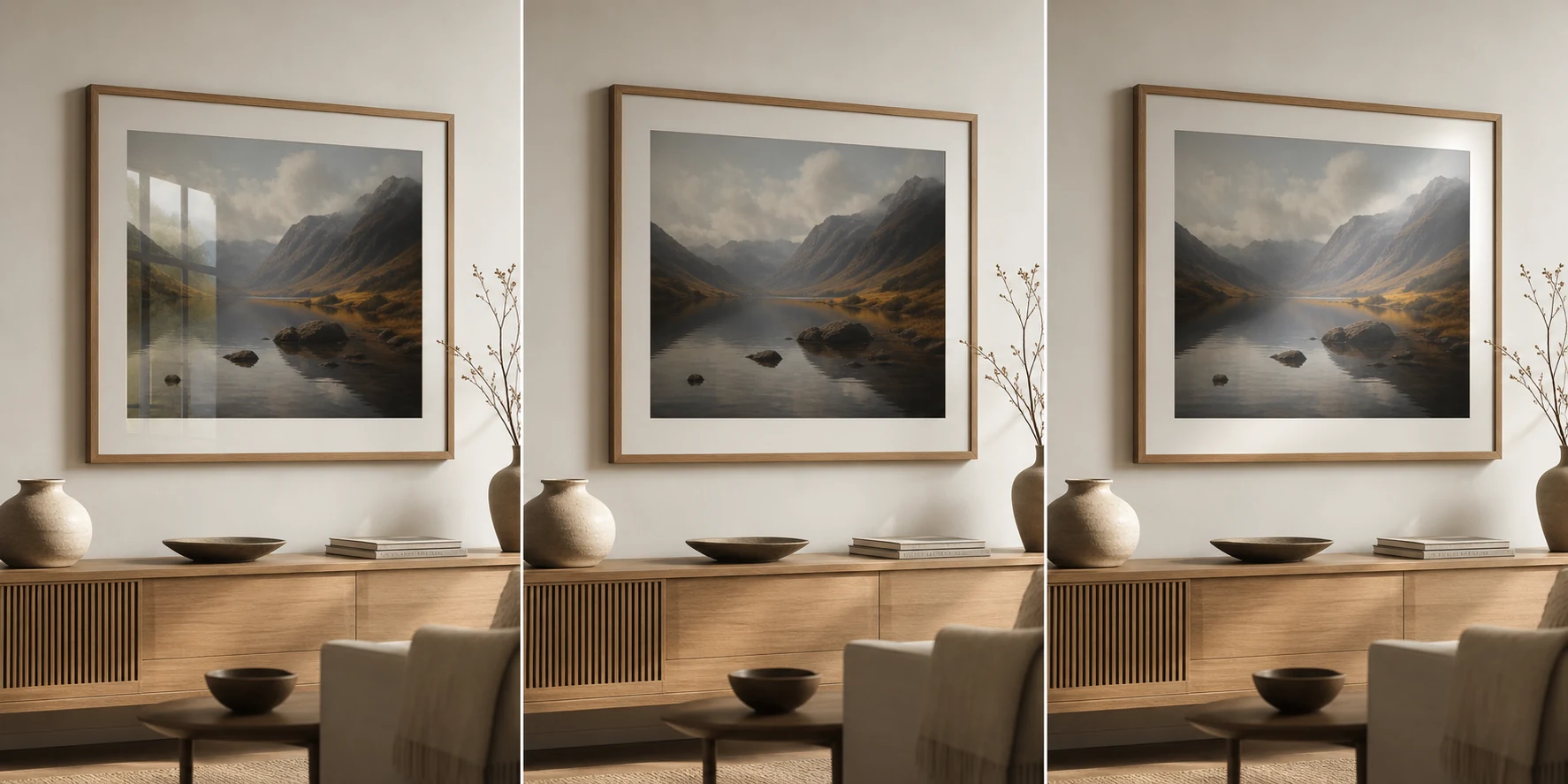
Photo paper is not just a finish. It changes how the print handles light, contrast, fingerprints and the mood of the room.
Glossy photo paper
Glossy paper can make colour and contrast feel punchy. It is often what people imagine when they think of a classic photo print. The tradeoff is reflection. In a bright room, glossy prints can catch window glare and become harder to view from some angles.
Matte photo paper
Matte paper is quieter. It does not shout for attention in the same way. It can work beautifully for black and white photography, soft landscapes, muted interiors and rooms where you want the print to feel integrated rather than shiny.
Lustre photo paper
Lustre is the practical middle ground. It has a gentle sheen and usually holds contrast better than a very flat matte surface, but it avoids the strongest glare of glossy paper. Many people choose it when they want a print to feel polished without looking plastic.
| Finish | Best for | Watch out for |
|---|---|---|
| Glossy | Strong colour, punchy contrast | Glare and fingerprints |
| Matte | Calm rooms, black and white, soft landscapes | Can feel less contrasty |
| Lustre | Balanced wall art | Less dramatic than glossy or matte |
Which should you choose for wall art?
For framed photography in a living room, bedroom or office, matte and lustre are usually safer than high gloss. They behave better in changing light and tend to feel more premium on the wall.
Browse photography prints with a quieter finish in mind
A good print should feel considered before anyone notices the technical choices behind it.