
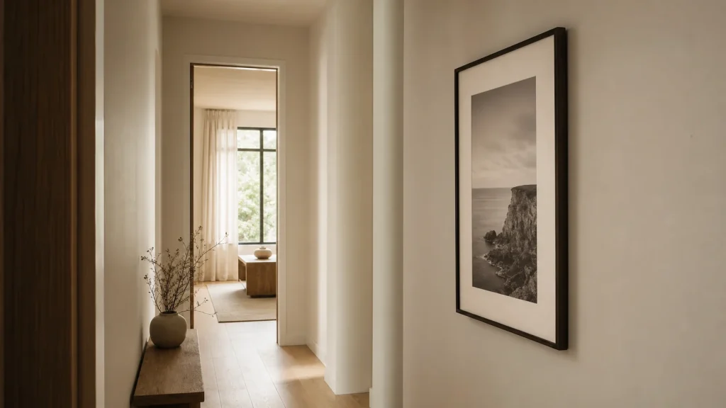
Hallways are awkward places for art. They are narrow, often darker than the rest of the home, and usually seen in motion. That makes the right photography print useful. It can give a passing space a point of focus without making it feel busy.
Why hallway wall art is different
A living room gives a print space to breathe. A hallway does not. You usually see it from an angle, while walking, in changing light. That changes the job of the image.
The print does not need to dominate the whole home. It needs to create a pause. A good hallway photograph gives the eye something simple to understand: a bridge, a skyline, a cathedral, a horizon, a clean line of architecture, or a single stretch of light.
This is why very busy images often feel weaker in hallways. They may be beautiful up close, but they lose their shape from a few metres away. A stronger hallway print holds together from a distance first, then rewards closer looking afterwards.
Start with the width of the wall
Hallways often make people choose art that is too small. A tiny print can look apologetic, especially above a console table or on a long blank run of wall.
As a simple guide, the artwork should feel related to the wall or furniture beneath it. It does not need to cover the whole space, but it should not look like it was placed there because there was nowhere else for it to go.
If the hallway is narrow, a single medium or large framed print is usually calmer than a cluttered gallery wall. If the hallway is long, a pair or small sequence can work, but keep the mood consistent. Different images can still belong together if they share tone, subject, or framing.
For narrow hallways
Look for clean lines, vertical energy, and strong contrast. Architecture works well because the structure is easy to read while you move past it.
For darker hallways
Use images with clear highlights or a lighter central subject. Black and white can work beautifully if the print has enough separation between light and shadow.
For calm homes
Choose fewer details. A horizon, quiet water, soft sky, or restrained London scene can make the space feel more considered without shouting.
Choose a photograph that reads quickly
Hallway art is rarely studied for five minutes. Most of the time, it is seen in passing. That does not make it less important. It just means the first read matters.
A strong hallway photograph usually has one of three things: a clear subject, a strong silhouette, or a simple path for the eye to follow. Tower Bridge Steel works because the structure is immediate. You recognise the weight of the bridge before you start noticing the smaller details.
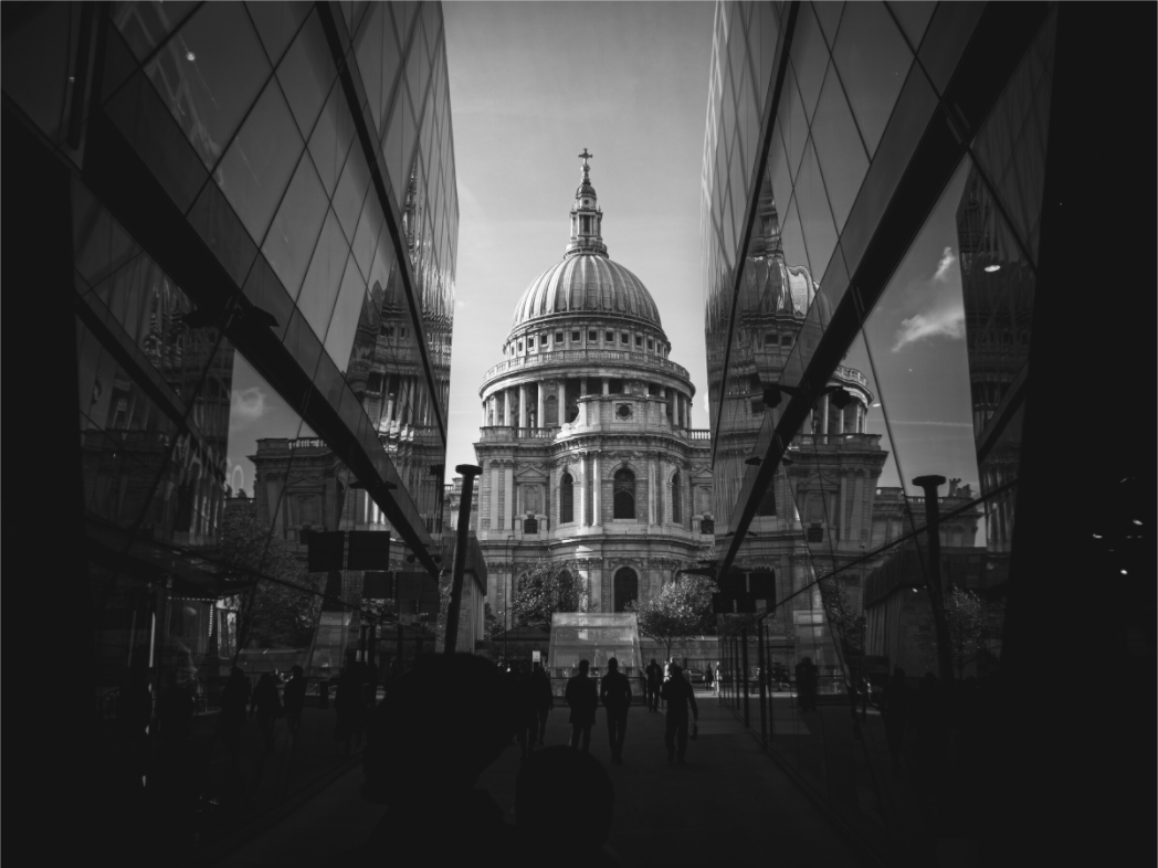
The same applies to quieter black and white architecture. Symmetry & Stone has a central form, strong tonal separation, and a calm sense of order. That kind of image suits a transitional space because it does not demand too much from the room.
Black and white can make a hallway feel more settled
Colour is not wrong for hallways. But colour adds another decision: does the print work with the floor, walls, doors, lighting, and the rooms on either side?
Black and white photography removes some of that friction. It lets the image lean on shape, light, texture, and atmosphere. In a hallway, that can feel more settled than a print fighting the existing palette.
This is especially useful in homes with neutral walls, dark flooring, or mixed materials. A black and white London print can feel architectural rather than decorative. It becomes part of the rhythm of the house, not an extra colour problem to solve.
If the hallway already feels cold, choose black and white carefully. Look for warmth in the subject: stone, old streets, evening light, or a slightly softer sky. Monochrome does not have to mean harsh.
Match the subject to the feeling of arrival
A hallway is often the first or last space you see. That gives the artwork a quiet role. It can set the tone before someone reaches the living room, kitchen, or stairs.
London architecture works when you want structure, memory, and a little city energy. Coastal and landscape photography works when you want the hallway to feel softer and more open. Abstract architecture works when you want something modern without making the space feel like a poster wall.
For a more urban direction, browse London photography prints. For a calmer, more graphic direction, the black and white photography collection is usually a better starting point.
| Hallway type | What usually works | What to avoid |
|---|---|---|
| Long and narrow | One strong architectural print, or a restrained pair | Lots of small, unrelated frames |
| Dark or windowless | Clear highlights, strong shapes, lighter skies | Muddy low-contrast images |
| Minimal home | Black and white, clean lines, negative space | Overly busy colour clashes |
| Entrance hallway | A print with presence and an immediate subject | Anything too small to hold the wall |
Frames matter more in a hallway
Because hallways are close-contact spaces, the frame is more visible. People walk near it. They see the edge, the mount, the glass, the shadow line. A cheap frame can weaken a good photograph quickly.
Simple usually wins. Black, white, natural wood, or a quiet metal frame will do more for the image than something ornate. If the hallway is already narrow, avoid frames that feel too heavy unless the print has enough scale to carry them.
For placement, keep the centre of the print close to eye level. If it sits above a console table, leave breathing room between the furniture and the frame. The print should feel deliberately placed, not squeezed into the gap.
A simple way to choose
Before buying hallway wall art, look at the space from the point where you first enter it. Do not judge the wall from directly in front of it. That is not how the print will usually be seen.
Ask three questions:
- Does the image read clearly from the end of the hallway?
- Does the mood fit the rooms around it?
- Would the print still feel good if you walked past it every day?
If the answer is yes, the print is probably doing the right job.
If you want a quiet place to start, look through the current London photography prints and black and white prints. Choose the image that still holds together when you imagine it from the other end of the hallway.
Prints mentioned in this article
A quick visual reference for the Othervariant prints linked above.
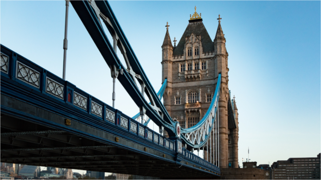
Tower Bridge Steel
Othervariant london available in multiple sizes and configurations.
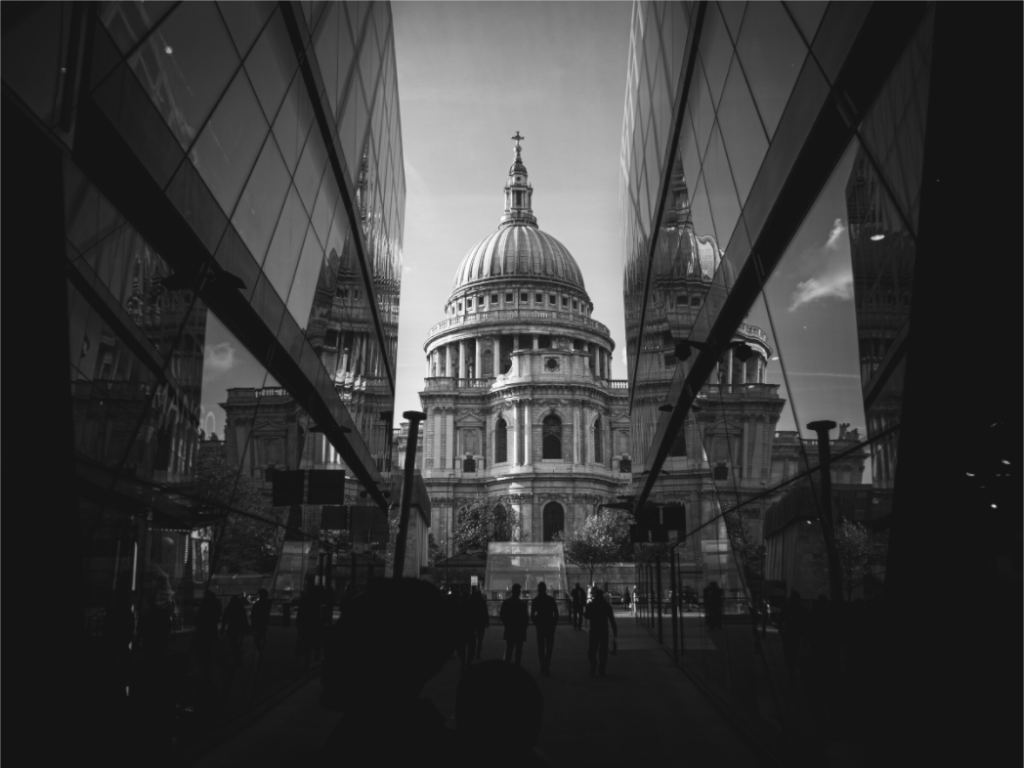
Symmetry & Stone
Othervariant black and white, london available in multiple sizes and configurations.