
Black and white photography works in minimal interiors because it removes one of the hardest variables in a room: colour. What remains is structure, contrast, shape, atmosphere, and the emotional weight of light.
It does not fight the room’s palette
Minimal interiors often rely on restraint: neutral walls, wood, stone, metal, linen, shadow, and carefully chosen objects. A colourful print can work, but it has to negotiate with everything else in the space. Black and white photography avoids that problem. It can sit beside warm plaster, dark paint, pale oak, concrete, or vintage furniture without demanding that the whole room be redesigned around it.
Shape becomes more important than subject
In monochrome, familiar subjects become less literal. A London landmark is no longer only a landmark. It becomes a set of arches, verticals, silhouettes, shadows, and open space. This is why architecture often translates well into black and white wall art.
Examples from the current collection include Symmetry & Stone, The Shard from Sky Garden, and Big Ben Through Wildflowers.
For calm rooms
Choose images with negative space, soft contrast, or a single clear subject.
For darker interiors
Use stronger highlights, architectural lines, and enough tonal separation so the print does not disappear.
For gallery walls
Keep editing style consistent. Mixing too many tones and frames can make the wall feel accidental.
Black and white can feel timeless, but not automatically
Monochrome is sometimes described as timeless, but that only works when the photograph has enough substance. A weak image does not become strong because it is black and white. Look for composition first: balance, rhythm, tension, atmosphere, and a subject that still holds attention once colour has been removed.
Contrast should serve the room
Very high contrast can look dramatic, but it can also feel harsh. Softer black and white prints may suit bedrooms, reading corners, and calm living rooms. Stronger architectural prints can work well above a desk, sideboard, or sofa where the wall needs more structure.
Why London works especially well in monochrome
London has enough texture to survive without colour: stone, glass, bridges, rain, shadows, station entrances, and old buildings beside new ones. Black and white editing can make those layers feel more coherent. Instead of competing signs, buses, and bright fragments, the image becomes about form and atmosphere.
Explore black and white photography prints
Browse monochrome London architecture, landmarks, and quiet studies selected for calm interiors.
Prints mentioned in this article
A quick visual reference for the Othervariant prints linked above.
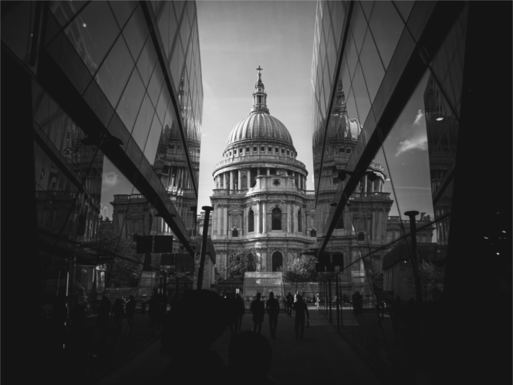
Symmetry & Stone
Othervariant black and white, london available in multiple sizes and configurations.
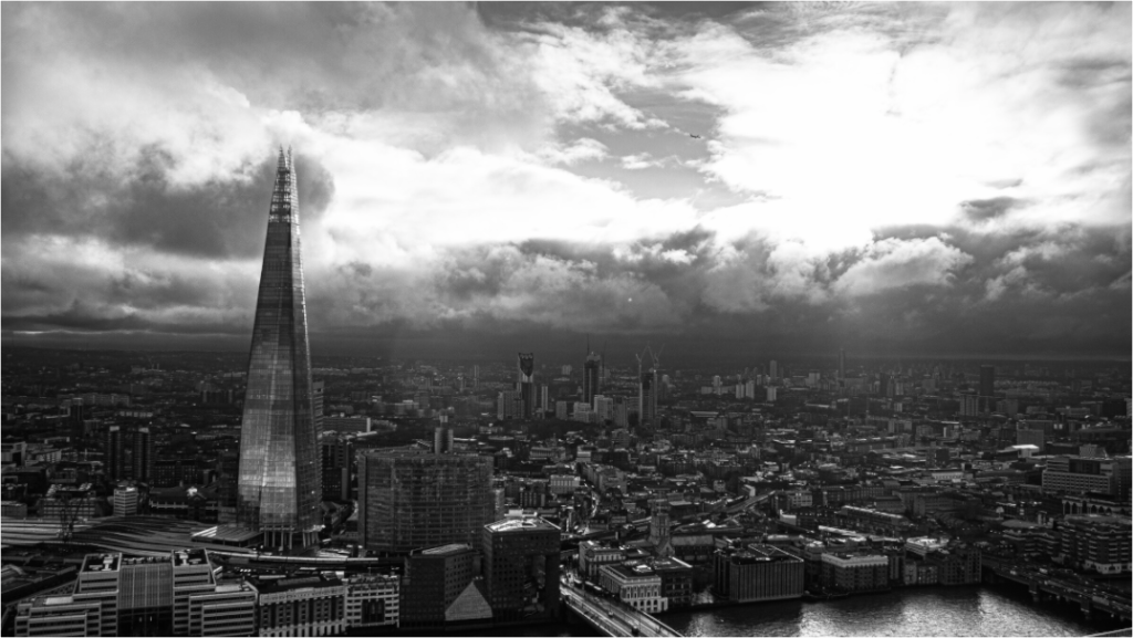
The Shard from Sky Garden
Othervariant london available in multiple sizes and configurations.
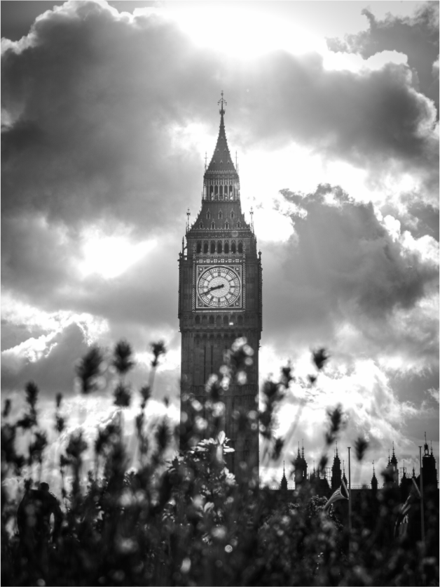
Big Ben Through Wildflowers
Othervariant black and white, london available in multiple sizes and configurations.